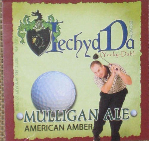
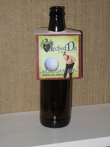
This is my first label for my first beer. The label seems a little busy to me. What do you think? I decided to use these hanging label because they come off easy, are reusable and still look nice.
I wouldn't say it's too busy, exactly. Kind of a style clash thing going on, what with the coat-of-arms/historical look and the comedic figure and the golf ball.
Do you like it? If you do, use it. It's certainly got character. And I'm guessing a few levels of meaning to you. It's professional and attractive, just a bit unusual.
I like the hanger presentation.
[edit: the more I look at it, the more I like it. ]
I was worried about the two styles clashing. In fact I did have a more "old word" type of font for the brewery name but chose this font for it slightly more updated appearance. Thanks for the responses.
The next label I'm working on is for my batch of Apfelwein. It's called "Frosty Donkey", because it was a cold a** day when I made it.

") ]
]
