Does my label seem too busy?

Homebrew Talk - Beer, Wine, Mead, & Cider Brewing Discussion Forum

Help Support Homebrew Talk - Beer, Wine, Mead, & Cider Brewing Discussion Forum:

This site may earn a commission from merchant affiliate links, including eBay, Amazon, and others.

Iechyd Da

Supporting Member
HBT Supporter
Joined
Dec 17, 2007
Messages
231
Reaction score
1
Location
Elkhart, IN
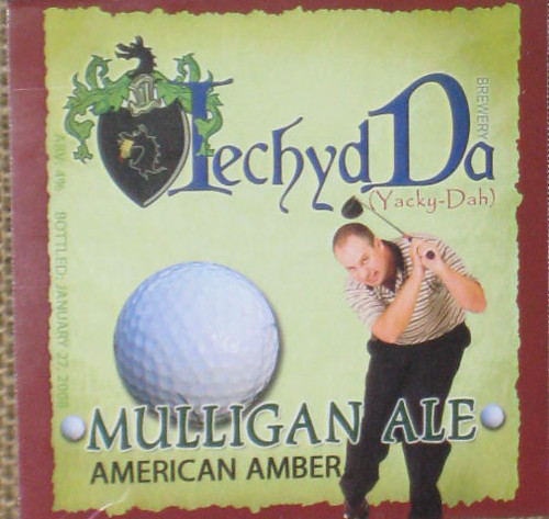
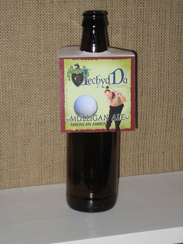
This is my first label for my first beer. The label seems a little busy to me. What do you think? I decided to use these hanging label because they come off easy, are reusable and still look nice.
2266044328_73b84d7135.jpg

2266044544_3e310e0016.jpg
 
I wouldn't say it's too busy, exactly. Kind of a style clash thing going on, what with the coat-of-arms/historical look and the comedic figure and the golf ball.

Do you like it? If you do, use it. It's certainly got character. And I'm guessing a few levels of meaning to you. It's professional and attractive, just a bit unusual.

I like the hanger presentation.

[edit: the more I look at it, the more I like it. :) ]
 
Its GREAT! I love it, not busy at all, its nice and balanced, hey are you one of them graphic design folk?
 
I was worried about the two styles clashing. In fact I did have a more "old word" type of font for the brewery name but chose this font for it slightly more updated appearance. Thanks for the responses.

The next label I'm working on is for my batch of Apfelwein. It's called "Frosty Donkey", because it was a cold a** day when I made it.
 

Latest posts

Back
Top