You are using an out of date browser. It may not display this or other websites correctly.
You should upgrade or use an alternative browser.
You should upgrade or use an alternative browser.
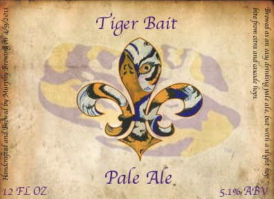
Tiger Bait Pale Ale Label
- Thread starter tmurph6
- Start date

Help Support Homebrew Talk:
This site may earn a commission from merchant affiliate
links, including eBay, Amazon, and others.
maffewl
Well-Known Member
You should change the colors to burnt orange and blue, and put an "AU" in the center. 
Looks nice though... Maybe add some shadow or burn to the outside of the Saints looking symbol and play with the purple name fonts a little. They need a little more character or depth.
Looks nice though... Maybe add some shadow or burn to the outside of the Saints looking symbol and play with the purple name fonts a little. They need a little more character or depth.
You should change the colors to burnt orange and blue, and put an "AU" in the center.
Looks nice though... Maybe add some shadow or burn to the outside of the Saints looking symbol and play with the purple name fonts a little. They need a little more character or depth.
As much as I hate to agree with an Auburn fan
DirtyPelican
New Member
Looking forward to one of these at the LSU-Oregon game!
Similar threads
- Replies
- 14
- Views
- 1K


