The "We'll fix your label for you" thread

Homebrew Talk - Beer, Wine, Mead, & Cider Brewing Discussion Forum

Help Support Homebrew Talk - Beer, Wine, Mead, & Cider Brewing Discussion Forum:

This site may earn a commission from merchant affiliate links, including eBay, Amazon, and others.
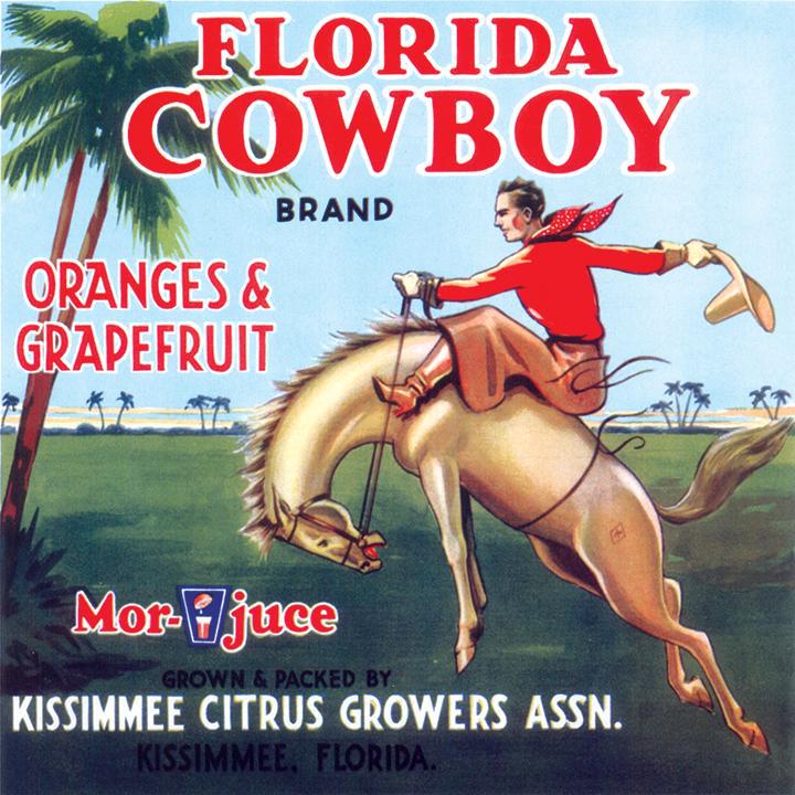
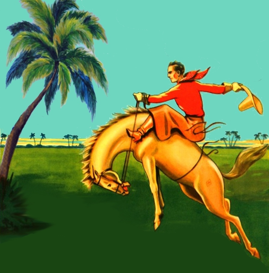
I'm hoping that one of the experts out there might be able to strip the text off of these two images.

Any assistance would be very appreciated.

Thank you -

Ron

Grapefruit 1.jpg


Grapefruit 2.jpg


Grapefruit 3.jpg
 
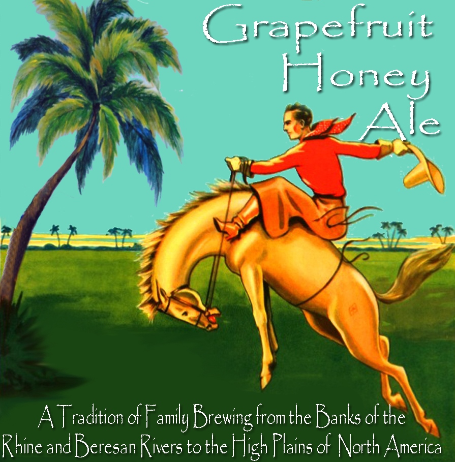
Oaky - I think I got this figured out for the most part. I am attaching what I was able to do. Not quite perfect, but a lot better than it was.

Would it be possible for someone to blend the bits n the bottom where the greens come together a bit, especially on the right-hand side? Also, on the tree going up the left hand side, would it be possible to blend it a bit to smooth it out?

Thanks for any assistance -

Ron

Grapefruit Honey Ale.jpg
 
Sounds good - I thought of that right after I posted. Also, the text will draw attention, when I add it. It will be the same as in the original "Grapefruit Hone Ale," just a different font etc.

Thanks!
 
Hey all,

I'm wanting to convert my intricate homebrew label to something I can get etched onto glassware. To restrain costs, I want to limit it to a max of 2 colors. Anyone have any ideas?

I'm including the original logo and what I have tried to do on my own. But I think I have stripped it down so much, it's hardly the same brewery.

I used Gimp to create it and I think I can save it into other formats if that helps anyone. I'm open to any ideas. You'll notice in my attempt, I outlined the lettering that if filled with a stout, would be black, like the full label, to save a color.

Thanks.

Cresent Moo'n Logo.jpg


Cresent Moo'n snifter.png
 
Little project for someone if they are interested.
Made. brew for my wedding and need a funky label, Don't want it typical wedding style, more minimal but funky. Looking for more green/blush colours and possibly a raspberry colour.
Thx

Raspberry/Vanilla Smoothie IPA
5.9%

Stuart & Marianne
9th August 2017
Trevor Hall
Llangollen
 
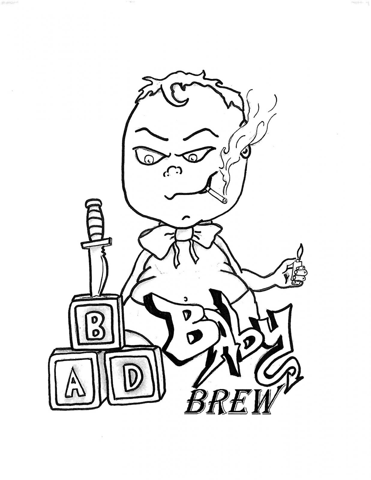
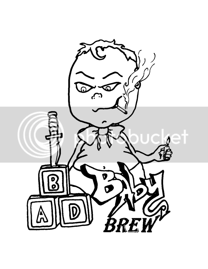
Hi I was wandering if anyone could help me with a design my friend drew for me. I want to get it etched on some 30mm shells for tap handles (and may make him a glass as a thank you) I was told by the guys doing the etching the pic had to be straight black and white for there engraver, and I had to eliminate the extra pixels and shading. If someone could please help me clean it up!
Thank you

BadBaby.jpg
 
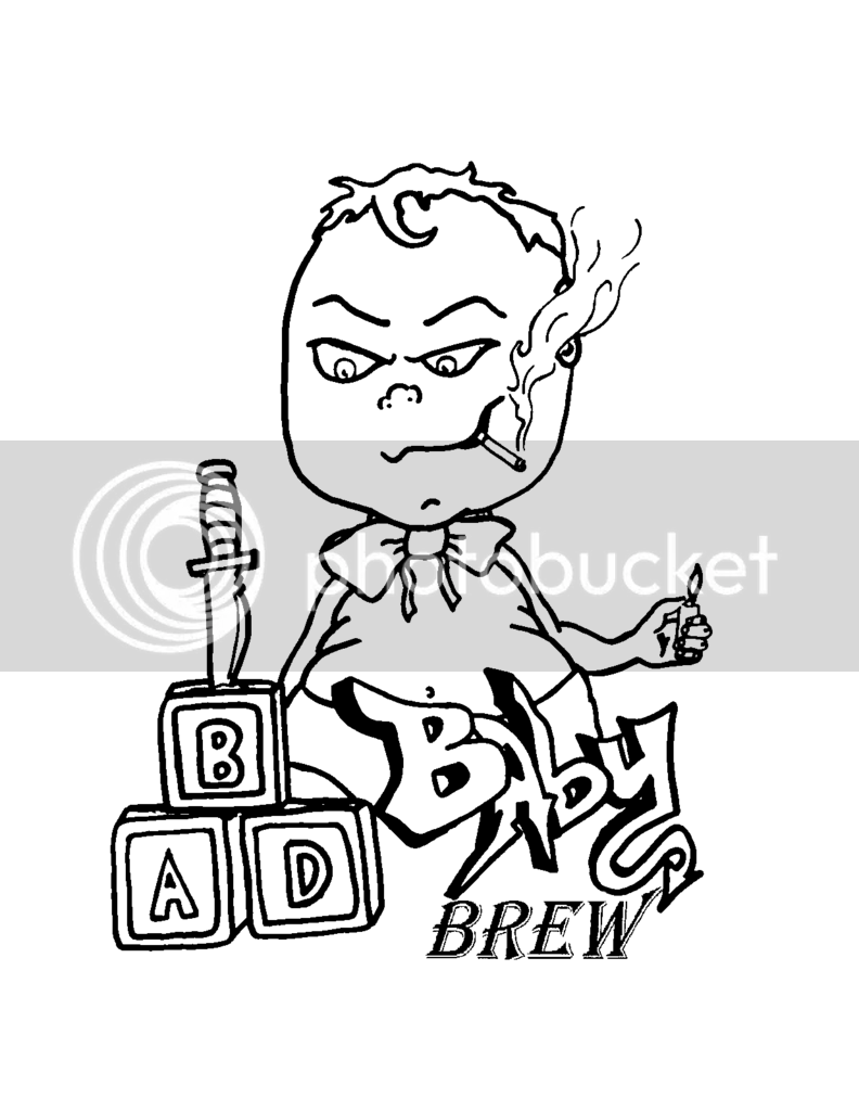
Opened in Photoshop, did about a 1.4 pixel Gaussian Blur, then adjusted the Threshold (difference between Black and White) until it looked right. Took care of the stray pixels and the shading, but the word "BREW" didn't come out that well... I have something else I need to do right now, maybe I can try again later and see if I can improve that...

BadBaby.png
 
Opened in Photoshop, did about a 1.4 pixel Gaussian Blur, then adjusted the Threshold (difference between Black and White) until it looked right. Took care of the stray pixels and the shading, but the word "BREW" didn't come out that well... I have something else I need to do right now, maybe I can try again later and see if I can improve that...


BadBaby.png


Hey that's great thank you, and don't worry about the word brew, I was thinking of deleting it out... it just feels like a mouthful to say. Thank you for doing it!
 
how do you all know how to create these labels? What kind of software are all using? I have a label that someone drew up for me for our "home brewery."

Id love to know how add color and make is look less like a drawing and more like a true image. any suggestions?
 
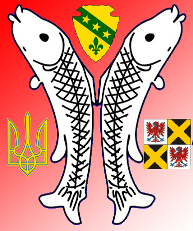
I'd be grateful if someone would help me improve my "logo" a bit. I simply don't have the skills, and my attempts have been pretty bad.

The current image is below, along with some other images that might helps illustrate what I am trying to do:

What I would like to do is:

1. Change the background colour to a deeper, more "German" red, as shown in the flag below. If possible, I'd like to "morph" to the German gold down toward the lower-right corner, but I am not sure if that can be done.

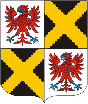
2. Use the attached Obersteinbach crest, rather than the one that is currently on it. There might be some transparency issues, as shown on the bottom of the image. I am including a GIF image and a PNG image - not sure which would be "better" to use.

3. Switch the positions of the Ukrainian crest and the Obersteinbach crest (on the bottom), and position them just a bit better so that they are symmetrical with the central Fish image.

Thanks again for any assistance that can be provided.

Ron

SchwarzMeerDeutsche Logo.jpg


Flag_of_Germany_svg.png


obersteinbach_city_fr67.gif


obersteinbach_city_fr67.png
 
I'd be grateful if someone would help me improve my "logo" a bit. I simply don't have the skills, and my attempts have been pretty bad.

The current image is below, along with some other images that might helps illustrate what I am trying to do:

What I would like to do is:

1. Change the background colour to a deeper, more "German" red, as shown in the flag below. If possible, I'd like to "morph" to the German gold down toward the lower-right corner, but I am not sure if that can be done.

2. Use the attached Obersteinbach crest, rather than the one that is currently on it. There might be some transparency issues, as shown on the bottom of the image. I am including a GIF image and a PNG image - not sure which would be "better" to use.

3. Switch the positions of the Ukrainian crest and the Obersteinbach crest (on the bottom), and position them just a bit better so that they are symmetrical with the central Fish image.

Thanks again for any assistance that can be provided.

Ron

Following your directions, I made the following pic. The bottom one is my interpretation of what it should be. I added some colors to the fish, shadowed & beveled the items. The problem with doing that is if you try to make it smaller sometimes it becomes too muddled.

SchwarzMeerDeutsche Logo Plain.jpg


SchwarzMeerDeutsche Logo.jpg
 
Nice - Very, very nice...both of them! :rockin:

The first image is exactly what I was envisioning...the second gives me a lot of food for thought, as the improvements are most excellent.

I am grateful, sir. :mug:
 
OOOOh, I would love some help..

https://drive.google.com/open?id=0B8F3C1boHghNUlFvMVZYc2ZMOGs

Is my labels

I would really like to intergrate the "seal" as it were
10-P1040345.JPG


Hofbrau kaltenhausen is a brewery name so that can be removed.. but I would love to see what someone could do with the main logo, and the can one! I have the AI files in there.


Thanks!

So what you are saying is, you want the "seal" or ribbon in this pic (or one like it) on the Beerey.PNG pic? And what is it that you want done with the BR-can-label-1d--0(1).jpeg?
 
Yea basically to add this seal (the photo minus the ribbon) to the beerery logo and can if you can!
 
Following your directions, I made the following pic. The bottom one is my interpretation of what it should be. I added some colors to the fish, shadowed & beveled the items. The problem with doing that is if you try to make it smaller sometimes it becomes too muddled.

both VERY GOOD. but I think the layer styles may be a bit overdone in the 2nd

any time I work with layer styles or blending options, (drop shadows, overlays, bevel & emboss) I usually go for what I think is the coolest look possible, then back off the fade, soften, opacity, size... whatever, one at a time until each is somewhere between noticeable and almost not noticeable. with my own stuff, what I think looks good is usually too much

what works for me is using "too much" as my starting point and backing it down until it's just enough
 
Yea basically to add this seal (the photo minus the ribbon) to the beerery logo and can if you can!


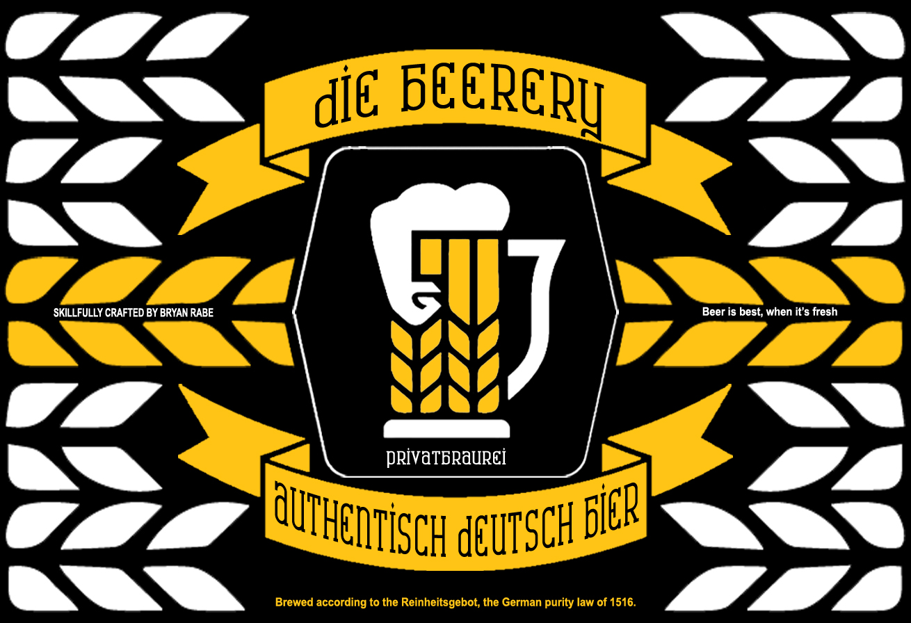
Here's what I came up with on the first one. I kept the font, but changed the color because I didn't think it looked that great. If you want it back to the color you had or some other color, let me know.

Beerery.PNG


Beerery2.jpg
 
Last edited:
Hi, @cas3439 -

I don't want to risk imposing, but if/when you have time, could you take a look at a couple of (hopefully easy) tweaks to those two images?

For the first, "flat" one, can you make the fish image a little larger, so that it fills in the background a little more? I'm not sure if doing so would run up against the three crests, but figured it wouldn't hurt to ask

For the second, "beveled" one, would you be able to scoot the crests and fish image down just enough so that the North Dakota crest isn't skimming along the bevel line?

The only other thing I had rolling around in my head might be to see if it would be possible to look at an image with the "outside" bevel around the border gone, but the rest of the bevels (fish and crests" intact.

I'd really appreciate it - both of these are really nice, and I couldn't ask for anything more as they are perfect for my message with that logo. I plan to try both of them on bottles when I can, and will make a final decision then as to which to use.

I am grateful - of course, if you are ever in Montana, the beer is on me!

Ron

Here is what I think you are looking for. I reduced some shadowing on the emblems and fish. Let me know if you need anything else done/tweaked.

SchwarzMeerDeutsche Logo Plain2.jpg


SchwarzMeerDeutsche Logo Cropped.jpg
 
Not really fond of the font, but love the pic. Would appreciate any and all help creating a brewery logo for sign and coasters!

Wildcat's Lair Brewing Co. 1.jpg
 
Back
Top