The "We'll fix your label for you" thread

Homebrew Talk - Beer, Wine, Mead, & Cider Brewing Discussion Forum

Help Support Homebrew Talk - Beer, Wine, Mead, & Cider Brewing Discussion Forum:

This site may earn a commission from merchant affiliate links, including eBay, Amazon, and others.
Hey jinks, you did so well with my brewery logo and other people's labels I was wondering if you'd be interested in helping me with a label design.

Beer is based on the pirate strong ale recipe here on hbt and I'm trying to get a pirates of the Caribbean thing going, couldn't find a good pic of a capt jack sparrow that wasn't johnny depp so I am liking this pic of the pearl. Abv is estimated at 10.5%. I'm open to you changing whatever you feel helps the theme, I didn't like the beer labelizer options for this pic.

Edit: forgot to mention the name of the beer is "Capt. Jack's Strongarm Ale" by Flowerfield Brewery

Something like this? Or were you thinking a different direction?


cptnjack.jpg
 
@JINKS - dang! As always, you've done a wonderful job!

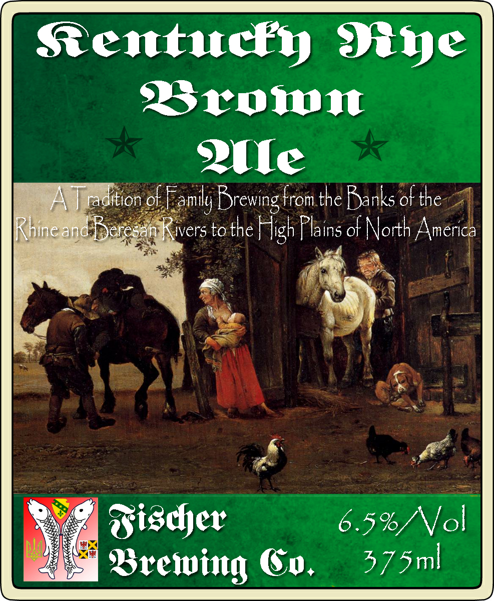
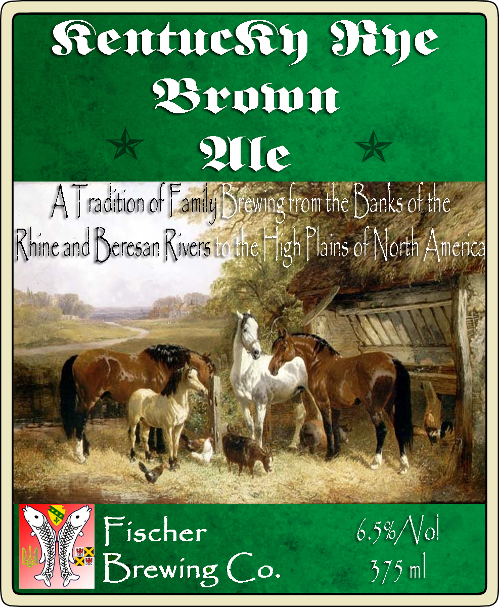
One thing is for sure - with the stars on the lower part of the "top portion," the "Brown" and "Ale" definitely look better on two separate lines:

Kentucky
Brown
Ale​

Also, I like the way that the tag line on the top label is split between light and dark in accomodation with the background; it not only makes it easier to read, but I also noticed that it emphasised some points that are important.​

Would it be possible to see how it looks with "Brewing" also dark on the top line, but "to the" switched to light on the bottom line? Something like:

A Tradition of Family Brewing From the Banks of the
Rhine and Beresan Rivers to the High Plains of North America​


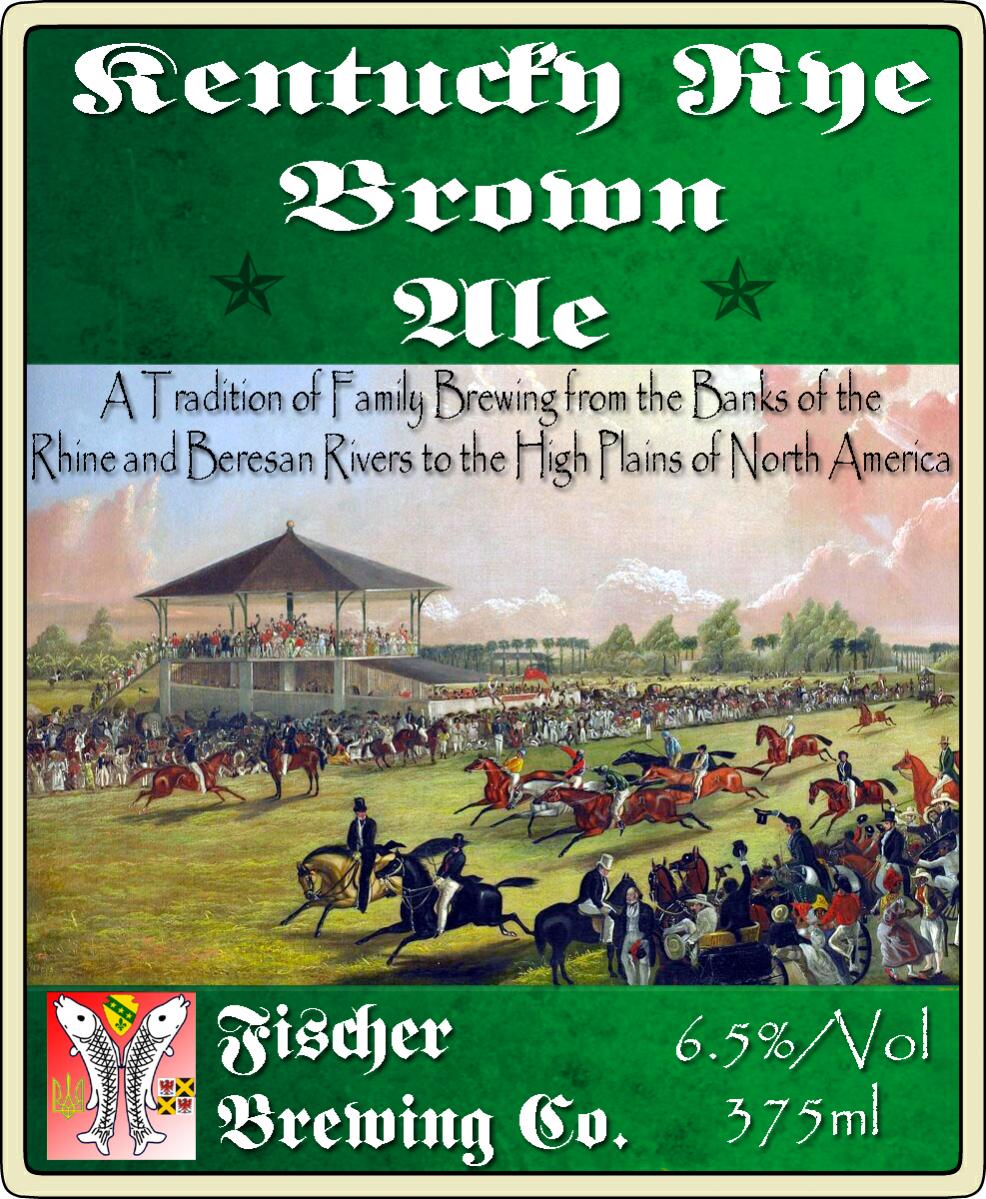
As for the pictures, I've got a dilemma, here - with the "Kentucky" aspect, the horses are very important, of course ~ they're all great, and now I need to decide on one, dang it! lol​

The bottom one would be perfect if it were in an "older" style. The horses and the landscape both look great, but a little too modern.​

The middle one, with the peasant aspect, keeps the theme of rustic tradition that I've been trying to hold onto, and reaches all the way from North Dakota to Ukraine and can even stretch back to Alsace and southwestern Germany, where it all started for my family. Is there any way to lighten that picture up, just a little?​

The top one might be the best compromise between horses and old rural-style. It could work, I think, but am not sure.​

I might leave the decision up to the group - anyone have any preferences on what "jumps out at them?"​

One more bit of help, if you don't mind ~ would you be able to take this:​

attachment.php

And switch "Hard Apple Cider" to "Apfelwein," with an ABV of 8.5% - I decided to jump try Edwort's best, and it's looking beautiful, so far!​

Thanks again, JINKS - I do appreciate the help, a lot ~ we haven't gone over to North Dakota to pick up those old hops, yet, but when we do, I am going to be sure to snag a couple of cuttings for you! :mug:

Ron​
 
hahahaha. Hard Nipple Cider. That's awesome. I bet a lot of people would glaze over it reading the label too.

Awesome labels. Sometimes I can't believe how great this community is.
 
Something like this? Or were you thinking a different direction?


View attachment 269882

I think its fantastic and certainly don't mean to sound nitpicky, but would it be possible to move the moon and pearl to the left and add the coin border to the right side with the surgeon general's warning

Secondly, I thought the logo may be better rotated 90 degrees so it would be right side up on the bottle

Some day ill purchase photo shop and watch YouTube tutorials so I can stop bugging you Jinks, I certainly didn't expect a sample that soon
 
@JINKS - dang! As always, you've done a wonderful job!

One thing is for sure - with the stars on the lower part of the "top portion," the "Brown" and "Ale" definitely look better on two separate lines:

Kentucky
Brown
Ale​

Also, I like the way that the tag line on the top label is split between light and dark in accomodation with the background; it not only makes it easier to read, but I also noticed that it emphasised some points that are important.​

Would it be possible to see how it looks with "Brewing" also dark on the top line, but "to the" switched to light on the bottom line? Something like:

A Tradition of Family Brewing From the Banks of the
Rhine and Beresan Rivers to the High Plains of North America​


As for the pictures, I've got a dilemma, here - with the "Kentucky" aspect, the horses are very important, of course ~ they're all great, and now I need to decide on one, dang it! lol​

The bottom one would be perfect if it were in an "older" style. The horses and the landscape both look great, but a little too modern.​

The middle one, with the peasant aspect, keeps the theme of rustic tradition that I've been trying to hold onto, and reaches all the way from North Dakota to Ukraine and can even stretch back to Alsace and southwestern Germany, where it all started for my family. Is there any way to lighten that picture up, just a little?​

The top one might be the best compromise between horses and old rural-style. It could work, I think, but am not sure.​

I might leave the decision up to the group - anyone have any preferences on what "jumps out at them?"​

One more bit of help, if you don't mind ~ would you be able to take this:​

attachment.php

And switch "Hard Apple Cider" to "Apfelwein," with an ABV of 8.5% - I decided to jump try Edwort's best, and it's looking beautiful, so far!​

Thanks again, JINKS - I do appreciate the help, a lot ~ we haven't gone over to North Dakota to pick up those old hops, yet, but when we do, I am going to be sure to snag a couple of cuttings for you! :mug:

Ron​

I personally really liked the third/bottom one of the horse labels
 
I think its fantastic and certainly don't mean to sound nitpicky, but would it be possible to move the moon and pearl to the left and add the coin border to the right side with the surgeon general's warning

Secondly, I thought the logo may be better rotated 90 degrees so it would be right side up on the bottle

Some day ill purchase photo shop and watch YouTube tutorials so I can stop bugging you Jinks, I certainly didn't expect a sample that soon

Left, Right, its all Goldencptnjack.jpg


p.s. you don't have to purchase photoshop, most of this can be done in paint.net which is free.

Short tutorial by me found here.
 
@JINKS - dang! As always, you've done a wonderful job!


Ron​

Here is first one with new coloring and position.

2nd.jpg


Here are the peasants lightened


Can't Leave it alone.jpg

and the other horses turned to watercolor.

More Horses.jpg
 
@JINKS

One more bit of help, if you don't mind ~ would you be able to take this:​

And switch "Hard Apple Cider" to "Apfelwein," with an ABV of 8.5% - I decided to jump try Edwort's best, and it's looking beautiful, so far!​

Ron​


Here is a blank master copy it will be easier to edit the next time.Master Copy blank.jpg

And finished?


Apfelwein copy.jpg
 
Got a quick chuckle for a second there. I thought it said Hard Nipple Cider, oops. Thanks for helping me name my cider.


Yea its there for me now. Almost never see apple looking at it now.:cross:
 
Left, Right, its all GoldenView attachment 270023


p.s. you don't have to purchase photoshop, most of this can be done in paint.net which is free.

Short tutorial by me found here.

Alittle confusion lol, if u could please, I actually meant the coins on the left side with logo vertical and flowerfield brewery as the original and also the coins on the right with surgeon generals warning...if you're done working on it that's fine and I definitely appreciate the help jinks
 
Alittle confusion lol, if u could please, I actually meant the coins on the left side with logo vertical and flowerfield brewery as the original and also the coins on the right with surgeon generals warning...if you're done working on it that's fine and I definitely appreciate the help jinks

Here ya go.


cptnjack.jpg
 
@JINKS - thanks, bud, they look great!

the apfelwein one is perfect - exactly what I'm looking for and it sets the mood that I was hoping to achieve.

For these:

Here is first one with new coloring and position.

View attachment 270025


Here are the peasants lightened


View attachment 270026

and the other horses turned to watercolor.

View attachment 270030


It's bound to be the 1st or second one, they adhere the most to the "old" look that I am definitely going for. I like the peasant one, especially now that it is lightened. The 1st one is good too, emphasising the horses, which is an important theme for this "Kentucky-themed" beer.

One or the other - I might flip a coin!

Last request - Copuld you capitalise "Tradition" in those labels? Somehow, it got small!:confused:

Thanks, as always, my friend - if it weren't for you, my beer would taste good, but look awfully plain! :tank:
 
@JINKS - thanks, bud, they look great!

Thanks, as always, my friend - if it weren't for you, my beer would taste good, but look awfully plain! :tank:

Yea I tried and tried to find a horses with the tradititional Kentucky horse fencing but I kept coming up short.

Can%27t%20Leave%20well%20enough%20alone.jpg


BeerLabel.jpg
 
@TasunkaWitko just because its fun to have choices.

Races.jpg
 
@TasunkaWitko, I just realized that I had a problem with the tradition line that I didn't catch. I have to many copies of the same thing in the folder and posted the wrong one. Ya gotta call me on the errors so I can fix. Unless you have some changes I'm gonna clear out the folder.
The original as requested with all fixes maybe.BeerLabel.jpg
One with the Germanic font at the bottom too.Germanicfont.jpg

Look at the working folder just for funCapture.JPG
 
now I have to dig up some source images of apples and pears that I can use to make a version of the label for my Easy Peasy Pear recipe.

I'm sure I'll be able to manage now
 
@JINKS - hey, they looks great...Thanks! I didn't catch that mistake, but no big deal.

I'll go ahead and grab all of the designs from the "working" folder, and will keep the appropriate "templates." Feel free to clear it out any time after today!

Thanks again for all of the assistance ~

Ron
 
@JINKS - UPDATE ~ I've saved all of the labels and will get something figured out as to which one to use - heck, they all look great!

Go ahead and clear out your working folder, and thanks for your help! :mug:
 
I now see that there's no easy way for me to make the background of an existing image transparent, using gimpshop. I may have to trace from a desired image in a new layer
 
@JINKS - UPDATE ~ I've saved all of the labels and will get something figured out as to which one to use - heck, they all look great!

Go ahead and clear out your working folder, and thanks for your help! :mug:

Cool I'll keep the psd's around as it is easier than remaking the whole label.
 
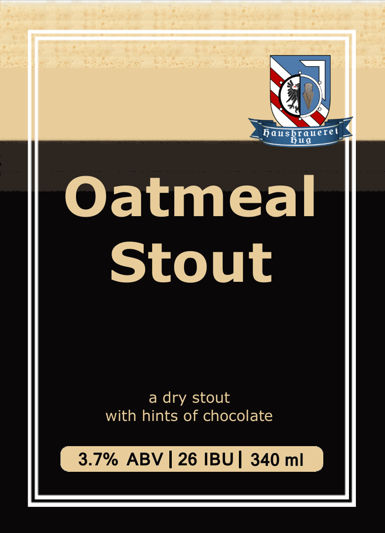
Does anyone have a nice close-up shot of a stout in a glass? I'm really looking to get the colour gradient, subtle colour changes, and the texture of the foam. I found this online, but it's nowhere near high enough rez to be the background for my stout label.

I bodged something together from that low res one, but it completely lacks texture, and you can see tiling in the foam.

The end print size of the label is about 3x4 inches, but might get scaled up a wee bit for bombers and such.

here's what I have so far.

I also thought about playing with the colours in the crest/logo to mute them and skew them to tan/brown, but I couldn't bring myself to do it. when I tried, it just went blah.

stock-photo-4184206-stout-beer.jpg


Oatmeal Stout.png
 
Looking to improve on this

Started with the middle part and it grew. This part stays the same with each batch, except for whatever ridiculous name I decide to give the batch

On the left is a description of the beer, in a font of my own handwriting, then a little about me using flags; US, VA, the Battle Ensign of the ship I was on, the VFW Cross & a Navy Jack.

On the right is the gubmint warning, a barcode for that batch + brewed& bottling dates in my handwriting font

working on this myself. I quoted the post with the original copy for comparison. let me know what you think

View attachment 272631
 

Attachments

  • howdy-brau-8-hearted.jpg
    howdy-brau-8-hearted.jpg
    286.9 KB · Views: 208
http://www.ohbeautifulbeer.com/

I check this site out on a regular basis. It is a great place to find inspiration. One thing that amateur designers like to do (not implying that I know anything) is add too many things. A good label is not necessarily minimal in its design, but minimal in its layout.

Take this label for example: http://www.ohbeautifulbeer.com/2014/09/st-cloud-belgian-white/

There is a lot going on, but everything is clear and has a purpose. The colors are distinct and recognizable, the artwork is crisp and clean, but the parts you need to read easily are obvious and you aren't distracted by everything else happening around it unless you take the time to really appreciate the whole thing.


I have nothing I'm working on right now. Does anyone want anything created rather than fixed?
 
Wow, @ThorGodOfThunder, these are fantastic. Some really good artwork, although some of the most minimal (X Marks the Stout) are the ones that really jump off the page. Consistent style, theme, and color schemes does seem to be the key.

I'm going to put some thought into something I would want created.
 
I have another slightly different request... I'm looking for a simple, yet unique logo for a business card. Black/white, blue/white, green/white or maybe one other color at most. It must contain a hops cone (or few), anything else is open to the artists interpretation. As opposed to my usual demeanor and interests, this one should be made with more happy interests. Abstract is okay. ''Sketchy'', hand-drawn looking if done clean is a plus.

This one is important to me and I'd be willing to compensate the right image with some homebrews if necessary. PM me if need/want any other info.
 
I'm not sure if this is the right place to post this. I have never given much thought to labels before, I keg most beers. My daughter is getting married on June 13th and my son and I offered to brew a "His" and "Hers" beer for the occasion. He requested a Belgium Pale Ale and she request an Oatmeal Stout. The beers have been brewed and recently bottled. We have four cases of each. I found some blue and pink bottle caps but just thought that a label for each would be a really nice touch. So...I need a crash course in label making and also would appreciate any ideas that you creative folks might have for a his and hers wedding beer label. Any ideas are greatly appreciated.
 
I'm not sure if this is the right place to post this. I have never given much thought to labels before, I keg most beers. My daughter is getting married on June 13th and my son and I offered to brew a "His" and "Hers" beer for the occasion. He requested a Belgium Pale Ale and she request an Oatmeal Stout. The beers have been brewed and recently bottled. We have four cases of each. I found some blue and pink bottle caps but just thought that a label for each would be a really nice touch. So...I need a crash course in label making and also would appreciate any ideas that you creative folks might have for a his and hers wedding beer label. Any ideas are greatly appreciated.

Instant Crash Course:
https://www.homebrewtalk.com/add-font-beerlabelizer.html

Crash Course 2:
https://www.homebrewtalk.com/multi-layer-label-with-paint-net.html
 
OK, I need some help, as the most sophisticated prog I have is MSPaint - I'd like the three counties I "starred" to be cut out of this pic and encircled. Maybe a thick border, or double-ringed, IDK, but with enough space to put "Tri-County Run Brewing" in the border or ring.

Background in the circle? Maybe... some Tar-Heels??? Or maybe the counties in white with the tar-heels overlaid into the design?

:D

The counties should be white. I am thinking of this as my neck-label, the "plain" part of the label being black to go with pretty much anything, but again, it's all open really.

Maybe even "Est." and "2015" on each side of the circle?

Anyone, I really appreciate any help someone might put into this.

:)

NCcounties.png


tarheels.png
 
Hey JINKS, thanks for the links. Could anybody point me in the direction of some wedding themed labels that I might draw some inspiration from?

You may be better suited finding a few images that feel right to you. Is there a theme for their wedding or something they really enjoy or have in common? A nice, simple label might do well to have a simple, clean image on it for a wedding beer label.
 
OK, I need some help, as the most sophisticated prog I have is MSPaint - I'd like the three counties I "starred" to be cut out of this pic and encircled. Maybe a thick border, or double-ringed, IDK, but with enough space to put "Tri-County Run Brewing" in the border or ring.

Background in the circle? Maybe... some Tar-Heels??? Or maybe the counties in white with the tar-heels overlaid into the design?

:D

The counties should be white. I am thinking of this as my neck-label, the "plain" part of the label being black to go with pretty much anything, but again, it's all open really.

Maybe even "Est." and "2015" on each side of the circle?

Anyone, I really appreciate any help someone might put into this.

:)

Anyone? Anyone...?

Bueller?

:(
 
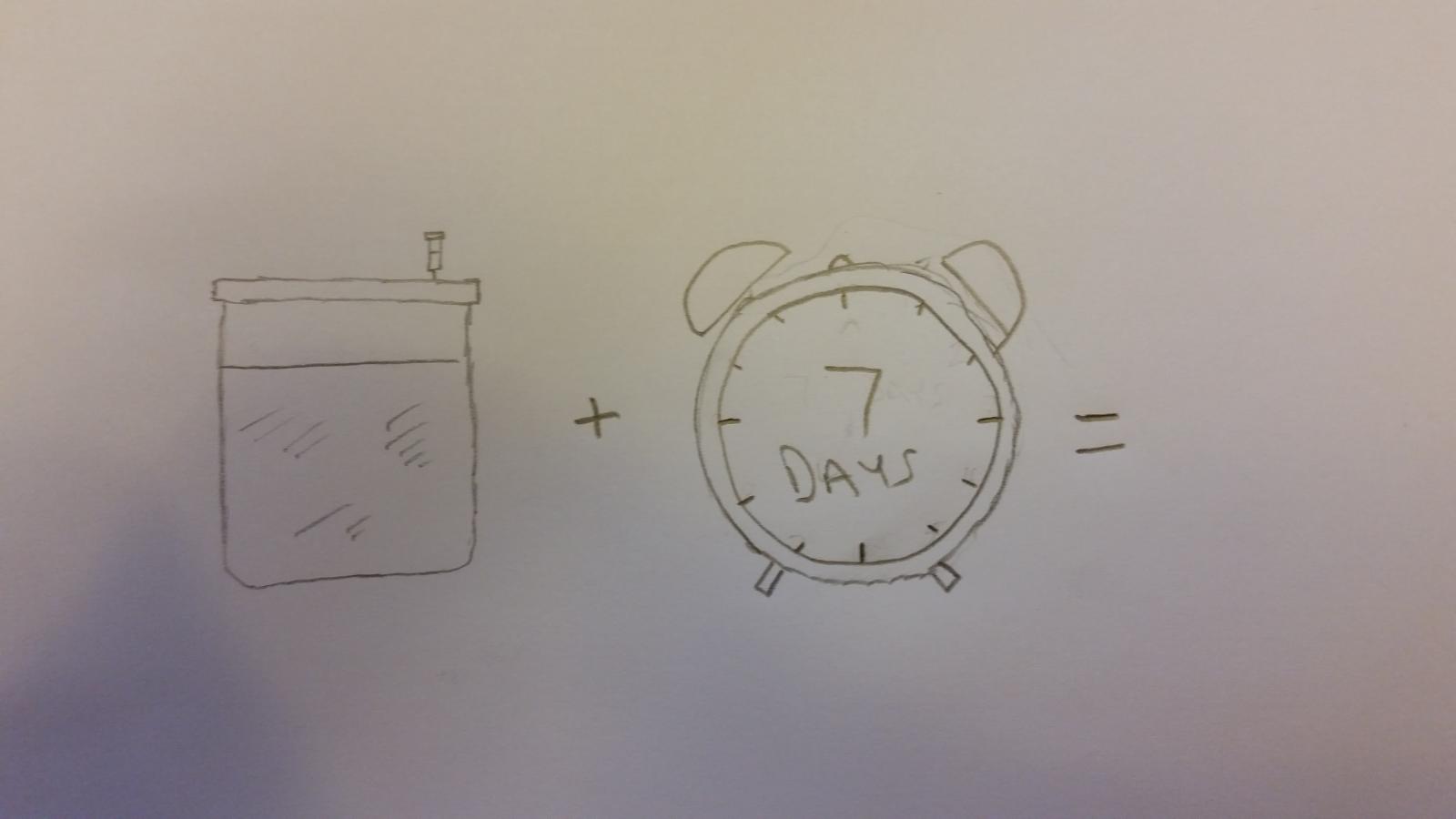
I made an American IPA with San Diego Super Yeast, with the challenge of having it grain to glass in a week. Surprisingly, it turned out great! I decided to call it Seventh Day Fermentist, but I need help with a label. I drew this as a concept. I was thinking of this in monochrome above the text name. Somewhere I would like the brewery name as "Brew for Keeps" and ABV of 6.8%

20150517_172841.jpg
 
Back
Top