blackheart
Well-Known Member
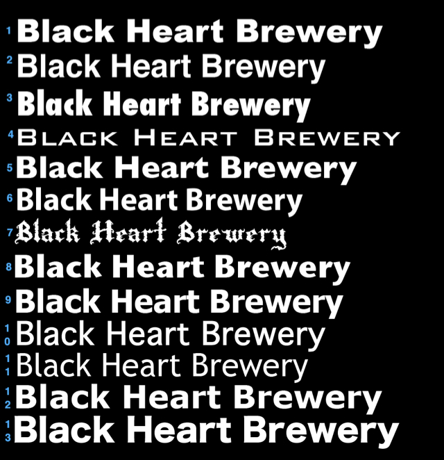
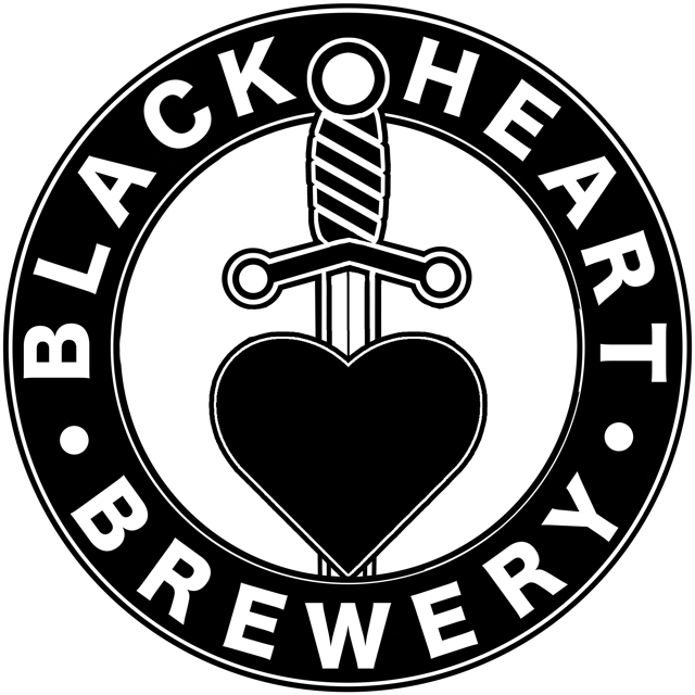
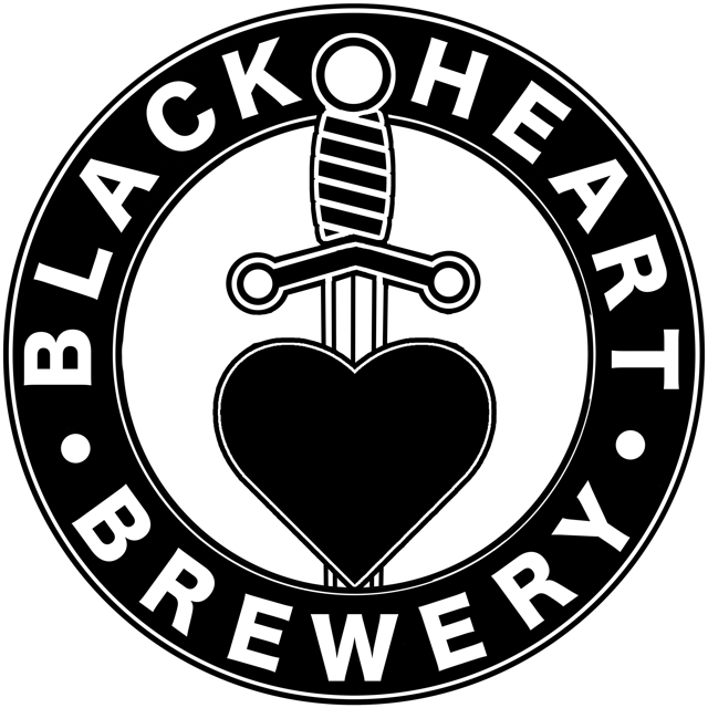
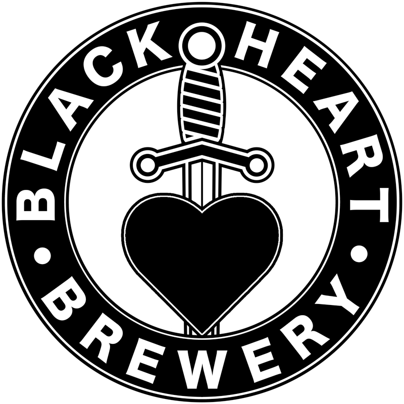
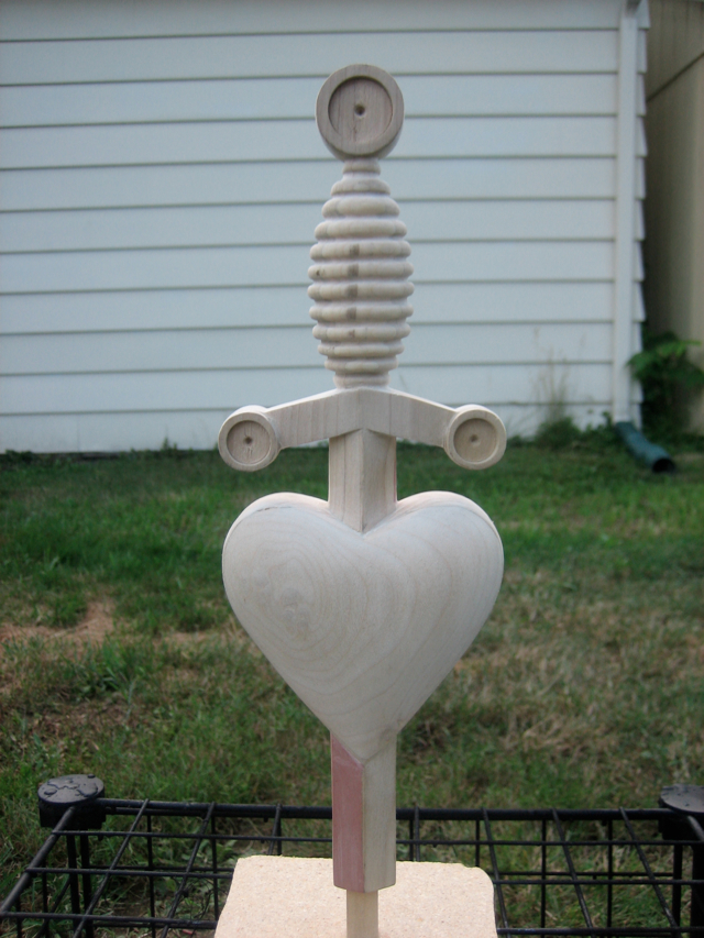
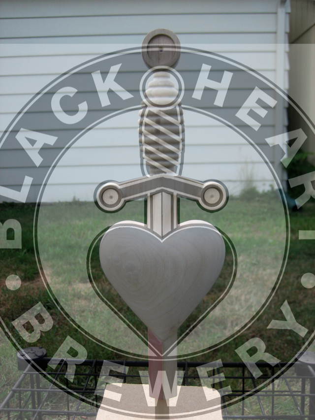
We have been working on a new logo for our brewery, Black Heart Brewery. Here is a few versions. You will notice some slight variations between versions. The logo should work well on black or white backgrounds as well as for stickers/buttons/pint glasses and maybe even labels...
1

2
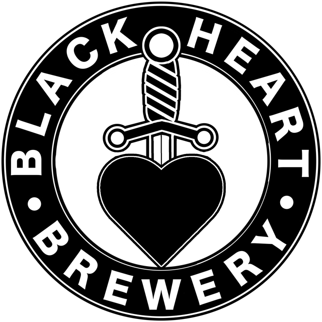
3

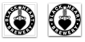
This shows the smaller comparison between both variations.
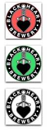
This shows some ideas for coloring based on beer styles possibly.
We are close to finalizing our logo but we could use some feedback from other brewers as to minor tweeks or other adjustments we should make before finishing everything up.
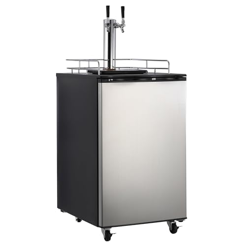
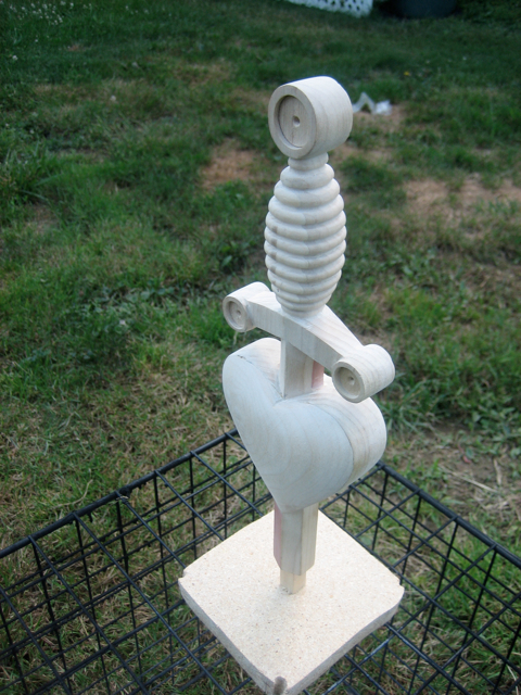
Here is our tap handle based on the basic design...
1
2
3
This shows the smaller comparison between both variations.
This shows some ideas for coloring based on beer styles possibly.
We are close to finalizing our logo but we could use some feedback from other brewers as to minor tweeks or other adjustments we should make before finishing everything up.
Here is our tap handle based on the basic design...


![Craft A Brew - Safale S-04 Dry Yeast - Fermentis - English Ale Dry Yeast - For English and American Ales and Hard Apple Ciders - Ingredients for Home Brewing - Beer Making Supplies - [1 Pack]](https://m.media-amazon.com/images/I/41fVGNh6JfL._SL500_.jpg)