Here is mine. I still want to add some color to it. If any talented people out there that would like to give it a try I would be delighted.

You are using an out of date browser. It may not display this or other websites correctly.
You should upgrade or use an alternative browser.
You should upgrade or use an alternative browser.
Logo Thread
- Thread starter DBake
- Start date

Help Support Homebrew Talk:
This site may earn a commission from merchant affiliate
links, including eBay, Amazon, and others.
bionicbrew
Well-Known Member
here's mine. i'll eventually work it more.

edit: there are some serious awesome logos here!
edit: there are some serious awesome logos here!
- Joined
- Mar 12, 2007
- Messages
- 6,841
- Reaction score
- 858
jcarson83
Well-Known Member
Tripod
Well-Known Member
Using this method:
https://www.homebrewtalk.com/f46/diy-custom-crown-caps-103859/
I reverse the image, print them on heavyweight paper spaced in a MS Word table with just over 1"x1" cells (1 cell per image). I print the sheets of images, cut them out into 1x1" squares, put the goop on the caps, apply the square image to the cap, let it dry, gently rub it off under running water (getting about 70% working, with the other 30% not transferring correctly). Let it dry, spray with sealer.
Hardest part is getting most of the goop off the image without rubbing the small serif stuff off the font.
Thanks for the link...that is one of the coolest things I've seen!
-Tripod
Ksosh
Well-Known Member
Thanks for the link...that is one of the coolest things I've seen!
-Tripod
No problem, but Hokie deserves the kudos for posting it in the first place.

$53.24
1pc Hose Barb/MFL 1.5" Tri Clamp to Ball Lock Post Liquid Gas Homebrew Kegging Fermentation Parts Brewer Hardware SUS304(Gas MFL)
Guangshui Weilu You Trading Co., Ltd

$22.00 ($623.23 / Ounce)
AMZLMPKNTW Ball Lock Sample Faucet 30cm Reinforced Silicone Hose Secondary Fermentation Homebrew Kegging joyful
无为中南商贸有限公司


$176.97
1pc Commercial Keg Manifold 2" Tri Clamp,Ball Lock Tapping Head,Pressure Gauge/Adjustable PRV for Kegging,Fermentation Control
hanhanbaihuoxiaoshoudian


$1.91
$29.95
Mastering Homebrew: The Complete Guide to Brewing Delicious Beer (Beer Brewing Bible, Homebrewing Book)
Goodwill Retail Services, Inc.


$719.00
$799.00
EdgeStar KC2000TWIN Full Size Dual Tap Kegerator & Draft Beer Dispenser - Black
Amazon.com


$58.16
HUIZHUGS Brewing Equipment Keg Ball Lock Faucet 30cm Reinforced Silicone Hose Secondary Fermentation Homebrew Kegging Brewing Equipment
xiangshuizhenzhanglingfengshop

$20.94
$29.99
The Brew Your Own Big Book of Clone Recipes: Featuring 300 Homebrew Recipes from Your Favorite Breweries
Amazon.com


$76.92 ($2,179.04 / Ounce)
Brewing accessories 1.5" Tri Clamp to Ball Lock Post Liquid Gas Homebrew Kegging Fermentation Parts Brewer Hardware SUS304 Brewing accessories(Gas Hose Barb)
chuhanhandianzishangwu


$53.24
1pc Hose Barb/MFL 1.5" Tri Clamp to Ball Lock Post Liquid Gas Homebrew Kegging Fermentation Parts Brewer Hardware SUS304(Liquid Hose Barb)
yunchengshiyanhuqucuichendianzishangwuyouxiangongsi


$11.99
DERNORD 1/2 Inch Stainless Steel Quick Disconnect Set - Beer Brewing Connector Kit (Barb Female/FPT Male)
denuodianqiyouxiangongsi

$44.99
$49.95
Craft A Brew - Mead Making Kit – Reusable Make Your Own Mead Kit – Yields 1 Gallon of Mead
Craft a Brew


$479.00
$559.00
EdgeStar KC1000SS Craft Brew Kegerator for 1/6 Barrel and Cornelius Kegs
Amazon.com


![Craft A Brew - Safale S-04 Dry Yeast - Fermentis - English Ale Dry Yeast - For English and American Ales and Hard Apple Ciders - Ingredients for Home Brewing - Beer Making Supplies - [1 Pack]](https://m.media-amazon.com/images/I/41fVGNh6JfL._SL500_.jpg)
$6.95 ($17.38 / Ounce)
$7.47 ($18.68 / Ounce)
Craft A Brew - Safale S-04 Dry Yeast - Fermentis - English Ale Dry Yeast - For English and American Ales and Hard Apple Ciders - Ingredients for Home Brewing - Beer Making Supplies - [1 Pack]
Hobby Homebrew

$7.79 ($7.79 / Count)
Craft A Brew - LalBrew Voss™ - Kveik Ale Yeast - For Craft Lagers - Ingredients for Home Brewing - Beer Making Supplies - (1 Pack)
Craft a Brew


$10.99 ($31.16 / Ounce)
Hornindal Kveik Yeast for Homebrewing - Mead, Cider, Wine, Beer - 10g Packet - Saccharomyces Cerevisiae - Sold by Shadowhive.com
Shadowhive


$33.99 ($17.00 / Count)
$41.99 ($21.00 / Count)
2 Pack 1 Gallon Large Fermentation Jars with 3 Airlocks and 2 SCREW Lids(100% Airtight Heavy Duty Lid w Silicone) - Wide Mouth Glass Jars w Scale Mark - Pickle Jars for Sauerkraut, Sourdough Starter
Qianfenie Direct

Koric
Member


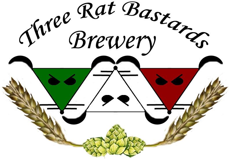
ThreeRatBastards
Well-Known Member
Here is my logo.
bigolbigbelly
Well-Known Member
- Joined
- Mar 9, 2009
- Messages
- 102
- Reaction score
- 0

This logo is related to my Lithuanian heritage.
The Legend of the Founding of Vilnius (Vilnius is the capital city of Lithuania)
"Legend has it that the Grand Duke of Lithuania, Gediminas, was hunting in the sacred forest near the Valley of ventaragis. Tired after the successful day's hunt, the Grand Duke settled in nearby for the night. He fell soundly asleep and began to dream. A huge Iron Wolf was standing on top a hill and the sound of hundreds of other wolves inside it filled all of the surrounding fields and woods. Upon awakening, the Duke asked the pagan priest Lizdeika to interpret the meaning of the dream. And the priest told him: "What is destined for the ruler and the State of Lithuania, is thus: the Iron Wolf represents a castle and a city which will be established by you on this site. This city will be the capital of the Lithuanian lands and the dwelling of their rulers, and the glory of their deeds shall echo throughout the world"
dasein668
Well-Known Member
Work in progress. The dog is done, but I'm still playing with typography. I have a horizontal and circular version that I'm messing around with.

and

and
smmcdermott
Well-Known Member
Here is mine. I still want to add some color to it. If any talented people out there that would like to give it a try I would be delighted.
I really like your logo, however, I feel the barrel should be much bigger to convey the STRONG ARM. Just a thought. Really do like it though.
smmcdermott
Well-Known Member
Really like this thread, as a knew brewer, I am looking for ideas for my own logo. I can't wait to see everyone else's.
MartyB
Well-Known Member
Got the nickname from my sister while she was working retail.

If the link doesn't work, copy/paste it into your browser.
If the link doesn't work, copy/paste it into your browser.
Ksosh
Well-Known Member
Here is my logo.
You know, I was just looking at this logo again, and realized if you took the three rats and turned them 90 degrees clockwise (as a group), it would form a '3'... (right now it's sort of a W... if you get what I mean)
Not really sure how to incorporate that into you logo, just figured I'd throw it out there for consideration.
smmcdermott
Well-Known Member
Got the nickname from my sister while she was working retail.
If the link doesn't work, copy/paste it into your browser.
That is a nice looking logo, however, beer never holds my head up, haha.

ThreeRatBastards
Well-Known Member
You know, I was just looking at this logo again, and realized if you took the three rats and turned them 90 degrees clockwise (as a group), it would form a '3'... (right now it's sort of a W... if you get what I mean)
Not really sure how to incorporate that into you logo, just figured I'd throw it out there for consideration.
Yeah I've seen that too Socia. Maybe I'll go home tonight and see if I can incorporate that somehow, though it could be a pretty big overhaul. The hops and barely have always kind of bothered me (though I do like the use of them to "round out" the logo). Maybe it's time for them to go.
Perhaps eventually I'll get enough name recognition that I could just go by "3RB". The rotated rats would work perfectly for that version
")
Ksosh
Well-Known Member
Maybe it the logo was more egg/oval shaped (tall, not wide), and the hops/barley was the bottom half of the circle, and 'Rat Bastards Brewery' was the top, with the three (and three rat heads) in the middle? Just an idea, and good luck with the revisions.
Nova5
Well-Known Member
Kinda rough, Inkscape may work better than Photoshop.
Fracturedman
Well-Known Member
Here is my first draft of my logo. I choose the Ouroboros because when I discovered real beer for what it was I was starting my life over and since then my life has been so different. I would be lying if I said beer had nothing to do with the changes that have occurred in my life since my divorce.
For those of you who are not into mythology the Ouroboros is symbolic of the cycles of live and regeneration - The endless replenishing of life and need to return to the beginning in order for the next generation to live.

Edit: This is a fast rendering to give myself somewhere to start. I consider myself to be somewhat of an artist and this is by no means the final copy.
For those of you who are not into mythology the Ouroboros is symbolic of the cycles of live and regeneration - The endless replenishing of life and need to return to the beginning in order for the next generation to live.
Edit: This is a fast rendering to give myself somewhere to start. I consider myself to be somewhat of an artist and this is by no means the final copy.
There are a lot of really great logos in this thread, but I just can't get over how awesome this is.
Hmmm.... does somebody play Warcraft?
Ksosh
Well-Known Member
Here is my first draft of my logo. I choose the Ouroboros because when I discovered real beer for what it was I was starting my life over and since then my life has been so different. I would be lying if I said beer had nothing to do with the changes that have occurred in my life since my divorce.
For those of you who are not into mythology the Ouroboros is symbolic of the cycles of live and regeneration - The endless replenishing of life and need to return to the beginning in order for the next generation to live.
Edit: This is a fast rendering to give myself somewhere to start. I consider myself to be somewhat of an artist and this is by no means the final copy.
I like it. I think it would either really pop, or look really childish, if it was like the shining elven font on the lord of the rings'... ring. You know what I mean? (like this http://www.recordingworkshop.com/images/The-Lord-of-the-Rings-The-One-Ring-3D-Screensaver_2.jpg)
Fracturedman
Well-Known Member
I like it. I think it would either really pop, or look really childish, if it was like the shining elven font on the lord of the rings'... ring. You know what I mean? (like this http://www.recordingworkshop.com/images/The-Lord-of-the-Rings-The-One-Ring-3D-Screensaver_2.jpg)
Yeah, I was playing with some fonts like that and others that seemed ancient/mythological, the biggest issue is that it wasnt easy to read. But, I am still palying around with it.
Sawdustguy
Well-Known Member

Ksosh
Well-Known Member
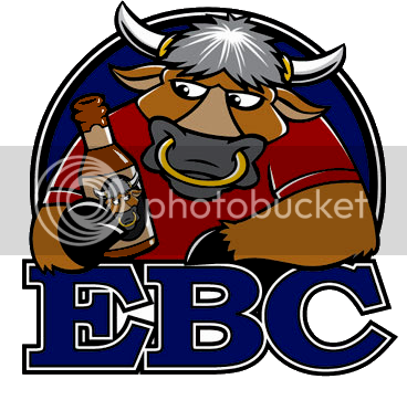
Very professional looking!
Hmmm.... does somebody play Warcraft?
Negative.
The wife refers to me as being "a bull in a china shop" all the time. And the cartoon also bears a striking resemblance. (Thanks again to the talented artist
 )
)FireNightFly
Well-Known Member
What do you guys think of this?

Nothing commercial or anything, thaught Id make something for the friends and family.
Nothing commercial or anything, thaught Id make something for the friends and family.
Ksosh
Well-Known Member
What do you guys think of this?
...
Nothing commercial or anything, thaught Id make something for the friends and family.
I like it, busy, but interesting. I'd suggest saving the file as something else in the image software. The graininess reminds me of a jpg saved as a gif or bmp? Is this right?
FireNightFly
Well-Known Member
Thanks for the reply. Ill look into that.
scuv
Active Member
Came up with this:

Planning on using the centre for the name of the drink.
Planning on using the centre for the name of the drink.
Edcculus
Well-Known Member
I like it, busy, but interesting. I'd suggest saving the file as something else in the image software. The graininess reminds me of a jpg saved as a gif or bmp? Is this right?
looks like the poster edges filter in Photoshop to me.
Tripod
Well-Known Member
Came up with this:
Planning on using the centre for the name of the drink.
I like the concept you are going for... My only critique is the white fonts get lost on white backgrounds so "YSTRADGYNLAIS" and "2009" are nearly unreadable. And old trick to solve this is to give the white fonts a black border around the individual letters. The white still "pops" out when used in contrast of a dark background but the border makes it stand out on light-colored back grounds.
Same with "Nantel Brewing"...give the light fonts a dark border and you'll achieve much sharper contrast. I'm at work so I can't provide an example but I'm sure if you look around you'll see what I am describing...
Hope that helps!
-Tripod
Tripod
Well-Known Member
Found an example from the Kitteh threads...

See how "Dude..." is a white font with a black border? The "..." portion doesn't get lost over the white fur of the stoned kitteh...
-Tripod

See how "Dude..." is a white font with a black border? The "..." portion doesn't get lost over the white fur of the stoned kitteh...
-Tripod
Bob
Well-Known Member

Crappy. But I'm not a graphics guy.
Besides, now we've added a fourth Greyhound, I gotta go change everything. [sigh]
Maybe I'll just change everything and go in a completely different direction...

Whaddaya think?
Bob

scuv
Active Member
Thanks for the critique Tripod!
I'll have a look at those letters again, probably the black border around the white would look pretty good. I found it hard to make the writing stand out from that picture in any colour or font.
I'll have a look at those letters again, probably the black border around the white would look pretty good. I found it hard to make the writing stand out from that picture in any colour or font.
Similar threads
- Replies
- 2
- Views
- 465
- Replies
- 17
- Views
- 1K
- Replies
- 18
- Views
- 823
