EcuPirate07
Beer is a food group
anyone wanna set up a how to on your logo so us people who havent messed with inkscape much can get a good handle on how to do it????

anyone wanna set up a how to on your logo so us people who havent messed with inkscape much can get a good handle on how to do it????
bobbym, the Overbrook logo looks real nice. All of these do.

anyone wanna set up a how to on your logo so us people who havent messed with inkscape much can get a good handle on how to do it????


If you are unfamiliar with any type of art program, just take the time to learn Inkscape or Illustrator instead of Photoshop. You should really be doing this type of thing in a vector editing program.
This is what I'm using on my bottle caps, hence the basic vector skillz. Probably going to redo it in the next few months to something higher quality.
I'd like to know how you're puting those on your caps! Are you just printing on round 1" labels?
-Tripod
Photoshop 8 and up utilizes vector graphics, not bitmap. Its much more difficult to learn photoshop than inkspace or illustrator though.

Using this method:
https://www.homebrewtalk.com/f46/diy-custom-crown-caps-103859/
I reverse the image, print them on heavyweight paper spaced in a MS Word table with just over 1"x1" cells (1 cell per image). I print the sheets of images, cut them out into 1x1" squares, put the goop on the caps, apply the square image to the cap, let it dry, gently rub it off under running water (getting about 70% working, with the other 30% not transferring correctly). Let it dry, spray with sealer.
Hardest part is getting most of the goop off the image without rubbing the small serif stuff off the font.
Thanks for the link...that is one of the coolest things I've seen!
-Tripod


Here is mine. I still want to add some color to it. If any talented people out there that would like to give it a try I would be delighted.


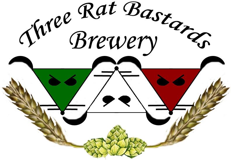
Here is my logo.
Got the nickname from my sister while she was working retail.
If the link doesn't work, copy/paste it into your browser.

You know, I was just looking at this logo again, and realized if you took the three rats and turned them 90 degrees clockwise (as a group), it would form a '3'... (right now it's sort of a W... if you get what I mean)
Not really sure how to incorporate that into you logo, just figured I'd throw it out there for consideration.
")


![Craft A Brew - Safale BE-256 Yeast - Fermentis - Belgian Ale Dry Yeast - For Belgian & Strong Ales - Ingredients for Home Brewing - Beer Making Supplies - [3 Pack]](https://m.media-amazon.com/images/I/51bcKEwQmWL._SL500_.jpg)


