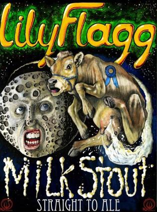
See, I just don't understand that. You've heard it's a good beer, you WANT to try it, so just buy the ****ing thing.
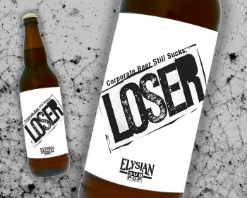
Trust me, I know it makes no sense at all. I just really, really dislike the label. If I had to give a reason I'd say it looks like it's trying too hard to be "cool". It stands out on the shelf. While that does make sure it gets noticed, it doesn't stand out in a way that appeals to me.
I'm not trying to claim it's rational at all. Thing is there are so many beers that I either know I like or still want to try that an off-putting label is the difference between the beer getting chosen or left on the shelf. No logic, no reason, just doesn't appeal to my sense of aesthetics.
Maybe next time my wife goes shopping I'll have her grab me a bottle so I don't have to look at the thing.


![Craft A Brew - Safale S-04 Dry Yeast - Fermentis - English Ale Dry Yeast - For English and American Ales and Hard Apple Ciders - Ingredients for Home Brewing - Beer Making Supplies - [1 Pack]](https://m.media-amazon.com/images/I/41fVGNh6JfL._SL500_.jpg)