No Label is just fine with me...
See? Brewed by No Label brewing, but it has a label, or does it? Hmmm.. it's called no label, but I see labels, I'm confused...
If you look closely, you'll see the NL and the words no label on a couple of places on their carrier")
No Label beer that has labels on em'? Oh crap, I'm just going to drink them! Ha!!!!
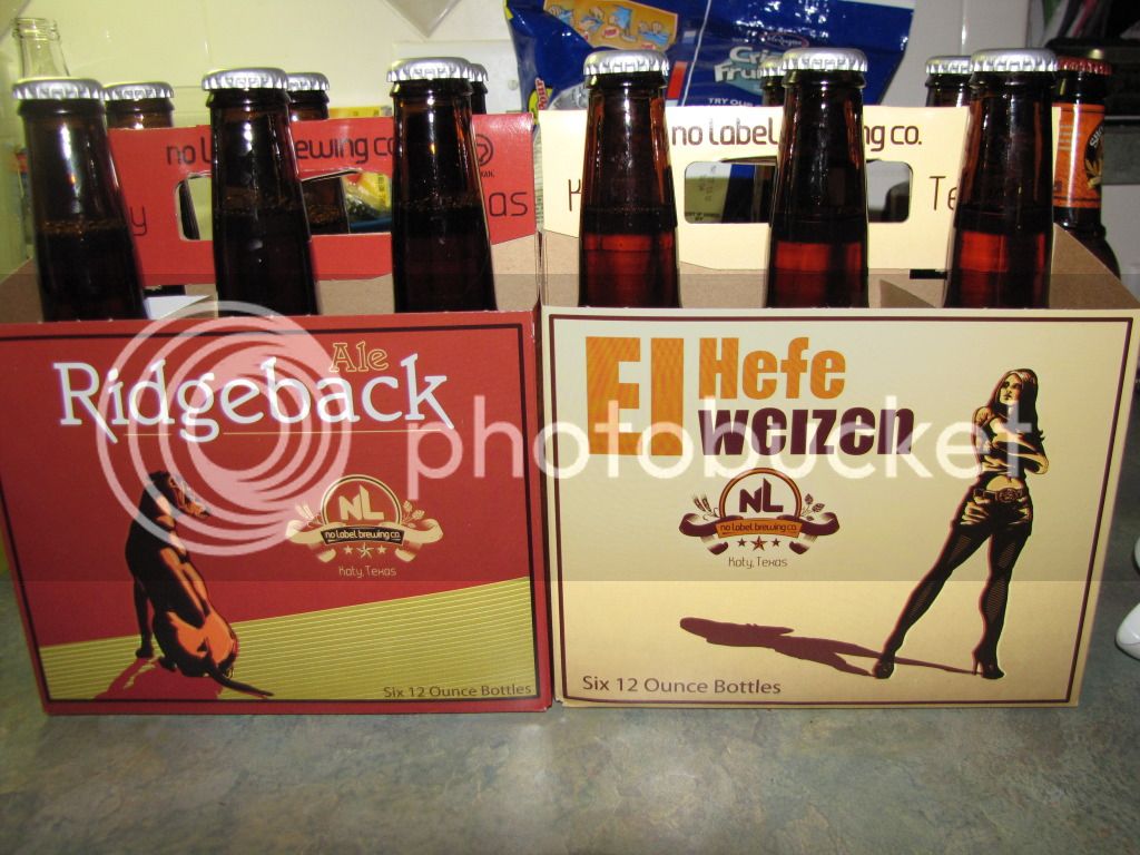
See? Brewed by No Label brewing, but it has a label, or does it? Hmmm.. it's called no label, but I see labels, I'm confused...
If you look closely, you'll see the NL and the words no label on a couple of places on their carrier
No Label beer that has labels on em'? Oh crap, I'm just going to drink them! Ha!!!!


![Craft A Brew - Safale BE-256 Yeast - Fermentis - Belgian Ale Dry Yeast - For Belgian & Strong Ales - Ingredients for Home Brewing - Beer Making Supplies - [3 Pack]](https://m.media-amazon.com/images/I/51bcKEwQmWL._SL500_.jpg)