• Please visit and share your knowledge at our sister communities:
  • If you have not, please join our official Homebrewing Facebook Group!

    Homebrewing Facebook Group

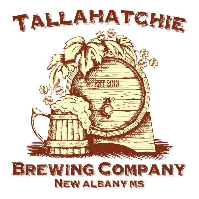
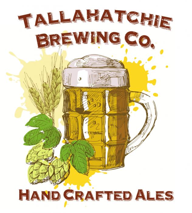
Feedback on Brewery Logo

Homebrew Talk

Help Support Homebrew Talk:

This site may earn a commission from merchant affiliate links, including eBay, Amazon, and others.
Here are some updates, mostly just the font change so it is more clean.

New Logo.jpg


Hand-Crafted.jpg
 
Titan88 said:
My brewery name is Tallahatchie Brewing Company. The Tallahatchie River runs right through the middle of my hometown, New Albany, Mississippi. Looking for feedback on my new logo. It's my first Inkscape logo.

Very cool graphic! I do agree that the font can get a little rough to read, but still very well done!
 
Very cool graphic! I do agree that the font can get a little rough to read, but still very well done!

Thanks! I do use vector graphics that I find online. I'm not quite good enough at drawing to design, scan and import into Inkscape for editing. Also, I download the fonts from fontspace.com and I highly recommend checking it out for all your fonts.
 
Any more opinions? If not, I might call it and go with what I have now. I'm not really an expert at design and finding a good theme to go with that I can match to the logo has been a challenge.
 
My .02.

The logos have some pretty intricate details. If you ever need to print on a small scale (i.e. Business cards), you could lose some of that.

Most of the time when I design an identity I also try to keep in mind how it translates to black and white for things like letterheads and vinyl or metal cutouts. The level of detail and multiple colors can make that difficult.

I know you said that you haven't gotten to the point of editing vector art, but you might want to try to find some less detailed images.

However, I think the logo looks pretty good as is.
 
It looks like a small capital P with a long ribbon attached to it. If the vertical bar extended further downwards, it would be fine.
As strange as this comment is, every time I look at that "B" know I see a P with a ribbon. Didn't notice it till you mentioned it, but now it's all I see.

These labels are pretty sweet, there was only 1 I truly "didn't" like (Post #25)
 
Back
Top