• Please visit and share your knowledge at our sister communities:
  • If you have not, please join our official Homebrewing Facebook Group!

    Homebrewing Facebook Group

Feedback on Brewery Logo

Homebrew Talk

Help Support Homebrew Talk:

This site may earn a commission from merchant affiliate links, including eBay, Amazon, and others.

Titan88

Creator of MashLab Brewing Software
Joined
Dec 18, 2012
Messages
231
Reaction score
60
Location
Alexandria
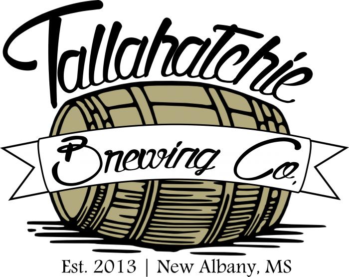
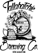
My brewery name is Tallahatchie Brewing Company. The Tallahatchie River runs right through the middle of my hometown, New Albany, Mississippi. Looking for feedback on my new logo. It's my first Inkscape logo.

Test Logo.jpg
 
I like it, though from the looks of it the font you're using won't scale down well or be able to be read at a distance. If that's not an issue keep it as is, if so I'd go with a font that's a little cleaner.
 
I like it, though from the looks of it the font you're using won't scale down well or be able to be read at a distance. If that's not an issue keep it as is, if so I'd go with a font that's a little cleaner.

That was my exact thought when I saw the logo as well. Have you looked at how it looks on a bottle?
 
Thanks to you both for the comments. I checked the size of a bottle neck label on some websites (3.4" x 1.4") and scaled the logo down to fit one (see below). Of course, it will need to be curved, but I am at work and at the mercy of Powerpoint. I'll mess with it on Inkscape when I get home. On the actual labels, I'm just planning on having the brewery name written out and the logo on the neck labels only. I will look into other fonts. Besides the font, how about the overall design? Too simple?

Neck Label.png
 
When it comes to product or company branding simple is good. Think about most of the really well known brands: Nike, Pepsi, McDonalds, New York. You don't picture the company first, you probably picture their symbol. Why? It's simple, with bold lines and distinctive colors. Most importantly it's easy to distinguish and remember. Your label has that with it's stylized barrel,mythical black lines, and color selections. modify the font to match with the complexity of the rest of the label and you're golden.
 
I like it but found the Tallahatchie hard to make out right at first. Also, I've never been a huge fan of using multiple font styles on one logo. I like the font used for "Brewing Co" but maybe you need to pick one font for both and leave the "est 2013" as the font that it is now.

Also, the barrel teases me to think you'll have at least an offering aged in a barrel or sorts so don't let us down. :D

Tallahatchie and Brewing Co. are the same font (Quality Street). I really, really like that font but I'm looking into others. As far as barrel-aged, I'm looking into getting an old whiskey barrel. I already have a barleywine recipe that is aged on oak. Whether that's in a barrel or on chips is yet to be determined.
 
I think it's kind of a shame that there's no 'river' in the logo. Something like http://www.drinkrangercreek.com/ has. Of course I do find their simplicity really kinda cool.

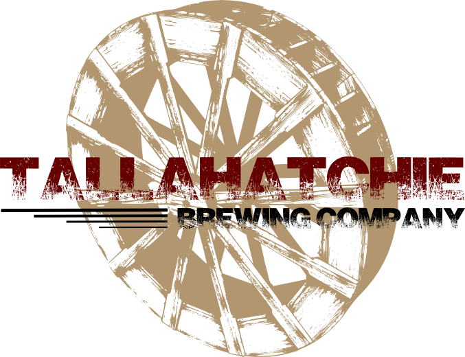
Great suggestion! I'm looking for something like that as we speak. I also threw together a quick new logo. Maybe if I decide to go with a more modern theme.

Picture3.jpg
 
okay, besides the taco Bell on 78, I don't really know anything about New Albany except for I know I've driven through it like a hundred times on the way to B'ham or Mobile the long way. Apparently, it was founded ion the river for saw and/or grist mills.

So what about incorporating the water wheel that powered the mill into the logo? So not forcing the river but adding something definitely river oriented and New Albany related.

I figure you'd have to set the wheel at a 3/4 angle other wise a profile would just look like a steering wheel or something.

Something like the attached (although, meh but you get the idea I'm having (psst, real hack job ;) )).
tallahatchie.jpg
 
okay, besides the taco Bell on 78, I don't really know anything about New Albany except for I know I've driven through it like a hundred times on the way to B'ham or Mobile the long way. Apparently, it was founded ion the river for saw and/or grist mills.

So what about incorporating the water wheel that powered the mill into the logo? So not forcing the river but adding something definitely river oriented and New Albany related.

I figure you'd have to set the wheel at a 3/4 angle other wise a profile would just look like a steering wheel or something.

Something like the attached (although, meh but you get the idea I'm having (psst, real hack job ;) )).

I think you have me sold on the waterwheel! That looks amazing and I def think I'm gonna roll with that. Where did you find the waterwheel image? Also, what was the second font you used?
 
Also, what was the second font you used?

Don't do it!

Sure, the clean, modern sans-serif is a little more readable than the slightly old-timey "second font" on your original logo, but the old-timey font seems to go better with script main font and the engraving-style illustrations.
 
Tallahatchie and Brewing Co. are the same font (Quality Street). I really, really like that font but I'm looking into others. As far as barrel-aged, I'm looking into getting an old whiskey barrel. I already have a barleywine recipe that is aged on oak. Whether that's in a barrel or on chips is yet to be determined.
My apologies, I had not realized they were the same font.
I agree. Would be awesome to have a river in there.

Maybe the barrel floating down the river?
Love that idea!
 
I do like the idea of the water wheel, but I can't seem to find any useable vectors. I think this one has a bit of a country feel to it as well.

New Logo.jpg


Hand-Crafted.jpg
 
Yeah Din was just open in PS so I tossed it on. I agree that a sans-serif isn't going to do it.

@Titan88 the last 2 are cool but as a logo, would they work? I think you would need something that could scale and look the same in black and white.

Here's another rough as I'm watching the Packers game and just kind of sitting here. Wheel would of course need to be drawn and its all rough. Still stuck on the New Albany mill city indian heritage thing.

The serif isnt going to print well so something else besides Engravers but I dont have a ton of serif fonts.

tallahatchie_2.jpg
 
I'm still exploring options and putting effort into getting a solid waterwheel/watermill design. I've attached the two pics in black and white. They seem to scale down nicely, the only thing that becomes hard to read being "Est. 2013" and "New Albany, MS". I'll keep plugging away. Thanks for all the input!

Logo BW.jpg


Hand Crafted BW.jpg
 

Latest posts

Back
Top