
fermentinginpa
Well-Known Member
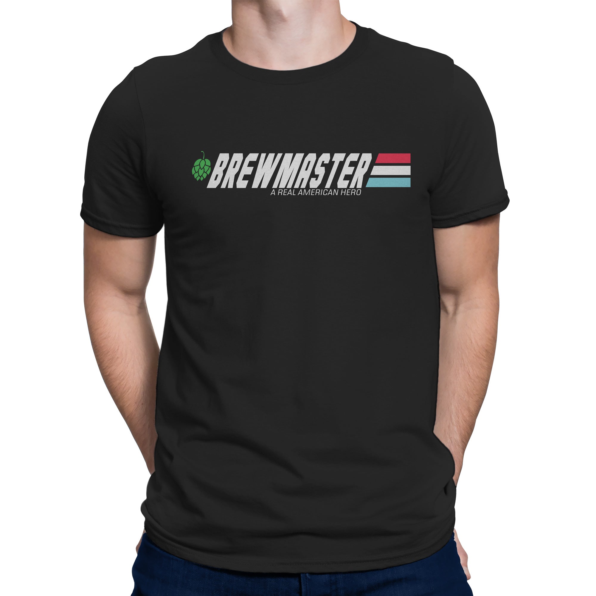
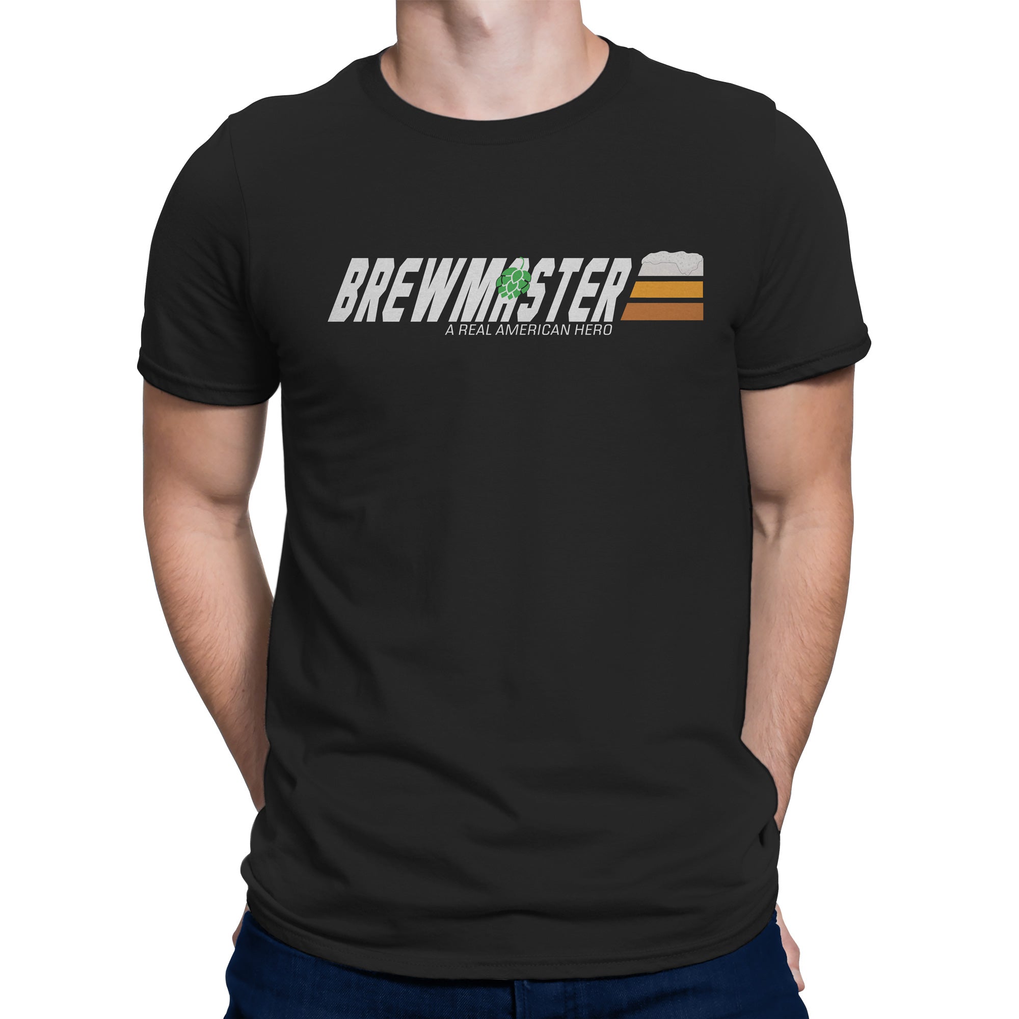
We came up with two variations on a new design. It's a GI Joe parody. The first one is closer to the original logo, the second one changes the colors to be a bit more beer centric. Which design do you prefer. Please vote and then if you have any additional comments, we would love to hear some feedback so post your comments to below. Even if it's to tell us you think they both suck.
Design A
Design B
Design A
Design B
")


![Craft A Brew - Safale S-04 Dry Yeast - Fermentis - English Ale Dry Yeast - For English and American Ales and Hard Apple Ciders - Ingredients for Home Brewing - Beer Making Supplies - [1 Pack]](https://m.media-amazon.com/images/I/41fVGNh6JfL._SL500_.jpg)


