How about scrapping the brewmaster and go with:
I.B.U
A real American Homebrew...
Just spitballing here
I.B.U
A real American Homebrew...
Just spitballing here

I would go another direction totally for the 80’s. Have a buff guy holding up a beer. In an appropriate font underneath it would say “Brewmaster, I HAVE THE POWER!”
") https://www.brewswag.com/collection...ewmasters-of-the-universe-homebrewing-t-shirt
https://www.brewswag.com/collection...ewmasters-of-the-universe-homebrewing-t-shirt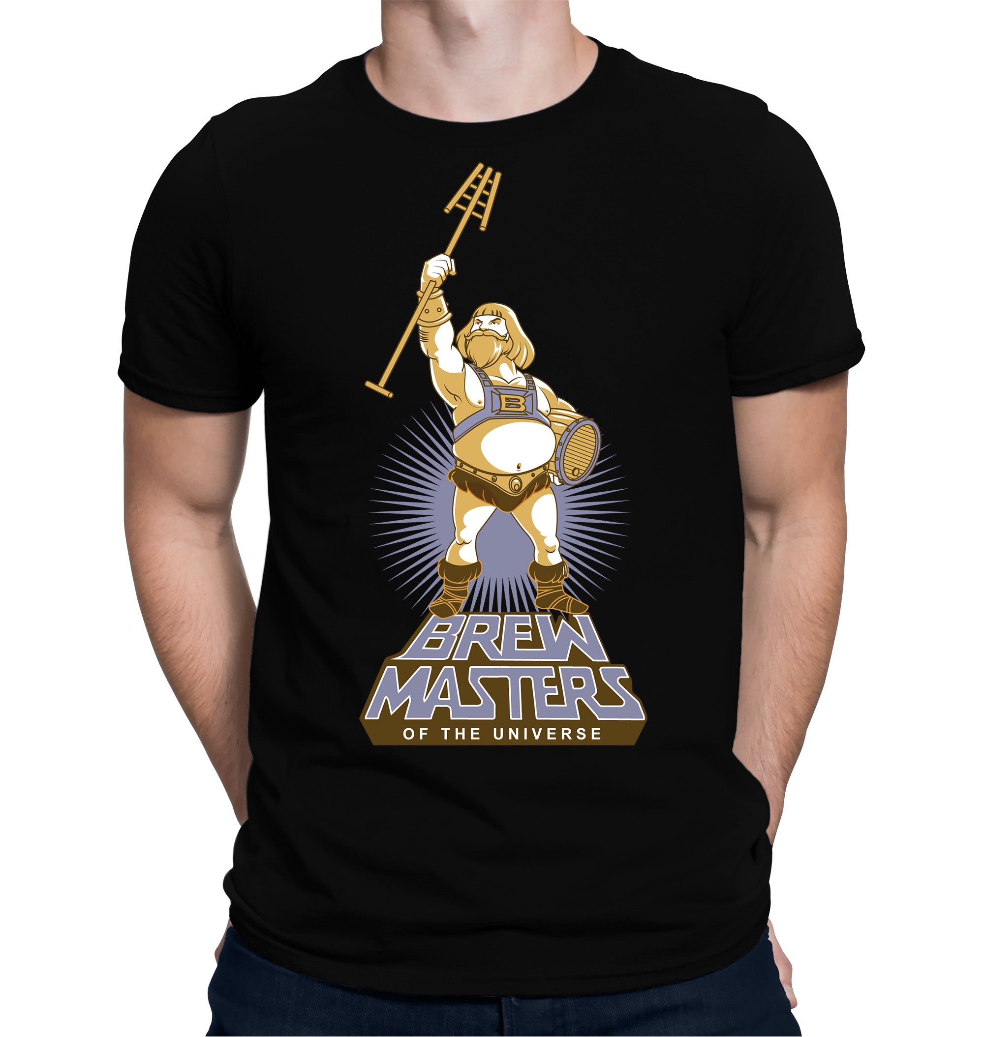
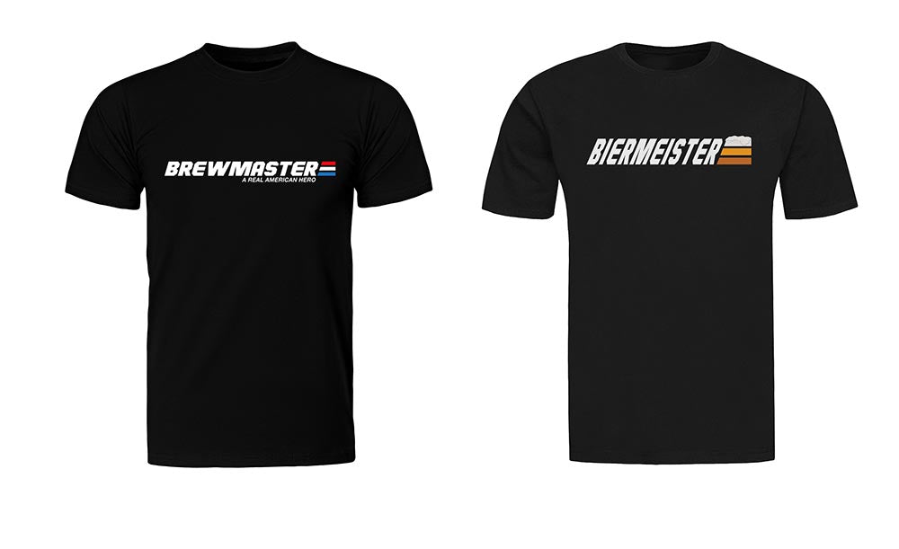
#B. It's a pretty sweet design. I don't think I'd wear it though - IMO the qualifications for "hero" have been reduced to almost nothing these days, a disservice to the real heros. I wouldn't want to contribute to that. I realize I'm overthinking this


![Craft A Brew - Safale S-04 Dry Yeast - Fermentis - English Ale Dry Yeast - For English and American Ales and Hard Apple Ciders - Ingredients for Home Brewing - Beer Making Supplies - [1 Pack]](https://m.media-amazon.com/images/I/41fVGNh6JfL._SL500_.jpg)


I agree, I am not sure of tag line is something I like. If you keep tag line then A is best.
I like B most, put prefer the hops moved to the left like on A


