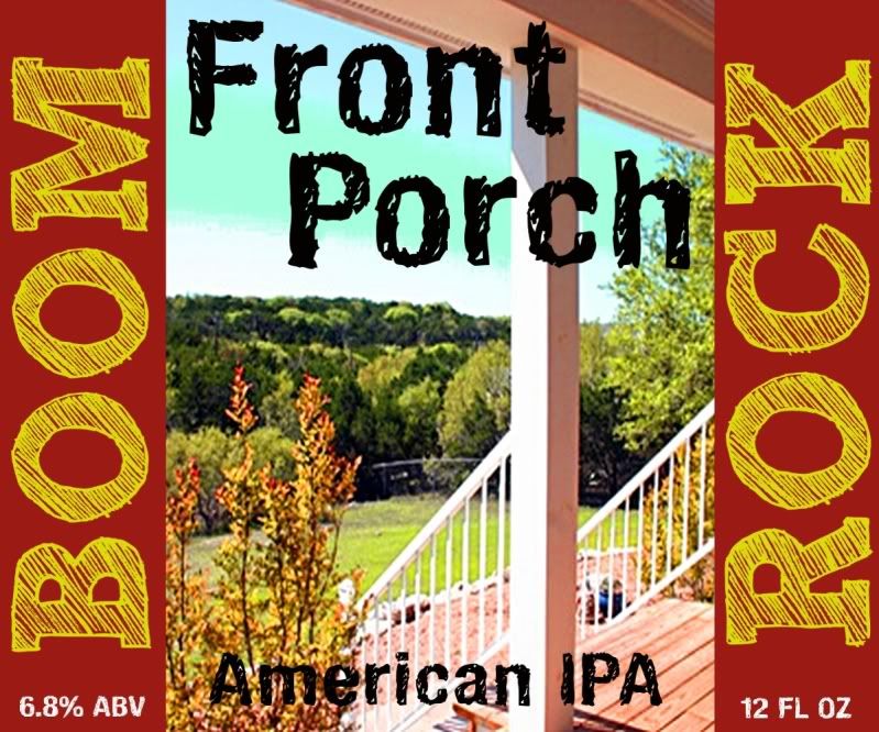
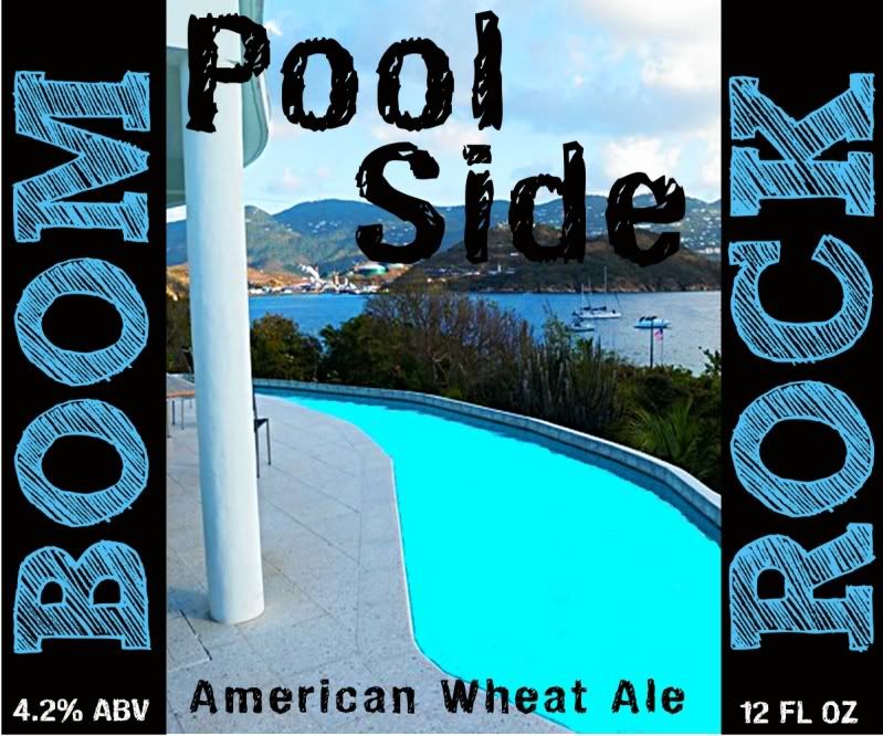
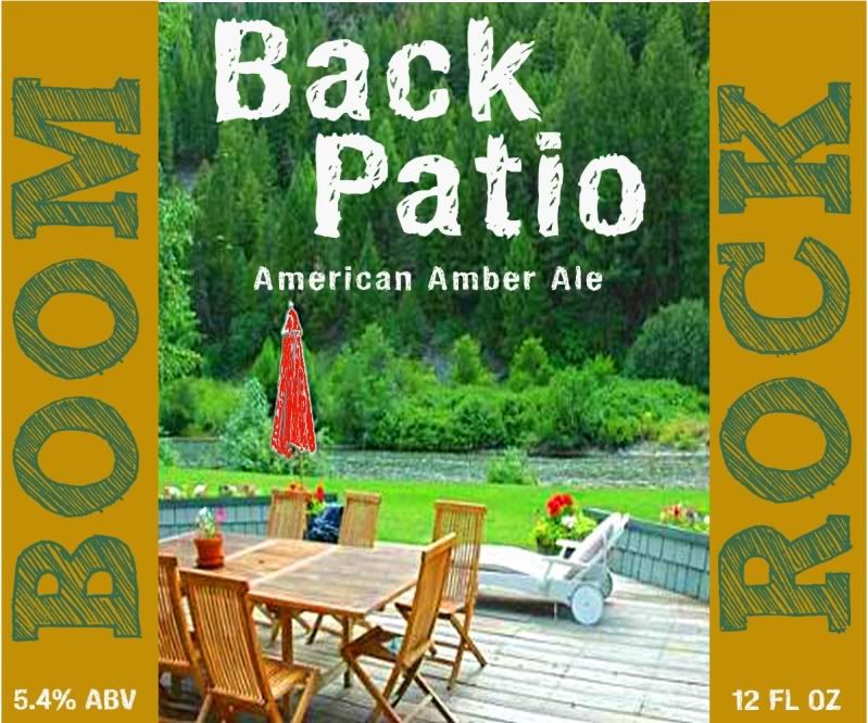
i like all of your labels save for the last one. Your first three labels all do a good job of color coordinating between the image and the text. Pool side uses a similar blue in the text and image. Front Porch shares similar reds.
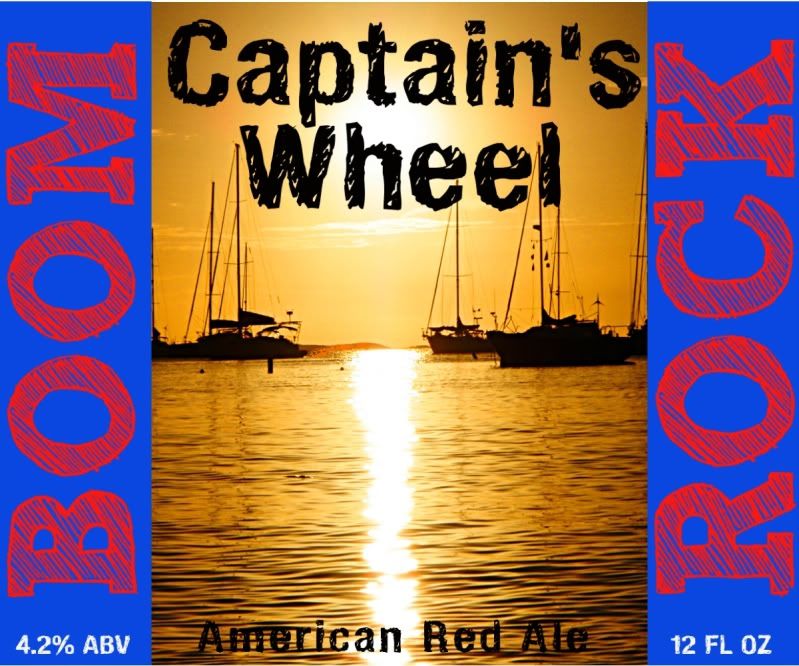
The last one doesn't do that. The blue/red and black/gold don't seem to compliment each other in the way that you do your other labels. That is all, it just looks broken up and clashes a bit for my taste.
Again, all good, it's just something little that i think you did well in the first three but not as good in the last one.


 Flashing/grommets in side of refrigerator for beer and gas line?


