Logo Thread

Homebrew Talk - Beer, Wine, Mead, & Cider Brewing Discussion Forum

Help Support Homebrew Talk - Beer, Wine, Mead, & Cider Brewing Discussion Forum:

This site may earn a commission from merchant affiliate links, including eBay, Amazon, and others.
Here's mine... it's gone through a few changes...
elemental4001.jpg
 
I realized it was the liberty bell, but maybe put Philadelphia, PA on the bottom so it makes more sense.

If I had replaced the Liberty Bell with the Gateway Arch, would I need to write St Louis at the bottom? Paris, France if I had put in the Eiffel Tower?

I'm just bustin' balls. I tried it and actually like the look of including the city in the logo
Slick%20Ninja%203%20logo.jpg
 
these are fantastic. Mine's not showing up but that's OK - got lots of work to do compared to all the above. I'm inspired.
 
Here's mine... it's gone through a few changes...
elemental4001.jpg

I really like this design. That looks cool.

If you are up for suggestions, I would suggest backing off on the "shiny" effect on the lettering. It seems a little too over done. If you are using photoshop I would back off the beveled edges a bit and maybe fade the plastic look just a hair too.

Love the design. That kicks ass. Reminds me a bit of the Isotopes logo from the Simpsons. I dig it.
 
I would probably either commit to a realistic rendering of the cranes or a cartoonish or sketch drawing.

It might be the 2 straight support lines in contrast to hand drawn metal structures.

Just my opinion...:)
 
Thanks for the critique, I really appreciate it. I will re do the supports when I get a chance and upload here for as a comparison. Now if only I wasn't at work...
 
wrecking%20balls.jpg


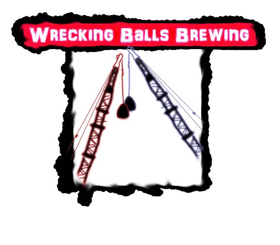
Here's the logo I've been working on, would love some constructive criticism.

I would find an image of a wrecking ball (or two wrecking balls) in action demolishing a building or a wall etc. to give it some excitement. Right now it looks like your two balls sagging.... or maybe they're are in love and whispering sweet nothings to each other or maybe they're asleep. Add a few Zzzzz's and you'll see what I mean.
 
Right now it looks like your two balls sagging.... or maybe they're are in love and whispering sweet nothings to each other or maybe they're asleep. Add a few Zzzzz's and you'll see what I mean.

That is a brutal...yet completely accurate (albeit hilarious) critique. LOL

I agree that it needs something to make it more dynamic. By having the name extend past the side of the image it creates a kind of frame, so there is a whole lot of white space within the image and around it.

I like the name though...I get it...it probably just needs to be executed differently.:mug:
 
rubrews.jpg


I know its not real fancy but I print these out on 1/2" white disk printer sheets from staples and stickem on top of all my crown caps. Looks way better than a plain Jane gold crown cap.

I really like this; great design. It's bright, symetrical, visually appealing, and simple. Great job. The only thing I would suggest trying is either center the text and have the point of the "w" intrude on the color, or rasterize the text and shrink that point of the "w" down. It's a little off balance with the text not being in the center of the "channels". It still works...just a thought.
 
you know i was going for a sleeping sweet nothing dangly balls type look. Thanks, i think i've made the pic even better now....

wrecking%20balls2.jpg


... but seriously, thanks for the tips. What do you think of the one below?


wrecking%20balls1.jpg
 
you know i was going for a sleeping sweet nothing dangly balls type look. Thanks, i think i've made the pic even better now....

wrecking%20balls2.jpg


... but seriously, thanks for the tips. What do you think of the one below?


wrecking%20balls1.jpg


I think it looks pretty badass
 
One wrecking ball, smashing into a large bottle of beer! Smashing all of the media hype of cold filtered and votex bottles, smashing the just right taste, smashing the megga multi-million dollar advertising machine that keeps people chained to bud and miller and coors.

Wrecking Balls Brewing: Smashing every notion of what "beer" should be!

This I like, that's awesome. :mug:
 
I would find an image of a wrecking ball (or two wrecking balls) in action demolishing a building or a wall etc. to give it some excitement. Right now it looks like your two balls sagging.... or maybe they're are in love and whispering sweet nothings to each other or maybe they're asleep. Add a few Zzzzz's and you'll see what I mean.

Just a case of old man balls. We will all be there one day!
 
latest version, thoughts?

Thanks!

Spaceport,

Looks great. BTW one of the first dates my wife and went one was a double date with her room mate and one of my college buddies to see the movie 2010. My buddy and I had read 2001 and 2010 in addition to seeing 2001 several times. We knew the story line and how everything fit together between the 2 movies. My wife and her room mate left the theater scratching their heads whilst my buddy and I prattled on and on about how much insight 2010 gave into 2001. To this day 2001 remains one of my favorite movies ever.
 
I like the newer logo more than the last. How about making the stars and the slogan centered on the same axis as "spaceport brewpub"?

other than that minor suggestion i think it's great.
 
I know this is a label thread, and I have posed some logos, but I thought I would share this. It is a mock-up of one of the wall art that will go into the brewpub. The artist for the original, Bee Two, is in the Philippines; I took his art and added the pilsner glass and lettering as a test. He is going to do this on a professional level and send me files that are fine enough to print in a six foot high graphic for the wall, as well as go on to t-shirts, posters, and other merchandise. Sexy Steam Punk Brewgal!
:ban:

SPBPBeeGirlW_text_16_Jul_10_Small.jpg
 
well that is a label a well, the "Honey Bee Wheat" or something.... I am in love with this gal!
 
Very cool! Fantastic even. Very "Heavy Metal"ish (I may be dating myself with reference to that magazine). Great job giving the beer that same soft feel...it's integrated perfectly. And I like how it's kind of floating, 0 g or anti-gravity...adding to the sci-fi feel. The only thing I would suggest is make the name larger to be the same width as the picture...giving it more visual weight on top and give the name the most importance.

Beautiful!
 

Latest posts

Back
Top