Logo Thread

Homebrew Talk - Beer, Wine, Mead, & Cider Brewing Discussion Forum

Help Support Homebrew Talk - Beer, Wine, Mead, & Cider Brewing Discussion Forum:

This site may earn a commission from merchant affiliate links, including eBay, Amazon, and others.
Logo3.jpg

So, can I sue for stealing my name? I haven't recieved royalties from Hawkins yet...
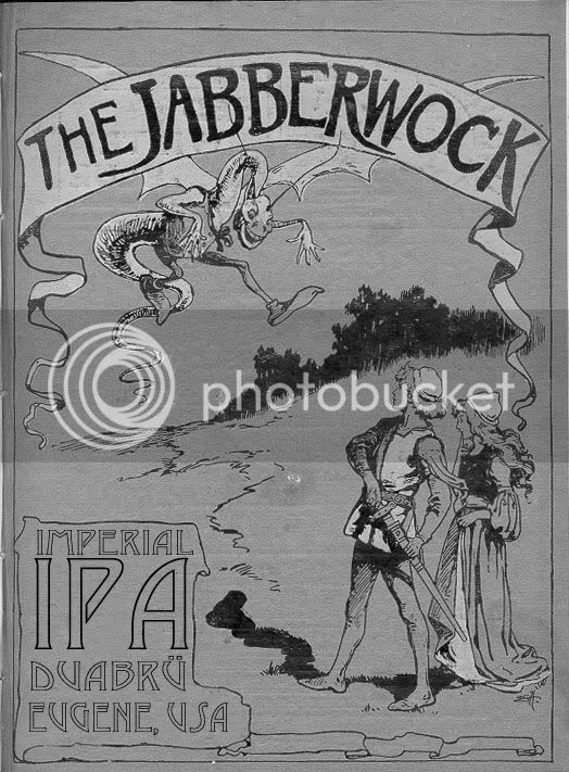
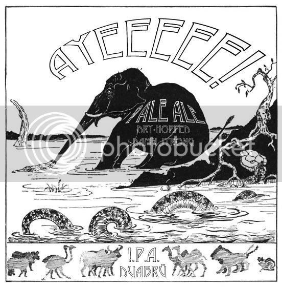
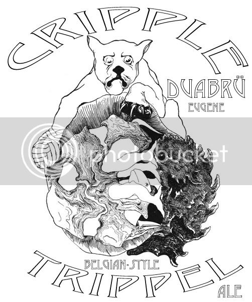

Fifth%20Dimension%20Bruisers.JPG
 
I made these years ago back in grad school. I was using the school's laser printers, but everything had to be in black & white. Most of this stuff involves inside jokes. I used illustrations from Rudyard Kipling's "Just So Stories" for a lot of stuff.

bandersnatch.gif

bustanutbrownalecopy.jpg

buttuglysteamcopy.jpg

jabberwockipacopy.jpg

longnoseipalabelcopy.jpg

pussnbootscopy.jpg

toughtimestrippelcopy.jpg

scowlingchadcopy.jpg
 
Alex, that Dark Harvest label looks great. One thing you might do, however, is tighten up some of the letter spacing, especially between the R and V in "harvest" and between the W and A in "washington." I love that font!
 
heres mine. still not dead set on the name. but thinkin of doing a different character in the center for different varieties. the hop and wheat stocks may evolve to into an evil hop face kind of a skull and cross bones. for a particularly strong beer. :cross:

brewlogo1.jpg
 
bvlb.png


I need to adjust some of the kerning between the T & A (heh heh) in Beeritas, plus the V & O in Vos, but I'm in the ballpark.
 
Here's one I've been playing with (so far, only in Powerpoint...):

4GFBW.jpg
 
Yeah, I realize that...the inspiration comes from "Four Green Fields", an Irish song, and the four ingredients for beer...so...
 
My grandfather was a german home brewer, so I used his family crest.
His name ment Seven Fields in German, so I just went with it!

7Fields.jpg
 
two_ravens_banner.PNG


My grandfather was Norwegian, and I have a great deal of respect for my Norse ancestors and their beliefs. The ravens are Hugin and Munin, who flew down Yggdrasil, the world tree, each day to bring news back to Odin of what was going on in the worlds.

I made this in Publisher. At some point (when I fix my personal laptop and have access to software other than what my work thinks is acceptable) I'll re-do it in Inkscape or photoshop, but until then this is what I've got.
 
Yeah, we were going for something really clean and simplistic. The nice part about it is that it is super easy to adapt to anything. It is basically just a font. The oval is just for using like a stamp to give it a finite presence.
 
i threw out my old logo and started working on this one. so far i am pretty pleased. not 100% on what to do with the name of the beer to make it stand out a little better.

montivagus_label.jpg
 
Love everything about it except the font. The "tails" on the g's are lost and it looks like "a". And then you have tails on the a's in Yeast Bank....Makes it a little hard to read.
 
Here is what I've been using...really simple, I know, but it looks GREAT on bottle caps.

seal12.jpg

BTW, a sun dog is not a trendy golden retriever that wears sunglasses and a bandana...it's a celestial phenomenon that looks something like this:

sundog1.jpg
sundog2.jpg

It happens when ice crystals in the atmosphere break the sunlight into a rainbow/halo...

-Tripod
 
Back
Top