Label. A work in progress

Homebrew Talk - Beer, Wine, Mead, & Cider Brewing Discussion Forum

Help Support Homebrew Talk - Beer, Wine, Mead, & Cider Brewing Discussion Forum:

This site may earn a commission from merchant affiliate links, including eBay, Amazon, and others.

Anderz

Active Member
Joined
Dec 30, 2008
Messages
42
Reaction score
0
Location
Edmonton
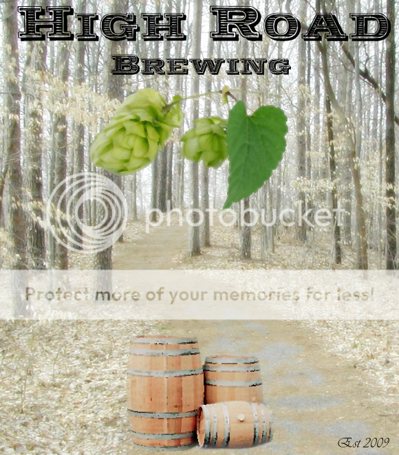
What do you think ? I would like to change a few things, like adding some curve to the "High Road" text and maybe removing the Center hop and possibly the barrels i have a few other ideas as well but unfortunately i saved it as one image instead of in layers so i pretty much have to redo the entire label in order to make changes.
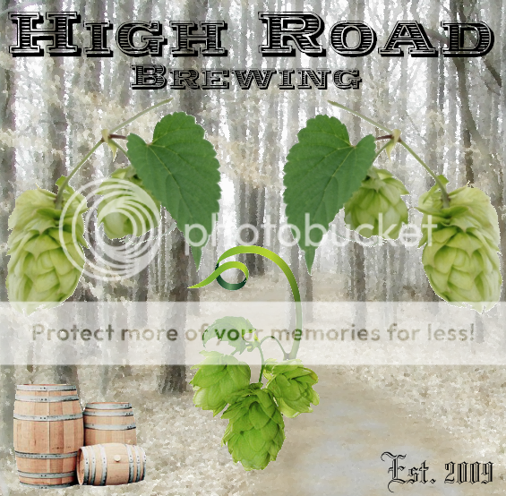
HighRoadBrewing3.png
 
personally i would dump the hops, they just seam too fake to me, maybe thats the photographer in me, trying to keep images like that real looking. i think with a little more blending and shadowing you could make the barrels look like they where actually in the original pic which would make it better imo.
 
I see some really cool stuff in the label that has my mind going crazy with different ways to use your images. I really like the font and look of the name. I agree with Nvr2low with the hops not looking right. Seem like they are standing out way to much IMO (as far as brightness compared to the toned down background)

There is a ton of stuff I would do with it, but I like the direction you are going.
 
Yeah they were just cut and paste :) how does this look ( Just learning how to use Paint.NET)
Thanks for the constructive criticism
HighRoad5.png


A little blurry perhaps ? ( but alt least i figured out how to build up a image in layers. Paint.NET makes it hard to write Text to a path any help
 
getting better but i have the same issues, it still looks very cut and paste. if you are dead set on using those hops move them out of the center and put them in a corner, it will look much better there.
 
yes, maybe as just a small accent above teh established date. And what is the significance of the barrels. The picture style of all 3 images is too far out from one another. They don't blend well for one picture.
 
Back
Top