kpr121
Well-Known Member
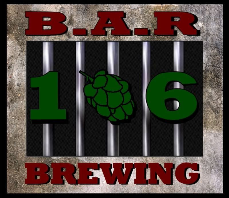
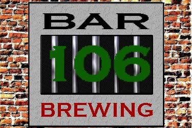
So I remember being a little more skilled at this back in high school (although I was using a pirated version of PS then). Here's my crappy sketch of what I want my logo to look like. Its gonna take me a while to clean it all up and I'll need to work in a higher resolution to make it look nice.
I'd like for the "106" to be behind the bars, with the 0 possibly being a hop cone. I'd also like to list the acronym for BAR - Brew Against (the) Rules somewhere, possibly down the three larger jail bars.
Any tips or criticism/ideas are appreciated.
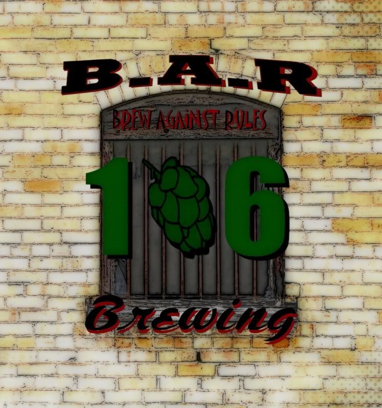
I'd like for the "106" to be behind the bars, with the 0 possibly being a hop cone. I'd also like to list the acronym for BAR - Brew Against (the) Rules somewhere, possibly down the three larger jail bars.
Any tips or criticism/ideas are appreciated.