Brewery logo Help

Homebrew Talk - Beer, Wine, Mead, & Cider Brewing Discussion Forum

Help Support Homebrew Talk - Beer, Wine, Mead, & Cider Brewing Discussion Forum:

This site may earn a commission from merchant affiliate links, including eBay, Amazon, and others.

sakeyfour

Well-Known Member
Joined
Feb 2, 2008
Messages
126
Reaction score
9
Location
Jay, Maine
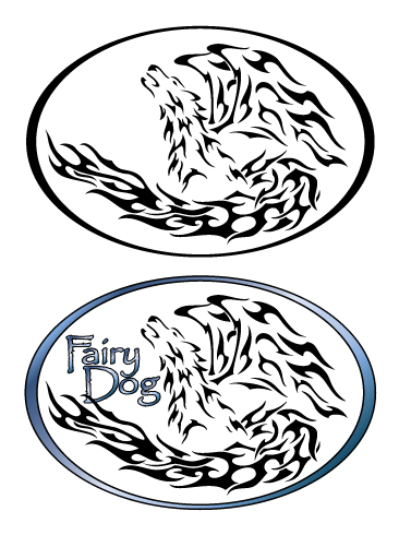
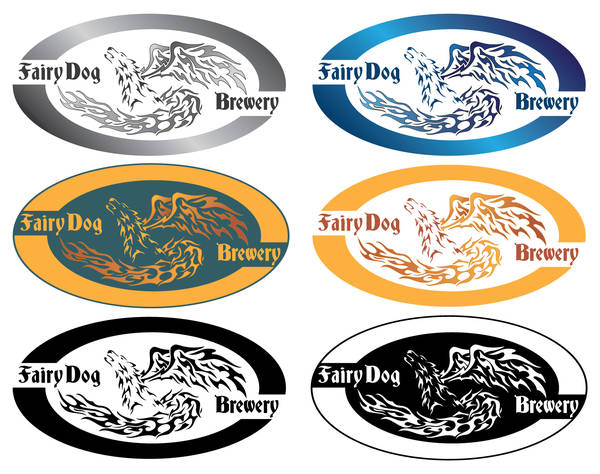
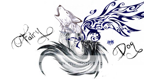
I need help from someone with artistic ability. I have none :drunk:. I want to make a brewery logo. I have a mockup that I cobbled together to give ideas.

mockup.png


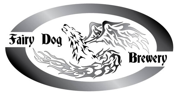
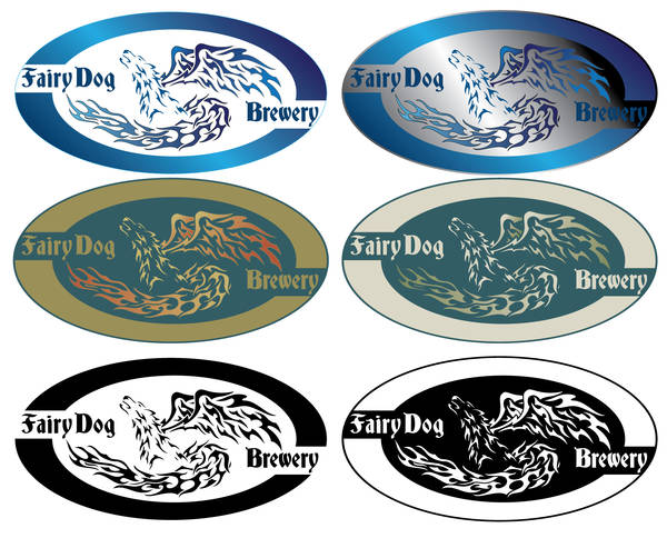
I want a simple logo with few colors maybe even black and white.
I want to be able to print on oval labels to put on bottle necks. and put into labels I make.
I would like the fairy dog to be a little tribal in theme. The tail sweeping around I like but it needs to match the wings better.

any help would be greatly appreciated.
 
Maybe take that and make it a tattoo looking thing? or just the wings and tail?
vertical or horizontal oval.

If you want me to work on it send me a PM to let me know.. :D
 
Ok here are the first two drawings.

I'm going to combine the two since I like the tail of one better than the other and there area few adjustments to make to keep it looking "tight" in an oval.


Ok here are the first two drawings.

I'm going to combine the two since I like the tail of one better than the other and there area few adjustments to make to keep it looking "tight" in an oval.

It amazes me how talented you are. These drawings look awesome.

Z.
 
Thank you I appreciate the adderations..But I'm not that great/talented (just a little lol) there are others far supperior than myself.
 
Great work COY. I like the second tribal dog better. But, having lived in San Francisco, is it wrong that my initial thoughts were of a guy in leather holding a chihuahua?:fro:
 
Great work COY. I like the second tribal dog better. But, having lived in San Francisco, is it wrong that my initial thoughts were of a guy in leather holding a chihuahua?:fro:


thanks and yes I think it's wrong for anyone to have that image in their head.. LMAO:confused::)
 
Please don't attack me for my critique, but I always like when people are honest (even when brutal) with me:

The tail part reminds me of the firefox logo and I would have never known that the tribal bit was supposed to be wings if you didn't say so.

I like the concept though and all of your renditions of it!

I'd rather hear a brutally honest opinion than one just flattering me but not really liking it.

I can work on the wings, since I agree that they are a less involved than the rest of the image.

Not sure about the firefox thing though.
I think they are quite different. But I had to go look just to make sure. LOL ;)
20070520-firefox_logo.jpg
 
I'm liking it so far. I'm trying to decide if it would look better either more filled in or less filled in (stencil like).

Like the outline. Can you cut back the tail a little bit, make the lettering form the oval. Fairy Dog on one side and Brewing on the other.

Who ever thought it would be so hard to pick something to put on my beer. After making recipes and brewing this should be easy.

keep up the great work these are awesome.
 
playing with the text. I'm not liking this font but wanted to get your opinion about the text placement.
The bottom one. The blue line is where your deminsions are at for the neck lable.
I'm also thinking of extending the wings out a bit more to fill the white space a bit to match the other side.
FairyDog3.jpg
 
that is awesome:rockin:

I agree with the wings extending
Let me know what you come up with for fonts, I keep looking for good ones.
 
I think the blue oval design in post #13 beats the split text.

What if the tail and the wings didn't connect so closely? I feel like they sort of blend into each other which makes the wings harder to pick out. Unless that was the idea...
 
I think the blackletter style font and tribal stuff in general is a little over-used... (or, a lot)

Plus, combining it with the fairy dog thing, now you have elements that are fantasy, tribal, and blackletter... I dunno, I don't quite get it.
 
Nice job.
I like the 2nd one in post 13.

I have bben struggling with a logo of my own.
It's between The Cypress Tiger Tavern and Double Diamond Brewing
Or maybe it will be Double Diamond Brewing at the Cypress Tiger Tavern.
Any thoughts?
 
Thoughts?
Changes?
:)
FairyDog2.jpg

I like the look of the blue one, though I'd play with color and font a bit.

As far as sizing and layout goes, it's quite tight. The ring is a nice shape. Maybe you'd want to throw in a background color or something.
 
Nice edits. I like the one with the blue ring as well. Great work!
 
that is awesome:rockin:

I agree with the wings extending
Let me know what you come up with for fonts, I keep looking for good ones.
Thanks,
Joshua has a font I liked once I get that I'll post up. he also had the idea of putting brewery under the dogs tail in small size w/ the Fair Dog on the left over the tail like I did with the blue ringed one.

I think the blackletter style font and tribal stuff in general is a little over-used... (or, a lot)

Plus, combining it with the fairy dog thing, now you have elements that are fantasy, tribal, and blackletter... I dunno, I don't quite get it.
Not a big fan of the blackletter font myself as I stated I'm still playing with fonts. ;)
As for the overal look it's what sakeyfour wanted. As i was told by him His son loves dogs, his daughter likes fairies and he wanted it tribal. I think the reasons behind the fantasy tribal is super cool.

Nice job.
I like the 2nd one in post 13.

I have bben struggling with a logo of my own.
It's between The Cypress Tiger Tavern and Double Diamond Brewing
Or maybe it will be Double Diamond Brewing at the Cypress Tiger Tavern.
Any thoughts?
How about Diamond Tiger brewing(or tavern). although the first image in my head of double diamond brewing I see an upscale looking label. with a grayish background and two diamonds overlapping some and a simple text..

I like the look of the blue one, though I'd play with color and font a bit.

As far as sizing and layout goes, it's quite tight. The ring is a nice shape. Maybe you'd want to throw in a background color or something.
I can go back to the blue steel look, but right now I'm playing with placement of text since sakeyfour wants Fairy Dog on one side and Brewery opposite.

Nice edits. I like the one with the blue ring as well. Great work!
Thank you
 
just a thought, it looks cool - but what if the outer edge of the wings and tail became part of the boundary outline?
 
I actually did that at first and it ended up looking more celtic than tribal. So i ditched the concept and didn't finish..
 
Thoughts.
Do you like the font. it needs some kerning but?
FairyDog4.jpg
 
I think it's a rockin label, pretty cool to be able to see the evolution of a design. Nice work coy! Regards, GF.
 
I think it's a rockin label, pretty cool to be able to see the evolution of a design. Nice work coy! Regards, GF.

That one is slick coy!

Thank you both. Really appreciate the complement.

That is what I was thinking of. That is great. Excellent work.:ban:

OK so I'll work on the text and making it look better then add some color.
Did you have a preference? We can do a solid color and a gradiant. Make it look like a metal, glossy whatever. ;)
I'll also have a black and white as you requested.
 
Just playing with some colors till you decide what you have in mind. lol
FairyDogColorPlay.jpg
 
Color choices:

I like the black/gray gradient in the earlier post
I also like the top two blue ones, the right side of the second one is a little dark.
kinda like the red gradient, but not with the green so much.

Very nice. you guys do excellent work.
 
Color choices:

I like the black/gray gradient in the earlier post
I also like the top two blue ones, the right side of the second one is a little dark.
kinda like the red gradient, but not with the green so much.

Very nice. you guys do excellent work.

Thank you

I'll get the colors tuned up for you over the weekend and you'll be ready to rock. :rockin:

the red and green was a simple experament with some colors i've never used togeather. lol
 
Coy: I just had a look at your flickr page & I gotta say: Holy freekin snickerdoodles! You guys have some serious talent! The sleeping fox logo just blew me away, and the emerald lion was also at the top of the list of logos that impressed me. Everything there was certainly top notch! Regards, GF.
 
I'm really enjoying watching the evolution of this label. I must say that I didn't really care much for it at the beginning but, with each new version, I find that it grows on me more and more.

So far I'm liking the top left (blue one) in post #31

I also took a look at you Flickr page. I'm impressed! There are some nice logos there. I especially like the Tin Roof Brewing Co. If I saw a beer on the shelf with that label I would absolutely pick it up and check it out.

4480072041_acd67574c6.jpg
 
Back
Top