GrogNerd
mean old man
pesky customers, making me work
fixed up the tag line a little
definitely let me know if you something else done

fixed up the tag line a little
definitely let me know if you something else done


I have a sketch that my Brother In Law did for me. It would be so cool to have it cleaned up and made into something. His colors and idea I really like and hope to preserve that if possible. He has never been a beer guy and the brew this label that was designed for was the first one he could actually drink. Anyway, all I have is this format. (.jpg)
The brew is Problem Child IPA.
Anything can be done with this? That would be so awesome

I too went like Grognerd and wanted to "fix it" up a bit. When I looked at it I initially thought the he was carrying a fishing pole. Then you said later about the Andy Griffith Show and fishing, so I decided to show the whole fishing pole.
Just playing around a bit.Anybody want to play around with this one?? Trying to clean it up but been using MS Paint, which I know is horrible. Don't have the skills to do much else to it. Thanks so much!!


![Craft A Brew - Safale S-04 Dry Yeast - Fermentis - English Ale Dry Yeast - For English and American Ales and Hard Apple Ciders - Ingredients for Home Brewing - Beer Making Supplies - [1 Pack]](https://m.media-amazon.com/images/I/41fVGNh6JfL._SL500_.jpg)


In case you wanted to keep the old fashion feel
does anyone feel up to chucking together an image on a transparent background that combines an oranguatan with a big hunk of Ginger Root, or a Ginger root with a head of flaming red hair? maybe take Fry from Futurama's hair, and replace his face with a Chunk of Ginger root?
I'm looking for something I can use for my Ginger Ranga cider with ginger and orange zest.
The rest of the label I've got under control, just not the main image.
Thanks


Any active aspiring (or experienced) graphic designer is looking to do a mock up of a logo? I want to call my home brewery "Bearded Joker" and surprisingly can't find any using me. Google

Not sure exactly you were looking for, but here's my interpretation.

Was hoping to be more of a joker you would see on a playing card, not the joker from batsman cause I foresee copyright issue if I ever sold. But I like they style!

")
A) The Hopcorn label is awesome! I don't often brew IPAs, but I'm going to have to now. I can't let something that awesome go to waste.
Hey guys, I'm sure there are a million and a half requests on here now, but I wanted to toss mine in for some assistance.
I'm not wholly terrible with photoshop, but I cannot for the life of me figure out how to make this image more 'crisp.' I'm hoping to have it at a high enough res to print vinyl labels. Any help, or even advice would be supremely appreciated.

Since the resolution is already high I'm guessing the crisp you are looking for, is what I would call pop (making it stand out more). I took it and embossed the lettering, then drop shadowed everything. I did this in Photoshop also. Is this what you are looking for?
...if someone has a script that looks along the sorts of this (attached on surfboard) and wouldn't mind posting "VGB" and "Very Good Brewery" it would be much appreciated. I attached the ideal and what I have now.

I threw this together. That exact font is a hard font to locate with a google search! Hopefully it's along the lines of what you want.
It's a png file, so it shouldn't have a background.
First of all - Thanks!
I love how crisp it is, but I think my brother is going to fight me on keeping the flat-vibe. How were you able to clean up those messy-looking lines that I currently have?
(If this is something that is easy to find online, feel free to say so, I just don't know what I would call this kind of touch up.)

Well, I didn't really clean your lines up, I just made new ones to avoid any problems. Actually your lines didn't look that bad, except that they looked like you added an outline (whether an outer glow or a contour in the Blending Options.) which left a dark gap between the inner line and the outer line making it look more rough. You won't get perfectly smooth lines in Photoshop due to the pixels it uses. There are other programs available that will make the smooth lines. Anyway I attached a pic of an example of our 2 lines for comparison. You can see that they are very similar without any Blending. You also had a line running thru both sides of the top angled line. I suspect it was just part of the stars that you added up there, I added an arrow to the area on the left. Also here is a link to a short YouTube video that shows smoothing out lines, which I didn't do to my lines. https://www.youtube.com/watch?v=m9hicX0gyXI
I like the way you designed the label to be minimal and clean! I'm guessing your brother is a barber or hair stylist, who has time to cut hair during the mash or the boil!


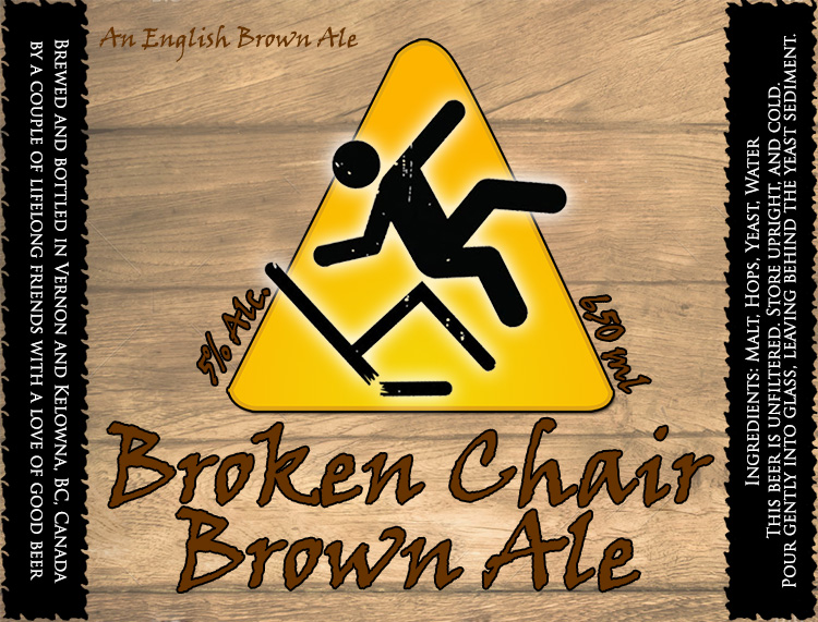
& kinda weird you have to turn the bottle on its side to read you need to keep it upright
overall very good


