ThorGodOfThunder
Well-Known Member
There are a lot of people here who are great at illustrator/photoshop/whatever and there are a lot of people here who are not.
This thread seemed to be heading this direction, so I decided to make a new thread where people can post drawings or previous designs that they might want tweaked or modified and they just don't have the resources or skill to do it.
So here how this will work. All work is done for free by the community. If you want to reward your artist with a few homebrews that is between you two, but the assumption is that everything is gratis.
That considered, you get what you pay for. I'm sure we'll all try the best we can, but keep in mind that we all probably work full-time and have other hobbies that enjoy. In other words, we'll help you, but don't be a dick.
Let one artist work on each project. So if someone says they got it, try not to jump in a take over.
So lets get started. Who needs work done?


![Craft A Brew - Safale BE-256 Yeast - Fermentis - Belgian Ale Dry Yeast - For Belgian & Strong Ales - Ingredients for Home Brewing - Beer Making Supplies - [3 Pack]](https://m.media-amazon.com/images/I/51bcKEwQmWL._SL500_.jpg)


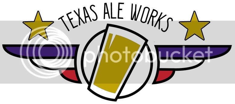


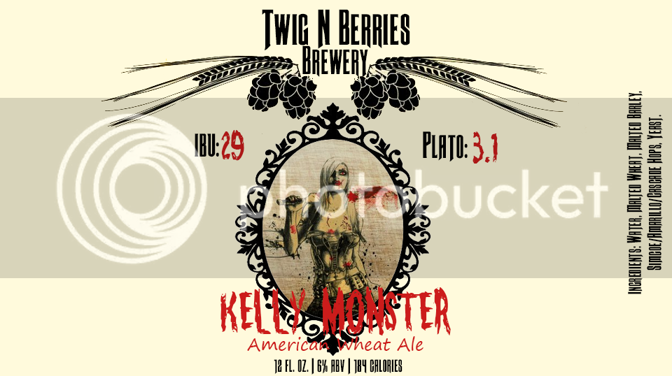
 If you don't like it, no worries! Let me know what you think. I didn't really know how to clean it up without changing it completely since I am not very good with photoshop and couldn't change things around with that background.
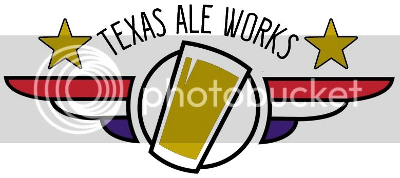