
It's down to the text. We decided to drop the dwarf, keep the barrels (which will be cleaned up a little bit more to fit), and change the text. So which do you guys like best. I promise this will be my last poll on our logo 
Image 1

Image 2
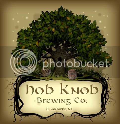
Image 3

Image 4
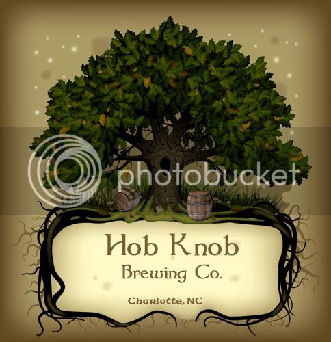
Image 5
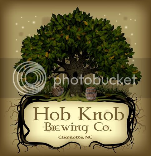
Image 6
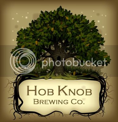
Image 7
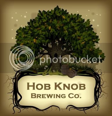
Image 1
Image 2
Image 3
Image 4
Image 5
Image 6
Image 7
