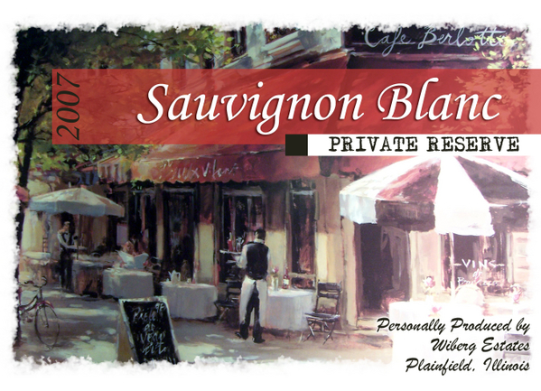
It's actually a print I have above my fireplace at home. I took a few pictures of it and played with it a little in photoshop. It turned out better than I thought it would.
pretty good my only comment would be to minimize the use of fonts on a small lable like this I wouldnt use so many different fonts.
I would change the private reserve to a sans-serif, same with the top on lower right