Mapleroots
Well-Known Member
I like the clarity of the first, nice detail.

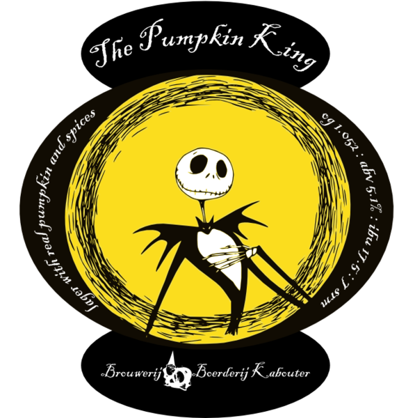
My ONLY critique on the Pumpkin King label (and I'm really stretching here, because I think it looks GREAT) is that it is really going to be a b!tch to cut out multiple times...
My ONLY critique on the Pumpkin King label (and I'm really stretching here, because I think it looks GREAT) is that it is really going to be a b!tch to cut out multiple times...
Wood cutting board, fresh x-acto blade.

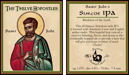
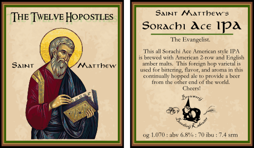
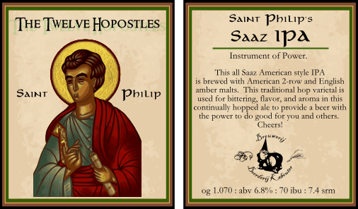
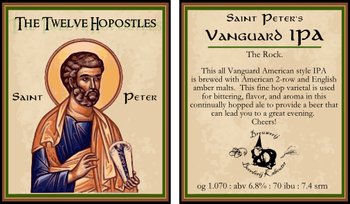
Newest one is still in development. I would appreciate any feedback... thanks.


![Craft A Brew - Safale S-04 Dry Yeast - Fermentis - English Ale Dry Yeast - For English and American Ales and Hard Apple Ciders - Ingredients for Home Brewing - Beer Making Supplies - [1 Pack]](https://m.media-amazon.com/images/I/41fVGNh6JfL._SL500_.jpg)


That label is awesome.
Just one slight critique: the "N" in "Queen's" kind of looks like an "R".


 ). What do you think. I think fading the text really brought the focus to the Kabouter, and lengthens the label which is what I was trying to get to in the first place.


