ICONCLAST make-over

Homebrew Talk - Beer, Wine, Mead, & Cider Brewing Discussion Forum

Help Support Homebrew Talk - Beer, Wine, Mead, & Cider Brewing Discussion Forum:

This site may earn a commission from merchant affiliate links, including eBay, Amazon, and others.

Brewpastor

Beer, not rocket chemistry
Joined
Feb 16, 2006
Messages
4,628
Reaction score
66
Location
Corrales, New Mexico
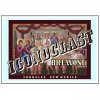
Still working on this one.

I have removed the background and added the shadow.

Thoughts?

shadowscript.png
 
can you have the shadow so the light looks like it's going towards the center. i mean make it so the shadow stretches to the left on the left and right on the right instead of all left? i think it would look cleaner.

pic is definitely more recognizable!
 
Have you tried using the whole picture with the bevels defining the words instead of eliminating the whole background?
 
rdwj said:
Have you tried using the whole picture with the bevels defining the words instead of eliminating the whole background?

The Banana Splits?!

If I understand what you are suggesting, yes I tried it but did not like the results.

I am trying for the old Rt. 66 postcard effect, if you remember that look. It is the script with images of say THE GRAND CANYON in the text. Maybe it is an idea whose time has past!
 
What traditions/artifacts/customs are you breaking with?
Is it religion in general, a specific doctrine?
Is it a method in brewing that you are casting out?

What object best represents that?
How can you best show it's destruction?

Wrapping all of that up in a font is really tough.

I say, look to build the iconography and show it's undoing.

How about a rider toppling a overtly religiously themed Tun with a mash paddle?
 
olllllo said:
What traditions/artifacts/customs are you breaking with?
Is it religion in general, a specific doctrine?
Is it a method in brewing that you are casting out?

What object best represents that?
How can you best show it's destruction?

Wrapping all of that up in a font is really tough.

I say, look to build the iconography and show it's undoing.

How about a rider toppling a overtly religiously themed Tun with a mash paddle?

It really has nothing to do with religion but is more about the spirit of craft brewing that allows the individual brewer to brew as they like, regardless of other's expectations and guidelines. I can get "preachy" on this, but what I think is that style is an important tool for learning, and a great general guideline for brewing, but it does not have to be a straitjacket. It also ties into what I see as a need for more critical thinking in the world in general, which means claiming the freedom to cast whatever icons we encounter aside if they are judged to be irrelivant, false or unjust. I would say Jesus was an iconoclast and the icon of the Wedding at Cana, where he changes water into wine is appropriate.

That is my 2 cents.
 
Ah.

So the iconography should be brew themed and less religious. You are more of a maverick or a rebel. I see what you mean though.
 
I wasn't really trying to point you in that direction specifically. I thought is would be funny to put the Style Manual in one hand and a mug being dumped in the other.

I looks to me that you are somewhat married to the font thing. If so, then I guess its a technical question.

Paging billpa.
 
I kinda dig the version with olllllo's picture as well...though I'm not sure that it's really what you're looking for. Try blurring the shadow a little - that might give it a little more refined look.
 
Brewpastor said:
...It really has nothing to do with religion...Jesus was an iconoclast and the icon of the Wedding at Cana, where he changes water into wine is appropriate...
How can the Last Supper not be religious?
(Rhetorical...does not require a reply) I just didn't want to type WTF!!! tonight...:drunk:

BTW, I like the first one better.
 
Brewpastor, I was looking at some of those route 66 postcards on-line. It seems to me that there are a couple of things that you could do to make your logo more like them.

First, most of the ones I saw used more than one picture. They may span a couple letters, but they are more a collection than a single portrait. The subjects were more centered too. Seems to me you could do a collage of religious pictures as well.

Additionally, almost all of them used at least one outline of the letters - usually a white. Many of them had double outlines with one on the inside with part of the pic on both sides.

Lastly, most of the ones I've seen didn't use all black shadow. It was more of a 3-d effect.

Don't know if this helps or not, but just my opinions.
 
Sounds like you're happy with the design, but are just looking for a way to make it "come to life" so to speak.

I'm thinking that if is the route 66 postcard style you're trying to emulate, you might want to try printing it out and seeing how it looks on paper over a background other than the stark white of your computer screen. It might take on a life of its' own from there. Then if necessary you could take a few extra steps to get the 'weathered' effect of an printed and aged artifact. If you're using photoshop, a little bit of subtle blurring and adding a bit of graininess around the edges (use restraint!) might go a long way.

here is a quickie example. In haste, i overdid the "grit" on the bottom a little... the border is strictly a suggestion:
iconoclast.jpg
 
Hey Brewpastor, here's my two cents. My last professor was a graphic designer and taught us how to make logos for half the semester, and one thing stands out in your label that he taught us about. Tensions spots. The way your letters are so close together (leading) and they have the drop shadow creates a LOT of tensions spots. These are very distracting to a viewer and keep them from embracing the logo as a whole. If you were to keep the logo as is and just tweak in the areas where tension is really tight, I bet it would make a world of difference.

A couple examples would be the last N and G in the brewing word, they are kind of touching and kind of not touching, you can see a sliver of white between them, this is bad tension. Also where the bottom corner of the top part of the C in ICON is cutting into the O's shadow and allllmost touching the O itself. More bad tension.

Again, just my 2 cents.
 
I used a different painting of the Wedding at Cana and matched the text to the perspective in the painting. I think the effect is pretty cool, but I don't have any good fonts installed yet (new OS). A different font would probably make a big difference. Here's what I've got so far:

4688-iconoclastperspective.jpg
 
question, why are determined to have a picture in the type?
Doing this is very hard to make it readable and require a lot of knowledge on type, perspective, colory theory, shadows, etc.
I congratulate you for trying, but it is still hard to read...and even tougher to see the picture

I had one of these projects in one of my design classes and it was very tough.
 
DeathBrewer said:
perhaps the challenge is part of the enjoyment

i think it's a great idea

you're reading me all wrong man, never said it was a bad idea
 
DeathBrewer said:
perhaps the challenge is part of the enjoyment

i think it's a great idea

I agree. It is a bit like the rest of my life, always in process, never complete, always needing a nap...

question, why are determined to have a picture in the type?
Doing this is very hard to make it readable and require a lot of knowledge on type, perspective, colory theory, shadows, etc.
I congratulate you for trying, but it is still hard to read...and even tougher to see the picture

I had one of these projects in one of my design classes and it was very tough.

I don't know. I have just had the idea for a LONG time (like 15 years!) and figured I should deal with it. It is hard, but it also isn't tied up in anybody else's deadlines, so it is fun. Thanks for the encouragement and perspectives!:mug:
 
I see your vision in this. I just wish I had artistic skills to help. I think this will give some of the others around here the idea and they can help you out better.
 
one thing I'm noticing in all but one of those examples is this: a black border (with or without drop shadow) and a thin white space separating it from the inside image. This seems to make it pop.
 
I can't figure out how to get the images in the font like the postcards above and keep the white outline.

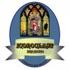
Here's an alternative design.

ICONOCLAST.jpeg

and one more incorporating your original broken glass design

iconoclast tap label2.jpeg
 
Back
Top