Brewpastor
Beer, not rocket chemistry
Still working on this one.
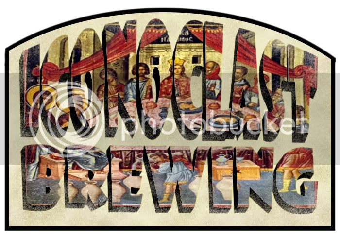
I have removed the background and added the shadow.
Thoughts?

I have removed the background and added the shadow.
Thoughts?

rdwj said:Have you tried using the whole picture with the bevels defining the words instead of eliminating the whole background?


![Craft A Brew - Safale S-04 Dry Yeast - Fermentis - English Ale Dry Yeast - For English and American Ales and Hard Apple Ciders - Ingredients for Home Brewing - Beer Making Supplies - [1 Pack]](https://m.media-amazon.com/images/I/41fVGNh6JfL._SL500_.jpg)


olllllo said:What traditions/artifacts/customs are you breaking with?
Is it religion in general, a specific doctrine?
Is it a method in brewing that you are casting out?
What object best represents that?
How can you best show it's destruction?
Wrapping all of that up in a font is really tough.
I say, look to build the iconography and show it's undoing.
How about a rider toppling a overtly religiously themed Tun with a mash paddle?

How can the Last Supper not be religious?Brewpastor said:...It really has nothing to do with religion...Jesus was an iconoclast and the icon of the Wedding at Cana, where he changes water into wine is appropriate...


DeathBrewer said:perhaps the challenge is part of the enjoyment
i think it's a great idea


