First Crack at a label design

Homebrew Talk - Beer, Wine, Mead, & Cider Brewing Discussion Forum

Help Support Homebrew Talk - Beer, Wine, Mead, & Cider Brewing Discussion Forum:

This site may earn a commission from merchant affiliate links, including eBay, Amazon, and others.

Alpine5654

Active Member
Joined
May 15, 2008
Messages
35
Reaction score
0
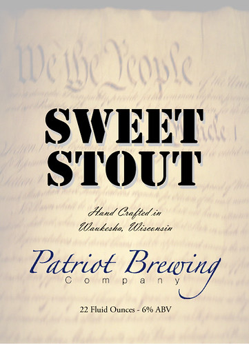
This is my first crack at a beer label design. I've been doing my
dads wine labels for years, but never liked them too much.

I am interested in suggestions / comments to make it more
appealing.

Please fire away.

2560931093_c66c303230.jpg
 
I'm not an artist by any stretch of the imagination. I work
in the printing industry and have access to thousands of
dollars worth of design software and high end fonts.

Thanks for the positive input, I think it's missing something...
but I can't figure out what
dontknow.gif
 
It's nice, but its got room for improvement. Using six different fonts in a single label is a tad excessive. The bold stencil font on top of all that script looks out of place. I think the intent is to showcase, "We the people," in the blank space up top; but it fades too much into the background, making your label very asymmetric.
 
It's nice, but its got room for improvement. Using six different fonts in a single label is a tad excessive. The bold stencil font on top of all that script looks out of place. I think the intent is to showcase, "We the people," in the blank space up top; but it fades too much into the background, making your label very asymmetric.

I think I have the images of the Constitution scaled back to a 20% screen
or so. I'll bump that up a bit to a 30% or so. Is the "stencil" font a little
much? I was trying to go for a Military type look, I'll re-work when I get
back home and re-post. Thanks for the input!
 
I like it a lot, much better than any of mine. When I think of Waukesha, I don't think of the declaration of independence, but I do think of Frank Lloyd Wright (go figure). I also think of beer, and the beer is always good (I miss it out there). Good luck and good brewing.

gfd622
 
I think it looks great! I've been trying to come up with a good label for about a year now. I need to find a way to unleash my creative side.
 
Try reducing the number of fonts your using. You would be surprised how much you can do with just 1 or 2
 
I second the opinion to get rid of the A-Team font at the top, and maybe change the 'company' font to the same as the one right above it (or remove the word 'company' altogether). Nice otherwise
 
nitpicky maybe but i think the SWEET STOUT is too black. maybe lower the transparency to 75% and (if youre using photoshop or whatever) set the layer to multiply. i dunno, but id try it and see if you like it as much.
 
nitpicky maybe but i think the SWEET STOUT is too black. maybe lower the transparency to 75% and (if youre using photoshop or whatever) set the layer to multiply. i dunno, but id try it and see if you like it as much.

Good Idea. I'm using Adobe Illustrator, so that is fairly easy. I'll update
it in a couple of days and repost.

Thanks!
 
Back
Top