
Jake Dmochowski
New Member
- Joined
- Apr 21, 2015
- Messages
- 1
- Reaction score
- 0
10 Most Badass Craft Brewery Logos
Making your homebrew look as professional as possible will impress your friends, and could make it taste better--the mind can play tricks on us. Would you rather have your buddies drink your beer from a plain brown bottle, or would you prefer to show off an awesome custom logo? That's what we thought.
Design has a huge impact on the way beer is perceived. I realized recently that I've been buying beer depending on how cool the packaging is. And that made me think: what are the most badass craft brewery logos, ever? And how can other people learn to make their own labels just as badass? Here's what happens when brew maker meets logo maker:
1. Our Brewing Company
That mustache. Go and tell that guy he's not a badass. With beers such as the Peanut Butter Molasses Porter, the Cursed Kettle Quadruppel, and the Dungeon Master Black IPA, Our Brewing Company means business. The colors are subtle, but the image is strong, and make us all think of our badass grandfathers.The font is authoritative and the elliptical shape makes it look like a badge or emblem. The overall shape also is a perfect fit for a 12 oz. beer bottle label.

Holland, Michigan
2. Firefly Hollow Brewing Co.
This is probably the coolest thing to ever come out of Bristol, Connecticut. The sketchiness of the drawing makes this logo. In 2015, the biggest logo trend is to have a flat logo and a basic, modern font. Firefly Hollow's logo defies both of these by having depth and its own custom font to match. The color scheme is simple and economical--it doesn't cost too much to print in only two colors.

Bristol, Connecticut
3. Flying Dog Brewery
This is probably the flashiest logo on this list, but that doesn't make it bad. It grabs your attention right away. Whether you're trying to figure out why someone hand-drew a Batman symbol on a beer bottle or doing some research on making your own colorful stained glass bat wings, this logo demands notice. The only thing I'm wondering is, where's the dog?

Frederick, Maryland
4. Blank Slate Brewing Company
Simple. Clean. Tough. Timeless. Although this logo may look like nothing special, it has all the ingredients to making a great and memorable design. Operating out of an old airplane hangar, Blank Slate's motto is: "Our minds may be empty...our beer is not." This logo embodies that message. They're not about the flash or glam of the brewing life,they make a good product that does its job well.

Cincinnati, Ohio
5. Junction Craft Brewing
Junction's hockey-playing and guitar-strumming president Tom Paterson seems to also love trains. A majority of Junction's beer line refers to different members of a train's crew (Engineer's IPA, Conductor's Craft Ale, Stationmaster's Stout). In terms of design, this is a strong logo. It ties the two concepts together--trains and beer--and states its presence with clarity.

Toronto, Ontario
6. Walkerville Brewery
Legendary Canadian alcohol manufactured Hiram Walker started Walkerville in 1890 to provide his customers with an "Honest Beer." That's badass enough by itself. The logo only adds to the toughness. The strong ship. The confident block sans serif font of "Walkerville" versus the arced serif font of "Brewery." The hard corners stuck in a circle. The juxtaposed aspects of this logo really give it merit.

Windsor, Ontario
7. Daredevil Brewing Co.
This one's just really cool. Again, we have a simple design that does the trick. But, the image can be taken two ways: first, you can see a stuntman's helmet with goggles and the strap going around. Look again and you'll see the letter "D" with racing stripes coming from it, surrounded by a red halo-type semi-circle. Pretty awesome.

Speedway, Indiana
8. Banded Horn Brewing Co.
This one's a little different than the others on our list. It has some three-dimensional aspects to it, uses more colors, and has clear imagery. Seems like a pretty basic logo, but all of these work well together to make a really cool logo. "We Shall Band Together" at the bottom seals the deal on this list for me.

Biddeford, Maine
9. Grapevine Craft Brewery
I love the nostalgic feel to this one, and it does a good job of capturing that Texas spirit. Grapevine is only sold in North and Central Texas. The colors work well together, and that fading on edges really ties the whole thing together. It's rough, it's tough, and it does a great job of subtly letting us know it's main location.

Grapevine, Texas
10. Monday Night Brewing
This one might be the winner. It doesn't say anything about the brand or the beer like many of the other logos did, but portrays a feeling more strongly than any others. The guy has his tie loosened and he's pumped. Why? Because it's Monday night and he can drink some beer in peace. Now that's badass.
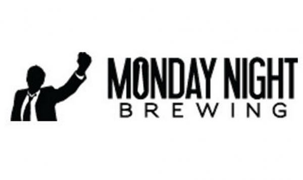
Atlanta, Georgia
***
Jake Dmochowski is a copywriter for LogoMix and is currently enrolled in journalism school at Boston University. LogoMix supplies businesses around the world with effective and memorable logos, business cards, and custom promotional products. In his spare time, Jake likes to correct other people's grammar, complain about exercising, and of course, drink great beer.

Making your homebrew look as professional as possible will impress your friends, and could make it taste better--the mind can play tricks on us. Would you rather have your buddies drink your beer from a plain brown bottle, or would you prefer to show off an awesome custom logo? That's what we thought.
Design has a huge impact on the way beer is perceived. I realized recently that I've been buying beer depending on how cool the packaging is. And that made me think: what are the most badass craft brewery logos, ever? And how can other people learn to make their own labels just as badass? Here's what happens when brew maker meets logo maker:
1. Our Brewing Company
That mustache. Go and tell that guy he's not a badass. With beers such as the Peanut Butter Molasses Porter, the Cursed Kettle Quadruppel, and the Dungeon Master Black IPA, Our Brewing Company means business. The colors are subtle, but the image is strong, and make us all think of our badass grandfathers.The font is authoritative and the elliptical shape makes it look like a badge or emblem. The overall shape also is a perfect fit for a 12 oz. beer bottle label.
Holland, Michigan
2. Firefly Hollow Brewing Co.
This is probably the coolest thing to ever come out of Bristol, Connecticut. The sketchiness of the drawing makes this logo. In 2015, the biggest logo trend is to have a flat logo and a basic, modern font. Firefly Hollow's logo defies both of these by having depth and its own custom font to match. The color scheme is simple and economical--it doesn't cost too much to print in only two colors.
Bristol, Connecticut
3. Flying Dog Brewery
This is probably the flashiest logo on this list, but that doesn't make it bad. It grabs your attention right away. Whether you're trying to figure out why someone hand-drew a Batman symbol on a beer bottle or doing some research on making your own colorful stained glass bat wings, this logo demands notice. The only thing I'm wondering is, where's the dog?
Frederick, Maryland
4. Blank Slate Brewing Company
Simple. Clean. Tough. Timeless. Although this logo may look like nothing special, it has all the ingredients to making a great and memorable design. Operating out of an old airplane hangar, Blank Slate's motto is: "Our minds may be empty...our beer is not." This logo embodies that message. They're not about the flash or glam of the brewing life,they make a good product that does its job well.
Cincinnati, Ohio
5. Junction Craft Brewing
Junction's hockey-playing and guitar-strumming president Tom Paterson seems to also love trains. A majority of Junction's beer line refers to different members of a train's crew (Engineer's IPA, Conductor's Craft Ale, Stationmaster's Stout). In terms of design, this is a strong logo. It ties the two concepts together--trains and beer--and states its presence with clarity.
Toronto, Ontario
6. Walkerville Brewery
Legendary Canadian alcohol manufactured Hiram Walker started Walkerville in 1890 to provide his customers with an "Honest Beer." That's badass enough by itself. The logo only adds to the toughness. The strong ship. The confident block sans serif font of "Walkerville" versus the arced serif font of "Brewery." The hard corners stuck in a circle. The juxtaposed aspects of this logo really give it merit.
Windsor, Ontario
7. Daredevil Brewing Co.
This one's just really cool. Again, we have a simple design that does the trick. But, the image can be taken two ways: first, you can see a stuntman's helmet with goggles and the strap going around. Look again and you'll see the letter "D" with racing stripes coming from it, surrounded by a red halo-type semi-circle. Pretty awesome.
Speedway, Indiana
8. Banded Horn Brewing Co.
This one's a little different than the others on our list. It has some three-dimensional aspects to it, uses more colors, and has clear imagery. Seems like a pretty basic logo, but all of these work well together to make a really cool logo. "We Shall Band Together" at the bottom seals the deal on this list for me.
Biddeford, Maine
9. Grapevine Craft Brewery
I love the nostalgic feel to this one, and it does a good job of capturing that Texas spirit. Grapevine is only sold in North and Central Texas. The colors work well together, and that fading on edges really ties the whole thing together. It's rough, it's tough, and it does a great job of subtly letting us know it's main location.
Grapevine, Texas
10. Monday Night Brewing
This one might be the winner. It doesn't say anything about the brand or the beer like many of the other logos did, but portrays a feeling more strongly than any others. The guy has his tie loosened and he's pumped. Why? Because it's Monday night and he can drink some beer in peace. Now that's badass.
Atlanta, Georgia
***
Jake Dmochowski is a copywriter for LogoMix and is currently enrolled in journalism school at Boston University. LogoMix supplies businesses around the world with effective and memorable logos, business cards, and custom promotional products. In his spare time, Jake likes to correct other people's grammar, complain about exercising, and of course, drink great beer.


![Craft A Brew - Safale BE-256 Yeast - Fermentis - Belgian Ale Dry Yeast - For Belgian & Strong Ales - Ingredients for Home Brewing - Beer Making Supplies - [3 Pack]](https://m.media-amazon.com/images/I/51bcKEwQmWL._SL500_.jpg)


")
