logo ideas

Homebrew Talk - Beer, Wine, Mead, & Cider Brewing Discussion Forum

Help Support Homebrew Talk - Beer, Wine, Mead, & Cider Brewing Discussion Forum:

This site may earn a commission from merchant affiliate links, including eBay, Amazon, and others.

Lukus

Well-Known Member
Joined
Sep 19, 2007
Messages
111
Reaction score
1
Location
Central Washington
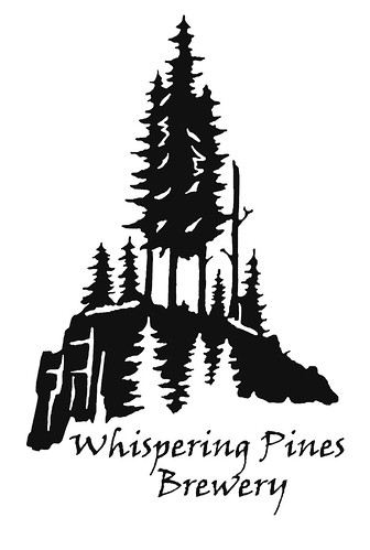
I have been working on a logo for awhile. Here is what I have come up with:
2475606451_4ddbd4aa03.jpg

it's a work in progress but the main things I don't like about it are, the trees don't look like Pine trees, and it seems a little tall. I was wondering if anyone has any suggestions. I am open to criticism.
Thanks for your help
 
It's simplicity actually works. Only a few minor changes I'd recommend. The big trees in the center are close together, so the effect is like one big tree with three trunks. Spread them out a bit if you can. Also, I'd remove the three small white trees in front of the rock and used that area to show more detail of the rock focusing attention to the trees on top.

Overall, you are close to an awesome looking logo.
 
I keep thinking how cool it would be acid etched on a clear bomber or wine bottle....

All you need is some of this...

etching%20cream.jpg

I was thinking the same thing. I also looked into making a vinyl sticker out of it to put on my carboy or growler. I went and talked to a local sign maker about making the vinyl sticker and they wanted to charge me $50.00 for one.

It's simplicity actually works. Only a few minor changes I'd recommend. The big trees in the center are close together, so the effect is like one big tree with three trunks. Spread them out a bit if you can. Also, I'd remove the three small white trees in front of the rock and used that area to show more detail of the rock focusing attention to the trees on top.

Overall, you are close to an awesome looking logo.

I will try and seperate the three trees on top. What if I took out the small white trees and moved the lettering into that area?
 
... would be to lean the two pines flanking that center pine away from it... the pine trees would look vaugely W shaped that way.
 
If you can fit the text inside the rock, that would probably look cool. Or just Whispering Pines inside then 'Brewery' outside.

I dig!
 
I think it looks great! If it ain't broke, don't fix it. Just IMHO.
 
I think it looks great! If it ain't broke, don't fix it. Just IMHO.

I totally agree. I think you could mess around with the text inside the black area but i like the negative space the white trees create. The large trees are noticed first(they do look like pine trees to me) and then the eye moves to the white ones. Very nice label.
 
Back
Top