Help me choose a logo

Homebrew Talk - Beer, Wine, Mead, & Cider Brewing Discussion Forum

Help Support Homebrew Talk - Beer, Wine, Mead, & Cider Brewing Discussion Forum:

This site may earn a commission from merchant affiliate links, including eBay, Amazon, and others.

StittsvilleJames

Well-Known Member
Joined
Jan 19, 2011
Messages
505
Reaction score
44
Location
Stittsville
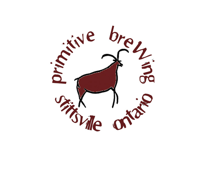
I made a couple of logo's today for myself. I went with "Primitive Brewing" because I'm not very evolved in my brewing yet, so it seemed to fit.

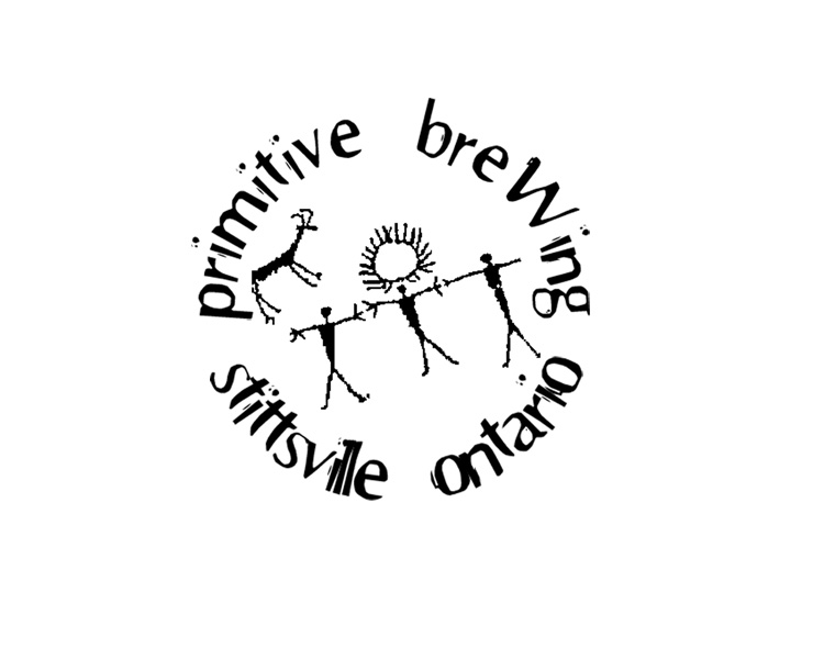
I am leaning towards the people dancing around the fire, because they seem like they're having a good time and probably drinking some caveman beer and feasting on deer or something.

I tried to keep them fairly basic and not too complicated in colour or anything, so they can easily be made small to fit in the corner of a label or something.

So whichy do you like, and how come? Any suggestions to make them better?

Thanks in advance!
primitive-beer-people.jpg
primitive-beer-animal.jpg
EDIT: I have my absolute final design now. Thank you for all your suggestions, feedback, and praise.

primitive circle 2.jpg
 
I'd go with the second one over the first.

But I'd rather have a drawing of stick figure men chasing a water buffalo type creature but instead of spears in their hand, they'd have mugs of beer. No, this makes no sense, but it sounds very humorous to me.
 
I like 'em both, they remind me of actual neolithic cave paintings, but then I think they're supposed to; so they work! If I had to choose 1 over the other, I think I'd probably have to go with #1, though #2 is a VERY close 2nd.
Regards, GF.
 
I like 'em both, they remind me of actual neolithic cave paintings, but then I think they're supposed to; so they work! If I had to choose 1 over the other, I think I'd probably have to go with #1, though #2 is a VERY close 2nd.
Regards, GF.

Both of the pictures are actually cave paintings, so that explains it. :)
 
I like the second better as a logo, although I would work a little more on the text to make it stand out from the water buffalo thing, without the outer glow its got now. Maybe just changing the color and using a bolder font would work.

I like it though.
 
I think you should add more space between the head and fire in the first. It was unclear to me if I was looking at an normal people to the left and right with an unfortunate person with Hydrocephalus in the center or...people around a fire/sun thing. I like the idea, but it wasn't clear to me at first glance.
 
Well I appear to be in the minority but I actually really like the second one as a logo. The first one is a really cool picture, but not as iconic and immediately engaging as the second.
 
The second is far more effective as a logo. You want people to be easily able to reconstruct and remember your logo. The more pieces, the less effective it is as it is more difficult to bring to mind. The second gets your point across and is far simpler. Something that sends the same message and is simpler is far more effective. Cooler doesn't mean better.

As a small business consultant, this is part of what I do for a living.

The above aside, aesthetically, I prefer the second anyways. Nice job!
 
Cimirie has a good point. While I originally chose #1 I think if you made the font more readable and distinguished from the illustration It would be great. I notice you might have attempted to do that with a white veneer around the text, I think it would look better if you replaced it by adjusting the font itself.
 
Thanks for helping me out everyone, I really appreciate the feedback.

Here's my new iteration of both of the logo's. I wasn't going to bother with the animal one, and just redo the people dancing, but after reading Cimirie's post, I redid both. Turns out it's a hell of a lot easier to make text go in a circle in photoshop than it was in Gimp.

So, what do you all think?

Thanks again!

primitive circle 2.jpg


primitive circle.jpg
 
YES. #1 for sure, well done. It might look good to arch "Stittsville Ontario" the other direction, like the animal is standing on it.
 
I like the second one. I think it would make a better logo because it is simple but still gets the primitive brewing image across.
 
I'd go with the second one over the first.

But I'd rather have a drawing of stick figure men chasing a water buffalo type creature but instead of spears in their hand, they'd have mugs of beer. No, this makes no sense, but it sounds very humorous to me.
Hahaha I like that idea!

I vote #1
 
You changed the order - is #1 with the animal or the people? ;)

FWIW, I like the one with the people and the sun. But both are nice, and its a very good idea, in my opinion.
 
Final revision:

Thank you all for your help and suggestions!!

primitive circle 2.jpg
:mug::tank::mug:

On a wooden 6-pack I made (it's just stencil / spray paint, need to get it milled somehow...) i like how it turned out though, very primitive (which can describe my wood working skills as much as my brewing skills :ban:)
SAM_0082.jpg
 
Man that looks awesome on the wooden sixer! I think the only way you could improve on it would be to burn it into the wood...
But it looks great as is. Well done!
Regards, GF. :mug:
 
Looks great, James. And hello in Stittsville (I'm an Ottawa native). Are you going to be getting into commercial sales?

Happy brewing!

Thanks alot!

Actually, I was on the bus this morning on my way to work, and I decided my goal isn't to open a brewery or a pub or anything (as awesome as that would be...) but what Ottawa really really needs is a 'brewing depot' store or something.

There is no good place to buy cheap ingredients around here, and it's not convenient to always have to do group buys and stuff (which the MoB - members of barleyment - do from time to time, I'm told).

We need a warehouse people can go to to pick up a few pounds of this, or a sack of that. Maybe some decent prices on kegging equipment and CO2 refills for under 20$.

Defalco's here in Ottawa has some beer stuff, but it's crazy expensive, and their selection sucks. They're more geared toward wine making, which all the places around here seem to be.

I think theirs a real market for a beer brewers store with actual selectoin and decent prices. I just need to convince someone with some capital to invest it in me. :)
 
Well, I just moved to Toronto recently, and have run into a similar problem - but at least there are a few options. I think it's a great idea! If you have the space available chez vous, you could always start up a small operation out of your house.

There is a great example of this here in TO ~ Toronto Brewing | Homebrew Beer Making Supplies
A great website and the items are for sale from a very low-key home operation. Works great.

You'd be an Ottawa brewing hero!
 
Back
Top