
worxman02
Well-Known Member
- Joined
- Jan 13, 2007
- Messages
- 230
- Reaction score
- 19
Hey,
This is my first brew logo on my own (had one with my ex-roomates, had falling out, can't use old logo designed by roomate).
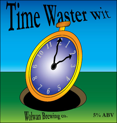
It is the first draft of the logo, I only did it in an hour so its very rough. But the main idea is there. My opinion is that it is too flat looking and needs better depth to it. I don't want to make it too complex and extravagant but I am looking for a professional logo that I can be proud of.
The story behind the logo is that my gf and her mom keep saying that the brew process takes a long time and lots of work, hence the "time waster". The brew came out excellent however and the gf enjoys it very much . The brewery name is just an amalgam of my and my gf's dad, who I brewed it with, last names.
This is my first brew logo on my own (had one with my ex-roomates, had falling out, can't use old logo designed by roomate).
It is the first draft of the logo, I only did it in an hour so its very rough. But the main idea is there. My opinion is that it is too flat looking and needs better depth to it. I don't want to make it too complex and extravagant but I am looking for a professional logo that I can be proud of.
The story behind the logo is that my gf and her mom keep saying that the brew process takes a long time and lots of work, hence the "time waster". The brew came out excellent however and the gf enjoys it very much
. The brewery name is just an amalgam of my and my gf's dad, who I brewed it with, last names.")
