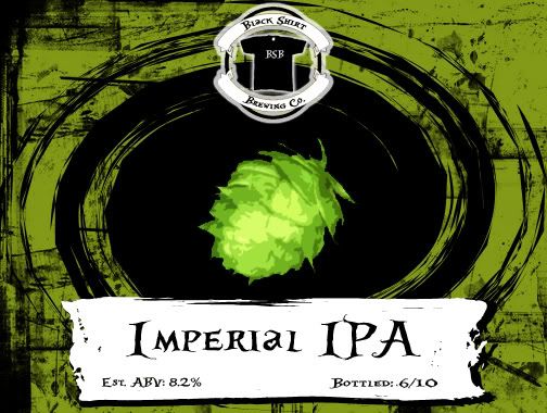
Hey guys. I've been trying to come up with some ideas for labels for my IIPA that I'll be bottling soon. This is my first attempt at making labels, and it's still not the final draft. Let me know what you think.
If you're looking for a few options, I'd suggest maybe have the ABV and date somewhere separate(maybe underneath) , leaving only the name in the white border. I find it just a bit big. Also, maybe giving the white border a bit more rough edges(let the black bleed in more) could help.