You are using an out of date browser. It may not display this or other websites correctly.
You should upgrade or use an alternative browser.
You should upgrade or use an alternative browser.
Show Us Your Label
- Thread starter muse435
- Start date

Help Support Homebrew Talk - Beer, Wine, Mead, & Cider Brewing Discussion Forum:
This site may earn a commission from merchant affiliate
links, including eBay, Amazon, and others.

Calichusetts
Well-Known Member
I really like the simply layout...but it kind of feels like the main screen of a video game, don't know if that is what you are looking for...still, unique!
Scruffy1207
Well-Known Member
Calichusetts said:I really like the simply layout...but it kind of feels like the main screen of a video game, don't know if that is what you are looking for...still, unique!
I agree, I thought it looked like a video game too. I think with a bit of tinkering a great label can come out of this. That being said, I like it. I think it's a solid label.
heckels
Well-Known Member
saintdog327 said:Here's my logo
I like the visual, I would put "imperial" on the top.
paulster2626
Well-Known Member
I like the visual, I would put "imperial" on the top.
And fix the spelling - "PALEL"

saintdog327 said:Here's my logo
I dig this label.. very clean, nice look
underdogadam
Active Member
labels for my xmas brew. packaged in 22's, forrest green wax-tipped. boom!


J187
Well-Known Member
- Joined
- Jan 2, 2012
- Messages
- 857
- Reaction score
- 99
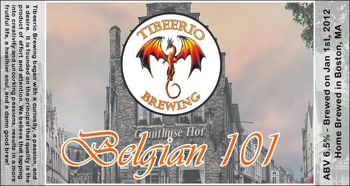
These are the two drafts I'm working on for my first brew. The bottom one just has the logo w. slightly less opacity.
I chose the name Belgian 101 for my first brew since it was both a very simple standard Belgian Ale and my "introduction" to home brewing.
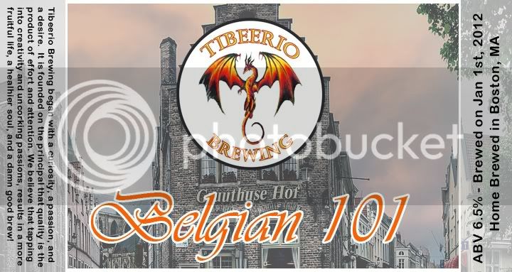
Actually, the white background of the forum fuses with the top and bottom white lines in the label, giving it that uneven look. In reality, it looks more like this:
I chose the name Belgian 101 for my first brew since it was both a very simple standard Belgian Ale and my "introduction" to home brewing.
Actually, the white background of the forum fuses with the top and bottom white lines in the label, giving it that uneven look. In reality, it looks more like this:
pmzjr69
Well-Known Member
What do you all think of this label that I made on Microsoft word to print on name tags?
words on the label noted as follow:
CajunKing's Brewery
Brown Ale
Brewed/Bottled on
Jan 1st/ Jan 15th 2012

words on the label noted as follow:
CajunKing's Brewery
Brown Ale
Brewed/Bottled on
Jan 1st/ Jan 15th 2012
pmzjr69
Well-Known Member
Font is "Blackadder ITC" and Font size is 7. remember is on small name tag size. 
J187
Well-Known Member
- Joined
- Jan 2, 2012
- Messages
- 857
- Reaction score
- 99
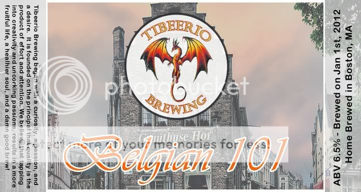
These are the two drafts I'm working on for my first brew. The bottom one just has the logo w. slightly less opacity.
I chose the name Belgian 101 for my first brew since it was both a very simple standard Belgian Ale and my "introduction" to home brewing.
Actually, the white background of the forum fuses with the top and bottom white lines in the label, giving it that uneven look. In reality, it looks more like this:
I would like to hear some opinions on which of the two you guys think is better, the one with the logo more transparent or the one with it full opacity.
ToMakeBeer
Well-Known Member
Just designed this one today.
ToMakeBeer
Well-Known Member
saintdog327
Well-Known Member
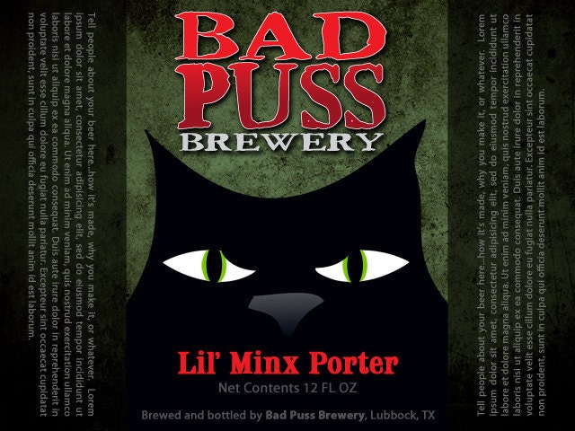
It was about time for my label to get updated! lol Here's my most current version. Criticisms are much appreciated

ToMakeBeer
Well-Known Member
Another one that we created...
caburdet78
Well-Known Member
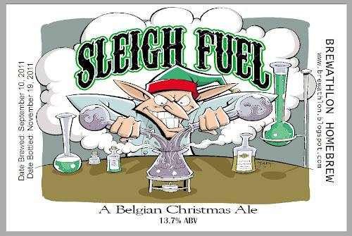
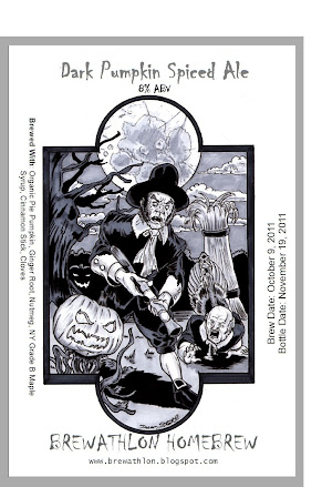
Two labels from Holiday brewing...

Turtletello
Member

Scruffy1207
Well-Known Member
cacique said:<img src="https://www.homebrewtalk.com/attachment.php?attachmentid=42882"/>
Sounds horribly delicious
ToMakeBeer
Well-Known Member
A new customizable label by us:
pmzjr69
Well-Known Member
I like it. Good colors. What font is that? Looks like a Tim Burton font.
Thanks Ty!

ToMakeBeer
Well-Known Member
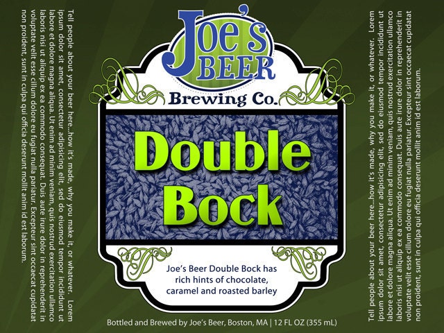
My first attempts at labels and also my first three brews.


Pdeezy
Well-Known Member
It was about time for my label to get updated! lol Here's my most current version. Criticisms are much appreciated
I think the "Imperial" should be on the top half of the circle with "Pale Ale" on the bottom. I think it would read better that way. Everything esle looks good though.
My first attempts at labels and also my first three brews.
I like the porter label a lot. Nice work. Incidentally it sounds great too.
Thanks SenorPepe. It was my first recipe, it turned out better than I dreamed. I've had a few and they're great, I'm hoping it will get even better after they condition a little more.I like the porter label a lot. Nice work. Incidentally it sounds great too.
Calichusetts
Well-Known Member
Take two...more of a wine feel to this, not done but I'm not putting in much more...I might shift everything up or to the right and add a description along it and a few decorative aspects
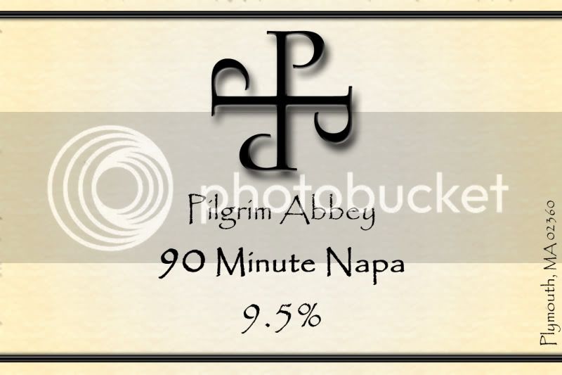
How did you make the symbol? and the shadowing... It looks really great.Take two...more of a wine feel to this, not done but I'm not putting in much more...I might shift everything up or to the right and add a description along it and a few decorative aspects
Chuginator
Well-Known Member
- Joined
- Feb 14, 2011
- Messages
- 477
- Reaction score
- 61
The other night I dreamed that I made labels after my dogs. Allie Ale and Sophie Stout. And the dream would not stop. Repeated over and over and over and over and rover.
terrapinj
Well-Known Member
4x6 label to sit on top of my keezer - font is a little hard to read but I like it

Calichusetts
Well-Known Member
The symbol is just four rotated "P"s...all photoshop
ToMakeBeer
Well-Known Member
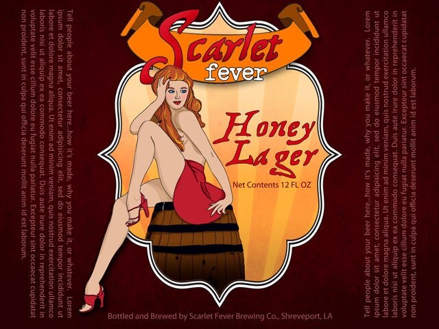
New Pin-up girl style customizable label
My first attempts at labels and also my first three brews.
Very nice labels. Did you do the art yourself? How did the Hoptoberfest clone turn out? Much like the original (I'm a big fan)?
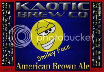
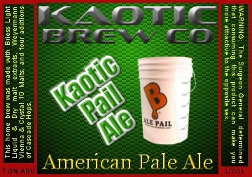
Couple of mine. Still tweaking them.
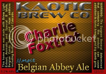
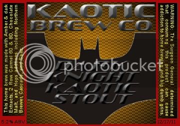
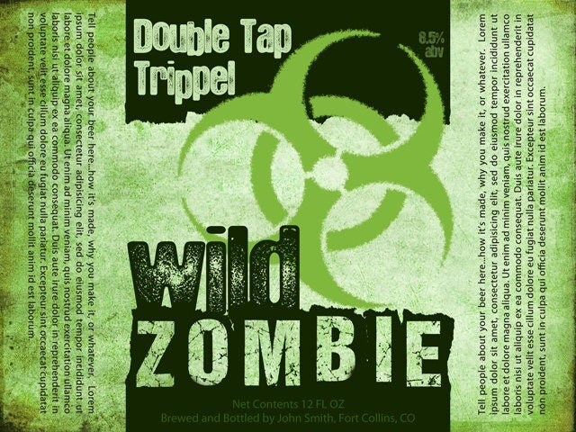
Fresh off of my wife's laptop... I'm especially proud of the warning!

TrooperThorn
Well-Known Member
Fresh off of my wife's laptop... I'm especially proud of the warning!
Greetings, Sir.
Welcome to the House of Win!
:rockin:
Similar threads
- Replies
- 4
- Views
- 552
- Replies
- 7
- Views
- 928
- Replies
- 86
- Views
- 3K
- Replies
- 264
- Views
- 10K
