Brewpastor
Beer, not rocket chemistry
Why mess with a good thing?
How's this?

How's this?


Brewpastor said:Is this one better? I turned the symbol around and rearranged the color order so the water is dripping and the grain and hops are growing. Does it make any difference to any body else?


olllllo said:Full Circle.


 ) and I think you could take it further with some cool design for the border.

billpa said:One more image (because I am apparently limited to 4 per post)
EDIT: This is a quick hack job...much easier to do when you have the original source files.
Brewpastor said:I like that effect but I can't do it with my limited program and ability.
billpa said:What program are you using? Can you blur text in it? If so, create a black (or that maroon color) version of the text, place it underneath your original text, and then blur it. That will give you a crude drop shadow. You can then shift it if you want it to have a directional look and if it isnt hard enough, make a copy of the same layer. Too hard, just bring the opacity down.
HTH,
Bill
Brewpastor said:Here is another one:
Brewpastor said:Can you try the same on the trinity symbol for me? Thanks.


iamjonsharp said:Jesus turning water into beer?

originally posted by Brewpastor
What else would he be doing?
Ok, here is my final design (for now anyway).
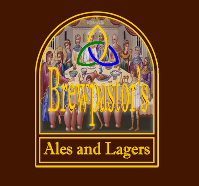
Brewpastor said:OK, I am liking this idea. Here is one with color in the knot. It is a Celtic Trinity knot. I added the color to also represent grain, water and hops.
Enter your email address to join:
