- Joined
- Mar 27, 2012
- Messages
- 2,814
- Reaction score
- 1,046
Haha that's brilliant!


movet22 said:I am heavily influenced by German Culture, and I wanted a new design that would reflect that. I settled on embracing the old Bauhaus design cues from the 1930's. Simple and modern are the two main points to focus on, so I took that and ran with a self modified bauhaus typefont. Below is my concept for my Märzen and my altbier.
A quick note: "Bierbrauen Ges." is short for "Bierbrauen Gesellschaft", which is german for 'Brewing Company.' EDIT: It may be worth noting that the top right corner and far left are just white (obviously washed out by the background on HBT).

I'm a huge fan of these. Please post one on a bottle!
antihero414 said:I'm a pretty new brewer. I just brewed my 3rd batch, an oatmeal stout, which was actually my first batch with my own equipment at my own house. The first two were brewed at a friends house with his equipment, a smoked porter and a rye pale ale. All have been partial grain/extract kits, but after hanging out in this thread for a day or so I was inspired to make a label for that oatmeal stout that's been sitting beautifully in primary for 10 days now. The label is minimal, but I'm enjoying it so far for a first attempt. It's called Black Omen Oatmeal Stout, which is named after a large, black spaceship from the Super Nintendo game, Chrono Trigger. Those who have played will understand, and for those who haven't, well... I hope it still looks cool. The quote on the side is from one of the game's greatest pro/antagonists, Magus.
It's my first time, so be gentle....
I don't have the mad graphics skills that many here do, so I went with a cribbed graphic and simple design. Sorry, the PDF got a little grainy converting to a JPG.
I really like the apple! Did you make that yourself?
I am heavily influenced by German Culture, and I wanted a new design that would reflect that. I settled on embracing the old Bauhaus design cues from the 1930's. Simple and modern are the two main points to focus on, so I took that and ran with a self modified bauhaus typefont. Below is my concept for my Märzen and my altbier.
A quick note: "Bierbrauen Ges." is short for "Bierbrauen Gesellschaft", which is german for 'Brewing Company.' EDIT: It may be worth noting that the top right corner and far left are just white (obviously washed out by the background on HBT).

I really like the apple! Did you make that yourself?


I wish I had the skill set and creativity to design something like that.
Found it with Google graphics search for Apfelwine, then experimented with about a dozen different fonts to find one I liked. Thanks to you and LoneTree for the compliments.
i liked your design, so i embraced a bit of it; hope you don't mind!
This isn't a finished label but this is the painting I did. Some friends and I brewed up a couple big batches this winter that will be distributed next X-mas to everyone present. This is the Strong Scotch Ale. It clocks in around 9.5% and for some reason Foghorn Kilt Buster came to my mind so that's what it's called.
I also have one for the Black Hole Mind F***er Russian Imperial Stout but it's slightly more inappropriate so I'm not sure I should post it here. But maybe with some prompting...
lets see the black hole!!


Here's my 2013 Winter 4-pack...

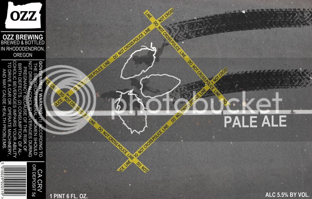
New label I've been working on today. Haven't pinned down a name for the beer yet so Pale Ale is the place holder. Going to be either an IPA, IIPA, or Pale.

thyirishmen said:here is a label for my all new zealand hopped IPA. made by Josh.


Enter your email address to join: