Here's my new logo (well...at least my new logo in progress):
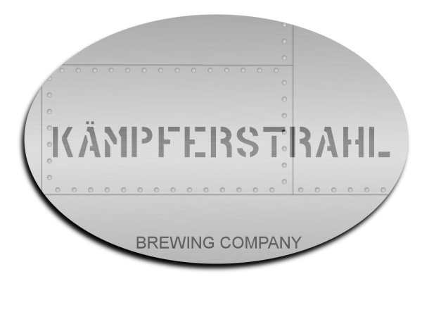
Translated literally, Kämpferstrahl is "fighter jet."
Comments?
Translated literally, Kämpferstrahl is "fighter jet."
Comments?

")
DaveyBoy said:...maybe change the font on the "Brewing company" at the bottom? Maybe something other than Arial?

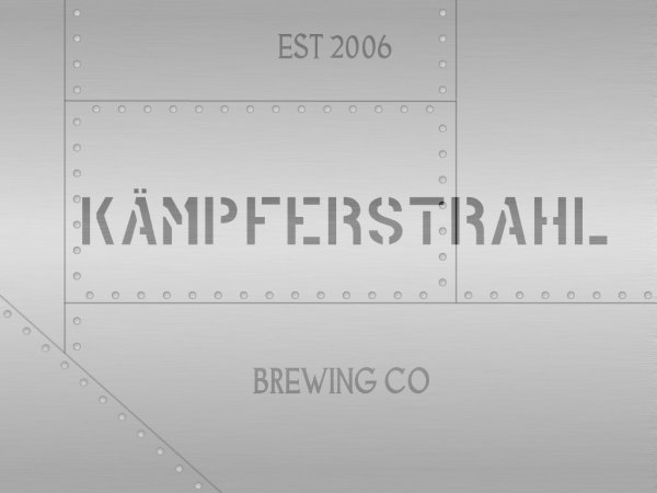
A little weathering around the rivets and panel.
"THIS IS NOT A STEP" - if I can incorporate it without it being distracting, I like it!olllllo said:This is not a step - what aircraft is complete without it.
A little weathering around the rivets and panel.
The diagonal element should be the ovaled version if at all possible. The diagonal really tells me aircraft and not ship hull (follow me?).


Yuri_Rage said:The semi-final design:
I didn't add any crazy text effects - I want it to look as if the words were painted on the side of a jet. I tried to go for an oil streaked, weathered look. Adding more words (like ACHTUNG! or THIS IS NOT A STEP) kinda cluttered the logo.
Thanks for all the help! Critiques? Slogan?
EDIT:
I was happy enough with this design to start making t-shirts. Click on the link in my signature :rockin:
EdWort said:Air Kampferstrahl, Mile High Club Facilitator.
One of a jet I'd be willing to fly...Jim Karr said:What kind of jet plane image would not have at least ONE bullet hole?
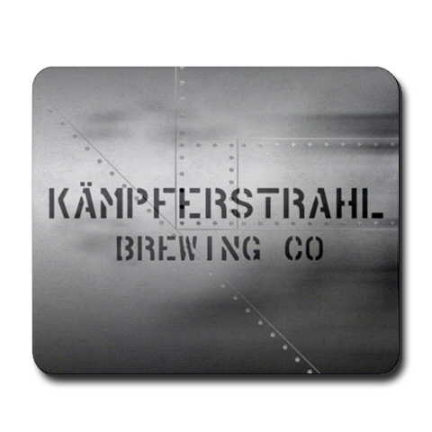
Yuri_Rage said:Here's the mousepad design I came up with for Cafe Press:
Yuri_Rage said:Here's the mousepad design I came up with for Cafe Press:
I just double checked...I can't mark that one down any lower.cowgo said:Well, 18 bucks for a white T-shirt.....I'm just saying.
Yuri_Rage said:I just double checked...I can't mark that one down any lower.
Just wondering if there's anything preventing anyone from buying Kämpferstrahl gear.
Enter your email address to join:
