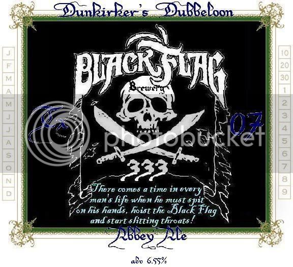
i really love the look of it. I've got a couple of suggestions. Take them or leave them, it makes no difference to me. What matters is you like your label.
Suggestion 1: Even with the white outline, the blue is kind of hard to read against the black background. It doesn't quite "pop," and it's just a hair too light to be a subtle "don't notice until you're looking" thing.
Suggestion 2: I think that the saying (which rocks, by the way) would look a little better in a dark crimson/bloodish color. Perhaps it just needs to be bigger. I can't decide. While the font itself isnt really "busy," that much text at that size makes it slightly difficult to read. I certainly couldn't read it after a few, anyway.
I lied. I have just a few more suggestions.
Suggestion 3: I love the way that Dunkirker's Dubbeloon rests on top of the green border. That works great. (And i can see that it's centered between the green and the white border.) It doesn't work quite as well with the Abbey Ale, because half the font is "stuck" in the green border. I had to stare at it for a second.
Final Suggestion: Maybe change the background color from black to blue (and then ignore the color suggestions in one and two), with a wavy matte, making it feel like it was on the ocean. That'd make the black flag pop.
Like I said, just a couple of suggestions. Take 'em or leave 'em. I really like the label.