Deacon1856
Well-Known Member
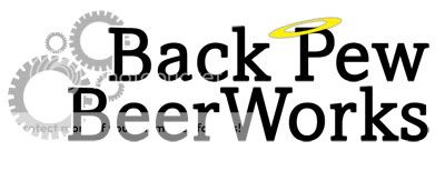
NEW LOGO ADDED IN PLACE OF ORIGINAL. THANKS IN ADVANCE FOR THE FEEDBACK!
I don't know what it is about having to put a label on things....even things as arbitrary as sitting in my garage in front of a propane flame. But there's something. Self expression? Maybe. Visions of Grandeur? Probably. Whatever the reason, everyone else was doing it so I am too!
Here's what I came up with:

It's preliminary. It's supposed to be simple. My actual LABELS will probably be more detailed, but I just wanted something that could be easily reproduced (minus the halo)!
Suggestions are welcomed! Encouraged even.
Thanks in advance
Deacon
I don't know what it is about having to put a label on things....even things as arbitrary as sitting in my garage in front of a propane flame. But there's something. Self expression? Maybe. Visions of Grandeur? Probably. Whatever the reason, everyone else was doing it so I am too!
Here's what I came up with:

It's preliminary. It's supposed to be simple. My actual LABELS will probably be more detailed, but I just wanted something that could be easily reproduced (minus the halo)!
Suggestions are welcomed! Encouraged even.
Thanks in advance
Deacon


