The "We'll fix your label for you" thread

Homebrew Talk - Beer, Wine, Mead, & Cider Brewing Discussion Forum

Help Support Homebrew Talk - Beer, Wine, Mead, & Cider Brewing Discussion Forum:

This site may earn a commission from merchant affiliate links, including eBay, Amazon, and others.
OK, I need some help, as the most sophisticated prog I have is MSPaint - I'd like the three counties I "starred" to be cut out of this pic and encircled. Maybe a thick border, or double-ringed, IDK, but with enough space to put "Tri-County Run Brewing" in the border or ring.

Background in the circle? Maybe... some Tar-Heels??? Or maybe the counties in white with the tar-heels overlaid into the design?

:D

The counties should be white. I am thinking of this as my neck-label, the "plain" part of the label being black to go with pretty much anything, but again, it's all open really.

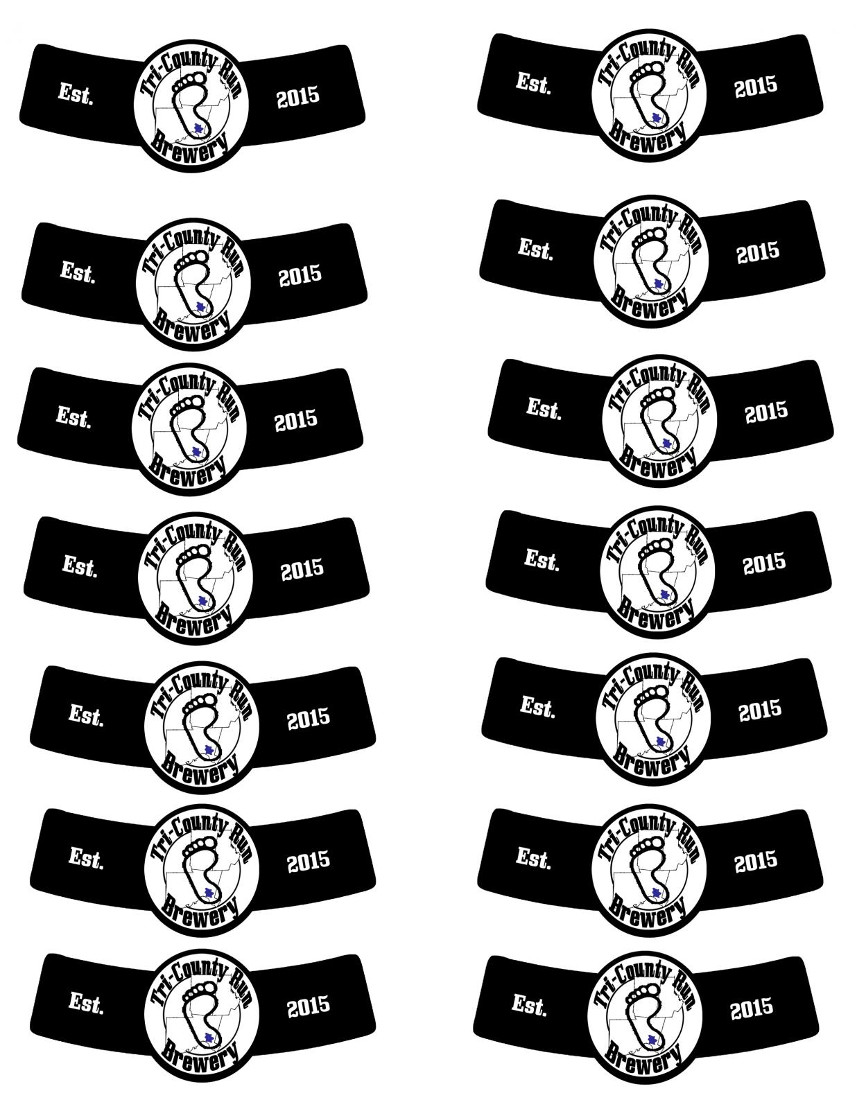
Maybe even "Est." and "2015" on each side of the circle?

Anyone, I really appreciate any help someone might put into this.

:)
This?

Neck label.jpg
 
Nice, but not what I was thinking... let me see if I can draw it out.

Oh, and thanks so much for helping out!
 
OK, here's what I was thinking -

W7ZLF3G.jpg


Oh, and even though the colours are wrong, I re-did the counties, I hope this helps you out -

qgM85Xy.png


I will say, looking at your original design, maybe I don't need the Tar Heels overlaying the counties. Could you mock up one like I have in my 3-rd grade level drawing above, except no Tar Heel in the circle, but the pairs on each side like you have it in your initial pic?

How about now?

Neck label.jpg
 
Dude! That freakin' rocks!!! If I can ask for one more thing - in the same font but white, about the same size, can I get "Est." on the left side of the blank black space, and "2015" on the other???

And, how do I get this on my label template?

Seriously, that looks really good, Jinks!
 
Dude! That freakin' rocks!!! If I can ask for one more thing - in the same font but white, about the same size, can I get "Est." on the left side of the blank black space, and "2015" on the other???

And, how do I get this on my label template?

Seriously, that looks really good, Jinks!

Minor touchup:cross:

Neck label.jpg


Neck label1.jpg
 
OK, I swear... one last thing - the very last one, but with the Tar Heel in blue like all the other ones.
 
OK, I swear... one last thing - the very last one, but with the Tar Heel in blue like all the other ones.

Here ya go.
Print the multiple one as a full page and they should fit. Its from the template I use for my labels.

Full Sheet.jpg


Neck label.jpg


Neck label1.jpg
 
Jinks, you ABSOLUTELY rock! Those are all great, I just have to decide which one to use now.

I totally owe you a beer sometime, somewhere, someway!

hail.gif
 
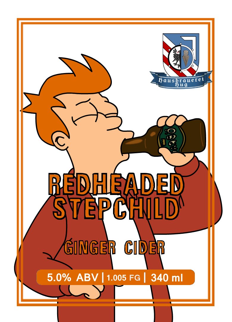
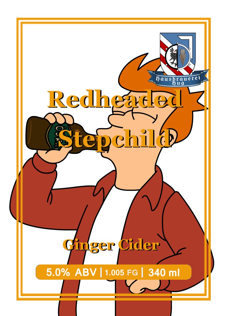
Can I get any suggestions on this label? Right now about the only thing I'm not terribly happy with is the font, and readability of the font, I tried to help that by putting some drop shadows behind it. I'm using gimpshop, and just downloaded a crap ton of free fonts.

Ginger Cider.jpg
 
Have you thought of using a different color? Maybe something that would contrast more? Also, maybe move the "red headed" down a bit so it is further from your logo. I'm not a graphic design guy... just my 2cents
 
Is that a standard layout for you in terms of the size and location of the different elements (logo, name of drink, etc.)?

If you're open to moves, I'd suggest shifting the logo to the top left to separate it from everything else.

The name of the cider is right on top of the lines of his face, which makes it really busy. On top of that, the colors are fairly close as well. Maybe slide the name down a little (or picture up a little) to have the words fall on top of the jacket/shirt and not his face. If you reduce the spacing between the lines, that might help as well.

For a fun twist, you can try putting your logo on his beer bottle. You'd probably want to make sure that the words aren't covering it up if you try that.

I'm not an artist either, so take those suggestions with a grain of salt.
 
Actually I just finishes making most I these same changes. The placement of everything is pretty well my standard now but after playing with the colours I moved the name of the cider down to the jacket area and changed it to an orange that matches the hair. I also changed the font to something that looks slightly childish but has black outlines. I then changed the other orange design elements to match the hair orange as well.

I considered the bottle logo earlier, but not being an artist, I'm not going to tackle that. I'll post the updated one later with the changes
 
Looks great. The thicker border really helped the readability. I also like the new font.
 
Hey, wow, what a cool thread! I'd actually been trying to play around to create a logo for my "brewery," but am struggling, mainly due to my lack of any sort of photoshop, illustrator, etc. skills. If anyone here wants to take a stab at it, it would be greatly appreciated. In general, here's what I'm looking for...

The name of the brewery is Cat's Meow Brewing Company. I would basically like to use the center cat from this image as the center of the logo:

tribal-cats-vector--cat-face-made-with-tribals_656748.jpg


And then I'd like the brewery name to wrap around it similar to the Port Brewing logo:


port-brewing-logo.jpg


Lastly at the bottom I'd like one of those scroll style banners like this:

7caK7xGgi.jpeg


that reads "Santa Cruz, CA"

Again, any attempts would be appreciated, and I'd just encourage you to have fun with it. I'm pretty open to suggestions on font, colors, etc., as I assume anyone attempting this has more artistic chops than I do!
 
Such a cool thread... I have a few ideas for what I want but I am so "artistically challenged" haha

The guys that are helping out are awesome!!! Slow clap for you guys
 
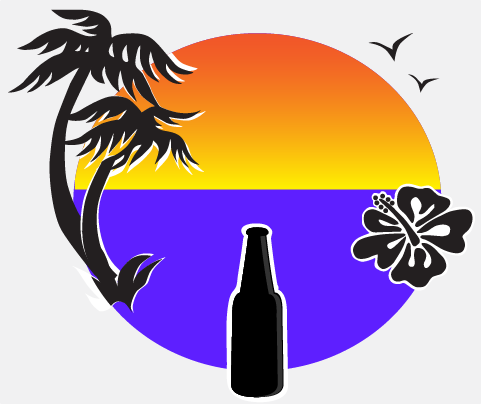
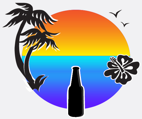
I've been trying for a few days to design a logo. Sunset at beach with beer bottle. Sound simple but not for someone who is artistically challenged. Still looking for pictures and trying to learn gimp software.
 
Hey, wow, what a cool thread! I'd actually been trying to play around to create a logo for my "brewery," but am struggling, mainly due to my lack of any sort of photoshop, illustrator, etc. skills. If anyone here wants to take a stab at it, it would be greatly appreciated. In general, here's what I'm looking for...

The name of the brewery is Cat's Meow Brewing Company. I would basically like to use the center cat from this image as the center of the logo:

tribal-cats-vector--cat-face-made-with-tribals_656748.jpg


And then I'd like the brewery name to wrap around it similar to the Port Brewing logo:


port-brewing-logo.jpg


Lastly at the bottom I'd like one of those scroll style banners like this:

7caK7xGgi.jpeg


that reads "Santa Cruz, CA"

Again, any attempts would be appreciated, and I'd just encourage you to have fun with it. I'm pretty open to suggestions on font, colors, etc., as I assume anyone attempting this has more artistic chops than I do!

This would probably look pretty cool, but the cats require attribution to use legally. Do you have something else you might want to use?
 
This would probably look pretty cool, but the cats require attribution to use legally. Do you have something else you might want to use?

Hey thanks for the reply! I figured since it was home brew and all that attribution wouldn't really matter since it would probably never be seen outside of my garage, but I understand if someone doesn't want to work with someone else's images just in case.

That being said, I don't really have another image in mind, but basically wanted a line drawing of a cat's face, and when I did a Google image search for "cat's face line drawing" that was in the results and reminded me a lot of one of my cats. I wasn't necessarily looking for a tribal image but it just kinda worked.

Does that help at all?
 
Sorry SteelManCM been out working. I liked the first one. Played a little with it in Gimp last night. Added some text but I'm still playing with it to see if that's what I really want. I will be sure to let you know if I need to change anything. Thanks again for the fast help.
 
actually thought one of these might be good. I added a gradient to the water, to match the sky and give it some depth

then added lines to the water, to suggest waves. had added the same to the sky, but it didn't look right

Sunset_with-waves.jpg


Sunset_without-waves.jpg
 
GrogNerd

Can you run the water all the way across and add sand? I like the gradients effects on the second image.
 
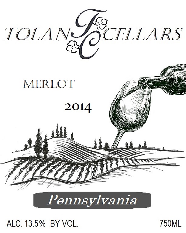
I'm making wine labels for the first time. I keg beer, so I don't label them obviously, and prior wines I've made, I never labeled them, but last year I made 42 gallons of various types of wine, so I need to label them.

Here's my design:

Wine%20Label%20Blank%20Template%20-%20Merlot%20Sample.jpg


I only have MS Paint, so my tools are limited.

I'll be printing them on 4" x 5" kraft brown labels.

I'm reasonably happy with what I have, but to me, it looks kind of "unpolished."

I'll be bottling either tomorrow or Saturday.

Thanks!
 
I only have MS Paint, so my tools are limited.

I'll be printing them on 4" x 5" kraft brown labels.

I'm reasonably happy with what I have, but to me, it looks kind of "unpolished."

I'll be bottling either tomorrow or Saturday.

Thanks!

You did that on MS Paint?

images
 
I'm making wine labels for the first time. I keg beer, so I don't label them obviously, and prior wines I've made, I never labeled them, but last year I made 42 gallons of various types of wine, so I need to label them.

Here's my design:

Wine%20Label%20Blank%20Template%20-%20Merlot%20Sample.jpg


I only have MS Paint, so my tools are limited.

I'll be printing them on 4" x 5" kraft brown labels.

I'm reasonably happy with what I have, but to me, it looks kind of "unpolished."

I'll be bottling either tomorrow or Saturday.

Thanks!


the only change I would make would be the grey behind the pennsylvania. If you could match it to the same colour as the black on the label, and then maybe have it as a crosshatch.
 
the only change I would make would be the grey behind the pennsylvania. If you could match it to the same colour as the black on the label, and then maybe have it as a crosshatch.

Agreed. All joking aside, I love the image. The only thing that possibly cheapens it is the text. If you can find a nice smooth text, or equally sketchy text it would look perfect. The text that is used now just looks like pixels to me. Get it to match, and its solid.
 
Back
Top