The "We'll fix your label for you" thread

Homebrew Talk - Beer, Wine, Mead, & Cider Brewing Discussion Forum

Help Support Homebrew Talk - Beer, Wine, Mead, & Cider Brewing Discussion Forum:

This site may earn a commission from merchant affiliate links, including eBay, Amazon, and others.
Hi - I'm checking to see if this thread is still active.

Hey Ron,

I don't have the programs or artistic ability that JINKS did, but if you need help, I'll do my best to keep this thread active. I threw this together on a coffee break. If it is anything close to something that would help you, just let me know what you might like to see and we can try to work something out.

kaifmd.jpg
 
Hi, CAD - and thank you; not just for the beautiful work there, but also for keeping this thread active. I keep telling myself that I need to get the apps/programs to do this myself, but while I can recognize true art, I can never seem to create it.

You have absolutely nailed those colours, and the font is perfect for this beer and that picture. Very nice. If you are able to put the abv above the ml, that would "conform" to my previous designs. I would also have a "logo" in the opposite corner that looks like this:

http://cdn.homebrewtalk.com/attachment.php?attachmentid=231349&stc=1&d=1414123463

Sometimes, it is also on a strip that is running up the side or along the bottom. Here's an example:

http://cdn.homebrewtalk.com/attachment.php?attachmentid=285613&d=1434763630

If this can't be done, no worries at all. Any assist is very much appreciated.
 
I screwed this one up.. going to try one with the logo-strip on the side. If there's anything else I can adjust going forward let me know. As long as this isn't too far off what you're looking for, I'll keep working on it until it's right for you.

any3kp.jpg
 
Dang - that is an interesting look - it gives kind of a dreamy feel...I like it!

A strip might be the way to go, so as not to interfere too much with the portrait of the "Bruxelles Blonde." If you could have "Fischer Brewing Co." running next to the logo, that'd be great. Here is an example:

http://cdn.homebrewtalk.com/attachment.php?attachmentid=243609&d=1419276423

Also, if it can be done, there is a "tag-line" that is related to the logo that would go across the bottom of the main label:

A Tradition of Family Brewing from the Banks of the
Rhine and Beresan Rivers to the High Plains of North America

It sort of outlines my family history, and how they brewed beer as they migrated from Alsace to Ukraine and then to North Dakota and eventually Montana.

That is indeed a nice look - sort of rural/peasanty, but also with just a hint of art deco in, which matches this particular beer and the name. I really like it and am very appreciative, CAD.
 
I screwed this one up.. going to try one with the logo-strip on the side. If there's anything else I can adjust going forward let me know. As long as this isn't too far off what you're looking for, I'll keep working on it until it's right for you.

any3kp.jpg

The only suggestion that I might have is to stretch the right side of the "coloured" portion just far enough to get the edge of her hair....
 
The only suggestion that I might have is to stretch the right side of the "coloured" portion just far enough to get the edge of her hair....

Here is roughly, the extent of what I can do as far as adding your strip, unless I make my own.. which I could do, it would just take me a bit to do and you'd lose the "(blue) fish inlay". I'll try to take your preferences and make one that works the way you would like.

2cgdcox.jpg
 
The strip looks great, for sure. I really like both the paneled look of the picture above and the soft-light look of the one immediately above. Both are very nice, and I'll trust your judgment on which to use for the final design. That is really ncie blending from her hair to the field - beautiful!
 
So here are the last couple I came up with. There are not many options for the text (with the programs I'm using) without making them extremely cluttered and unreadable.

---------------------------------------------------

2n86xz.jpg


---------------------------------------------------

68wy1e.jpg


---------------------------------------------------

2m31d9l.jpg


---------------------------------------------------

I know there isn't much here variation wise. This is obviously a bit beyond my artistic capabilities.
 
No worries about variation - the base design is outstanding, and I think you hit the bullseye with that. Besides, I would rather "tweak" a great design than get bogged down in a myriad of so-so ideas. With these, the only "criticism" that I can see is that it looks like something a little funky might be happening with the logo - on the top and bottom images, it appears a little "scratchy." If you need the original image, I can provide.

They are all very nice - each one of them has something about it that I really like. Putting it all together, the top one might be the way to go, especially with that awesome texture. Or perhaps the middle (with the strip in colour). But then again, there is something truly artistic about that bottom one....

Honestly, I think any of the three is a winner, and thank you much for your effort.
 
Honestly, I think any of the three is a winner, and thank you much for your effort.

I think what you're seeing with the funky logo is just the texture I applied, showing through it. If you would like, I can just overlay a fresh, un-manipulated logo strip over those two. Otherwise, it may be the best I've got for the day.

- I just re-applied the logo strip to them so the logo is not affected by the textures. Sending them to you in a PM. Kind of partial to this one with the replaced strip.

qpik9t.jpg


Thanks for giving me something to keep my mind off things.
 
That's just about perfect, CAD - I haven't checked the PM yet (will do so after posting this), but if you could overlay a fresh strip with the textured label, I will compare them....but I think I'll go with this one. It strikes me as a very nice melding of the ideas.

[EDIT] - Whoops, I should have checked the PM first - there it is![/EDIT]

Huge appreciation for this. I wish I lived closer so that I could buy you a beer, but until that day comes, you have my gratitude.
 
Say, everyone -

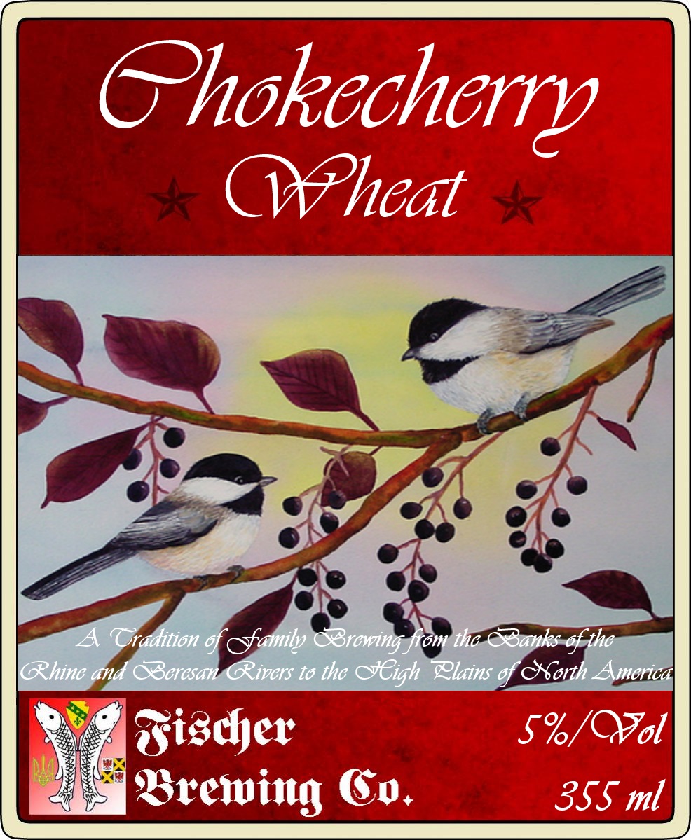
I didn't want to be a pain in the rear, so I figured I would try making my own label, using JINK's design as a base. It's not perfect; the spacing of the text and a few other small details could be better. However, I did better than I thought I would, and the colours/font/image are true to what I was going for, so it's not too bad:

Chokecherry Wheat.jpg
 
Well... Hell, I figured I might as well take advantage of this.

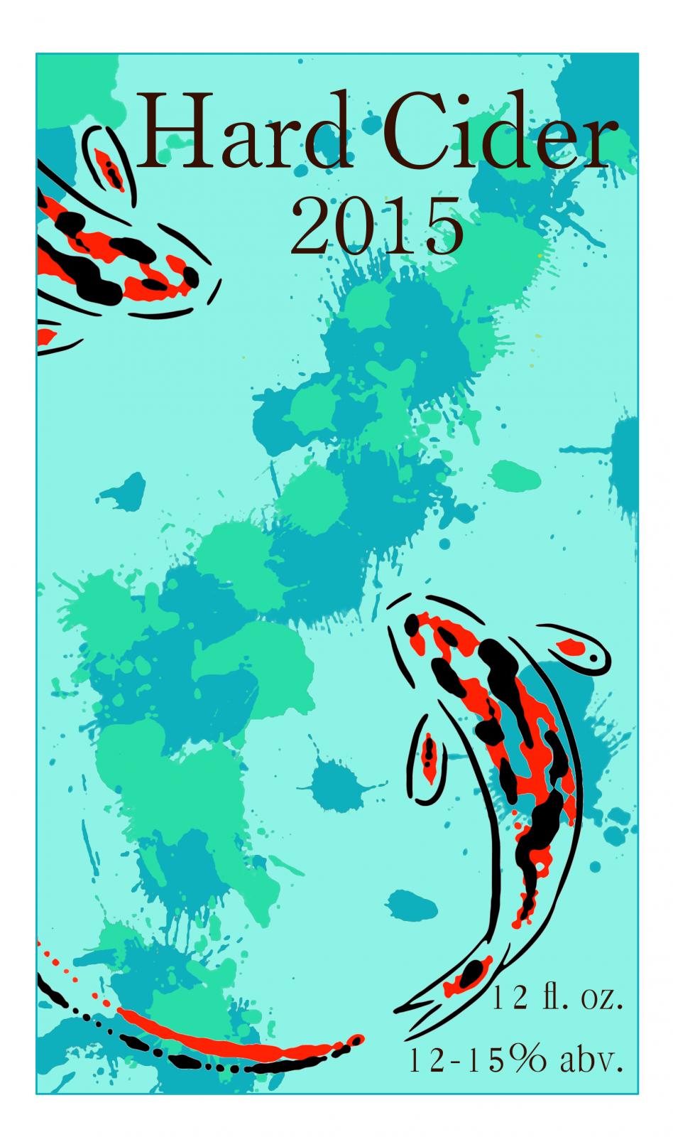
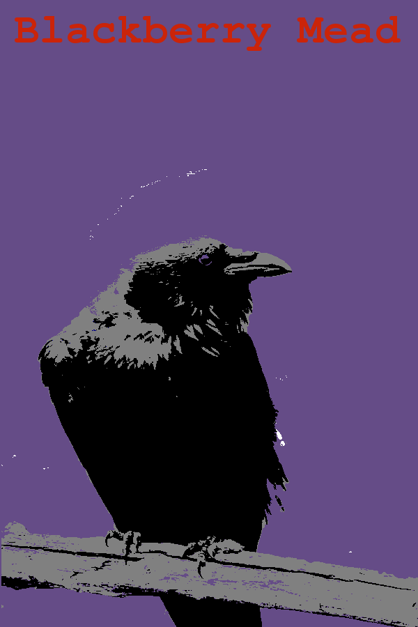
Attached are the two labels I've been working over in GIMP for the past few days. Cider's finishing up, and the blackberry mead's the next one to start. (hence the BS description text).

I've still got to size them to 3"x 4" for the print service I plan to use, but the more and more I work these over, the more they seem to be lacking.

The third one (with just the raven) is just an alternate haven't quite decided what to do with. I had been thinking of just different colors for different brews.

No name for myself or my "homebrewery", just in case someone asks what I'd call myself.

Thanks in advance!

*EDIT* Wow. There turned out to be a lot of residual bits and pieces to the raven in the third pic.

I apoligize for that.

bottle label 1.png


bottle label 2.1.jpg


blackberry.png
 
I've still got to size them to 3"x 4" for the print service I plan to use, but the more and more I work these over, the more they seem to be lacking..

I'd love to work on these a little; it will be a nice way to pass some time and make it through a quiet day at work. I'll get started after my meeting here in a few minutes. If there is anything specific you'd like to see, let me know. Otherwise I'll throw out some ideas that we can tweak as necessary.
 
I'd love to work on these a little; it will be a nice way to pass some time and make it through a quiet day at work. I'll get started after my meeting here in a few minutes. If there is anything specific you'd like to see, let me know. Otherwise I'll throw out some ideas that we can tweak as necessary.

That sounds fantastic. I have the gimp files too, if necessary. Just PM me with an email address if you want them, and I'll send them your way.

I like where they're heading in general, I just have a feeling that they're still unfinished and in some way, lacking.

Thank you very much for taking a look at them and offering to help!
 
orbird5d928.jpg


If there is anything you like or dislike about these let me know so we can refine something to your taste.
 
Whipped this up quickly. Hard to know what to do, not sure exactly what you're looking for. Kept the theme and colors roughly the same.

BB Mead.jpg
 

I hadn't thought about doing this one this way, but I'm liking the turn. The font seems a little too embellished (elegant), but it's growing on me.

The edges are interesting, but blurring them out a bit more, so they don't look quite as rough probably wouldn't be too bad.

It's also a nice design that could still be used for multiple brews, but easily swapped out with a different color, per se, and a bit different text.

I like where it's going.


Also very creative. I was playing with putting a bit more of textured background to that design as well, but never quite got something I liked.

The additions of grey and black are nice as well. Someone told me the design looked too much like a flag, and at first I was a bit discouraged by the comment, but this kinda ran with it and it looks nice. It's fairly solid and is one of my favorites so far. The blackbird and the tree are less of a focal point and more of an accent, which may be what I was missing before.

I almost would rather use this for the hard cider than the mead, but it fits both.

orbird5d928.jpg


If there is anything you like or dislike about these let me know so we can refine something to your taste.

This is the only one I dislike. The font change is bulky and really far from my tastes. (I tend towards typewriter style fonts, or nice clean modernist style fonts. I like thinner fonts, but I know that they tend to be at least a bit thicker for labels and such, which is why the second image was so much better font wise than this one) The shadows and shade are ok, but it's still suffering from the same flimsi-ness of the original.

Whipped this up quickly. Hard to know what to do, not sure exactly what you're looking for. Kept the theme and colors roughly the same.

I see where you're going with this, and I appreciate the effort. It still retains the raven and the tree motif, but I was going more for a graphic look rather than a photorealistic one.

The fonts are very medieval and traditional for meads, but it's not my style. I appreciate mead's rich history, but I like breaking from history and tradition when I create.

Thank you very much however for your efforts!
 
Thank you very much however for your efforts!

You got it. Thanks for the feedback. If you'd like, I will take another swing at them. I completely agree with each of your comments as well; I was merely throwing options on them to see what you'd like. Each base label was saved separately so I can add, mix and match different elements like the text. As far as the first one goes, I can very easily change the text and soften, remove or change the border completely. I'll see what I can do unless you're just not interested now. My style obviously comes through in my attempts, it can be tough to get around.
 
Whipped this up quickly. Hard to know what to do, not sure exactly what you're looking for. Kept the theme and colors roughly the same.

if I may make a suggestion...

the dark color of the font with the dark stroke plus dark inner and outer shadows make it look fuzzy or out of focus, especially with that background. maybe lighten up one or more of those elements to separate the letters from the background. maybe a white or light gray stroke
 
Perhaps some wording in the blank space between the badge border. "Artisan Ales to Share with Pals" or "Est 2008" or "Pembroke Pines, FL"

attachment.php

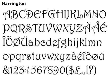
I recognize that font... It's called "Harrington". It's originally by Linotype, and it used to come with the Microsoft Office Value Pack for Mac (and probably other Microsoft products from then... I think Value Pack was for Office 98...)

Harrington.png


Here's a free version that can be downloaded:

http://www.1001freefonts.com/harrington.font

There are minor differences in the free version, but it's a decent substitute!

EDIT: I just realized Harrington is on my current Mac too, in the Microsoft Fonts folder (which means it came with Microsoft Office 2011 for Mac, too!)
 
been working on these two today, comments, constructive criticism, suggestions welcome.
the second is for a honey wheat american ale with mosaic hops that's coming up.
049 remembrance pale ale.jpg


050 Honey Wheat Mosaic.jpg
 
been working on these two today, comments, constructive criticism, suggestions welcome.
the second is for a honey wheat american ale with mosaic hops that's coming up.

is the space outside your borders that way to allow for bleed and what gets cut off in printing?

if so, that's fine, but otherwise the border seems a bit too far in.

The text is difficult to read. Partially due to the colors, but on the fighter jet one, it looks a little dull for a font, and it could be nice to include something more period.
 
Yeah I trim a lot off the edges after printing.

I would love colour selection suggestions and font suggestions. That's my Achilles heel. Impact is actually fairly old school, but the internet owns it now sort of.

Font colour is a beeatch, I want the colours to jive, but I want it to be legible, especially on the painting background. I used a drop shadow as a crutch on the mosaic wheat.
 
I will toy around with it when I get a chance.

I'm looking into options for free fonts. I also used google image search to find the original of the art you used, and am probably going to go with a version that's at a higher resolution.

I may also present a few different options (simply because I found a few other British WWII posters featuring planes/bombers).

I also noticed that the numbers in the corners are basically batch/recipe #, and using impact for both of these labels.... I get the sense that this isn't just "one" label" that looks like this, but that you have an entire run of labels that have been created along this sort of design motif.

This makes it harder to sit down and suggest much that is wildly different, or breaks the continuity too much.

Still, I'll toy around a little.
 
Honestly the planes aren't the focus of the image for me, but rather the convoy of ships. The hops are ahtanum and uk admiral. The batch numbers use Raavi bold, which is a continuity thing. But the batch name font is totally up for grab as it changes from recipe to recipe.

The only true common elements in my labels are the stats section, the border, and the crest ( which sometimes changes locations based on design elements) and now the newly added batch number
 
Im trying to design a label for my brewery, i have a picture i took as the base, it needs cropped for the final product
Im calling it "Green Forest Brewery" any suggestions?
IMG_0421.jpg
[/URL][/IMG]
 
a>


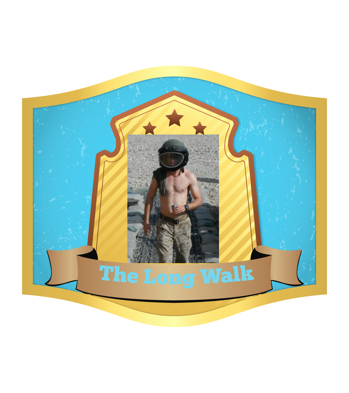
Here is a label I made on Labeley. It is a for a beer (Marzen) I made for my buddy. I was looking for some help with it. I need to crop the image and want more places for writing. Think I would be able to make this better in paint? I am very unfamiliar with creating labels or anything to do with art. Any advice before I try to create something in paint similar to that image? He likes German beer so I want to make it look German-ish. I really want to use that photo of him though. I was thinking of naming the beer The Long Walk Ale but I think I want to come up with something that sounds German.

10_no_dis_1447368439_3.5X3.0.png
 
Im trying to design a label for my brewery, i have a picture i took as the base, it needs cropped for the final product
Im calling it "Green Forest Brewery" any suggestions?

I got bored and played a little around with this for you.

378d393.jpg
 

Latest posts

Back
Top