schweitzer22
Active Member
and here are more


![Craft A Brew - Safale S-04 Dry Yeast - Fermentis - English Ale Dry Yeast - For English and American Ales and Hard Apple Ciders - Ingredients for Home Brewing - Beer Making Supplies - [1 Pack]](https://m.media-amazon.com/images/I/41fVGNh6JfL._SL500_.jpg)
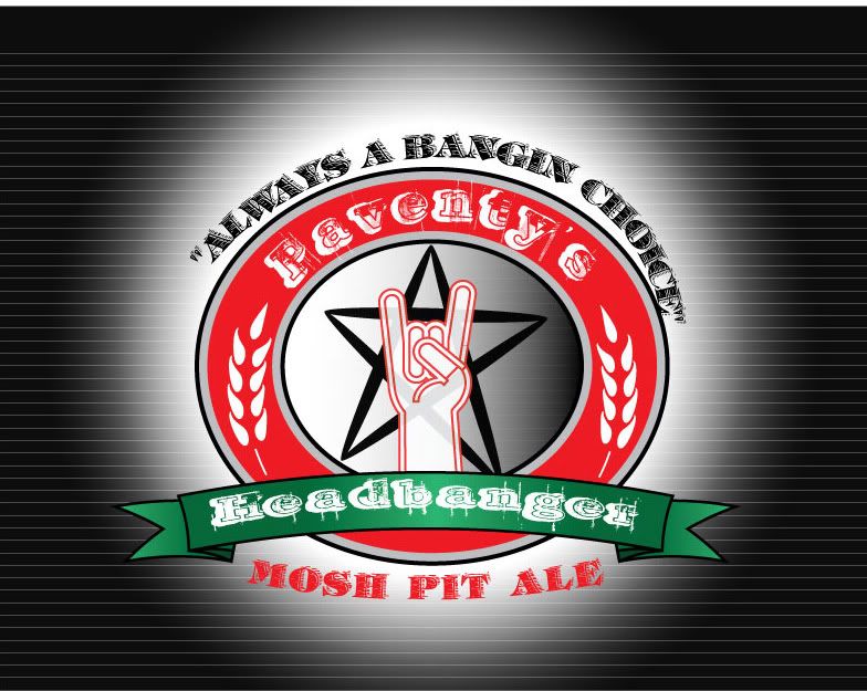
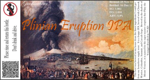
LoneTreeFarms said:here's a new one
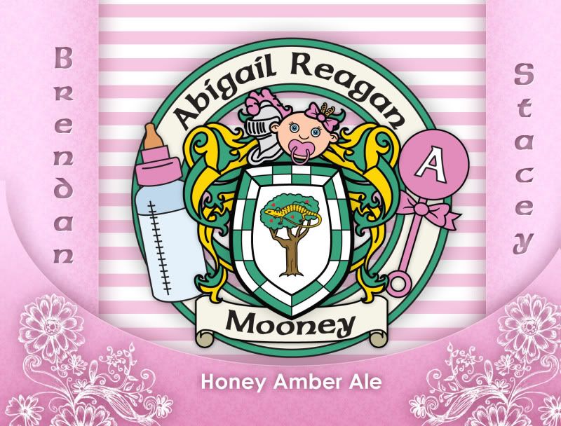
Here's my first label.
i think it is cool except your text boxes have some spacing issues and have information not usually included in beer labels. are you trying to look commerical or just have fun with it?

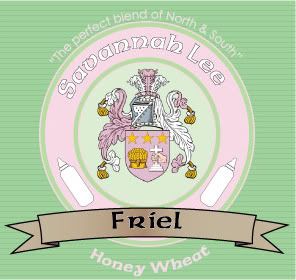
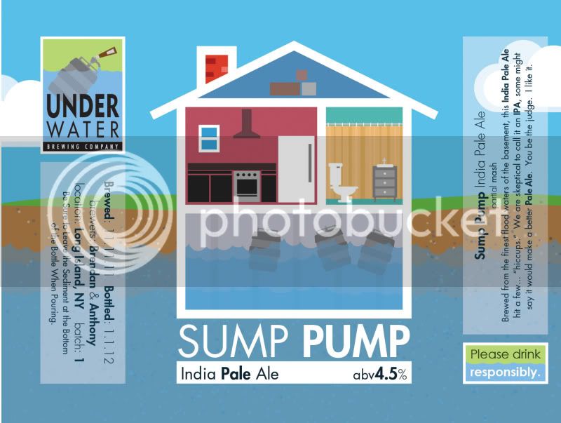
inertial said:Here's my first label.
My first label!
That's a slick label. I have barely serviceable graphics skills and I struggle to get the small fonts to look crisp like this.
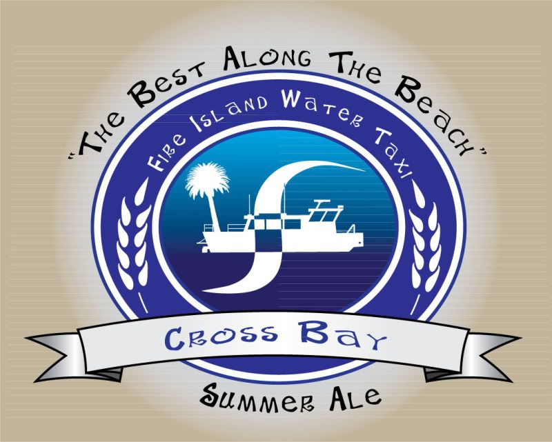
Here is my latest:
I like the description, and am supremely jealous you can go to Pizzeria de Michele any time you wish!!!


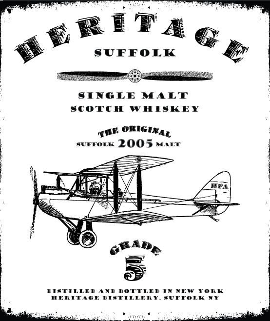
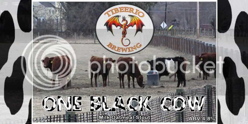
Here Are a couple I have made. Two Brewery labels and one beer label.


everything looks good except the first one looks a little dark. it might just be the preview and it might print well, but altering the brightness and contrast might make it pop more. with my phaser, i find that images always print darker than they appear on my screen so it might just be me.
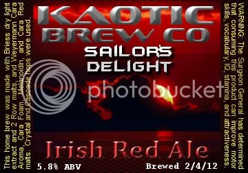
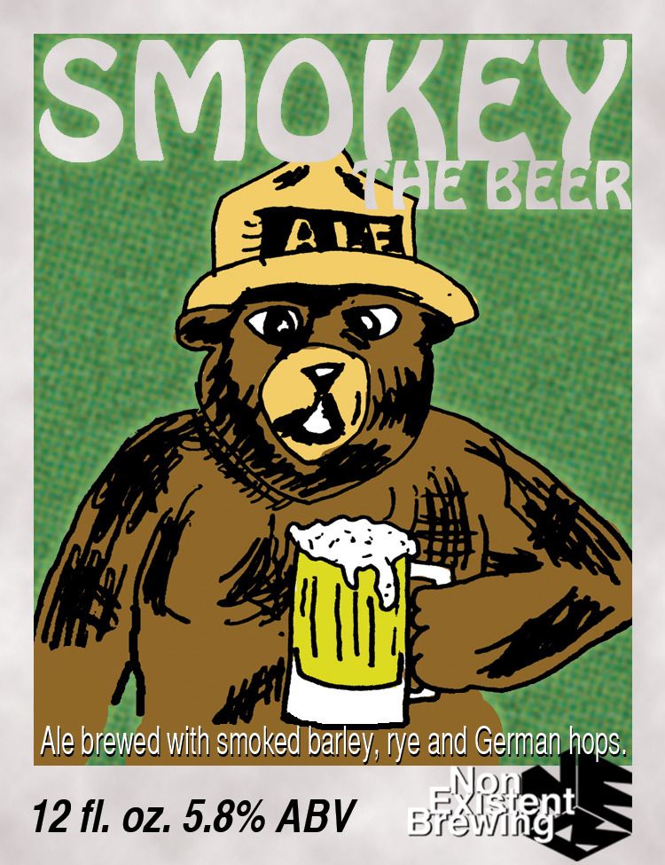
I bottled my smoked ale yesterday. Just a small, 2 gallon batch to test.
I didn't think the pizza could be that much better than American pizza when I was moving over here, but I was supremely wrong. I will definitely miss it when I leave.

@gugguson
I really like the way your bottles look with the thin label bottom aligned. I'm going to have to give that a go on my next batches.
Here Are a couple I have made. Two Brewery labels and one beer label.
")


@gugguson
I really like the way your bottles look with the thin label bottom aligned. I'm going to have to give that a go on my next batches.
http://gudbjargarson.net/gerandi/fyrstu-bjorar.jpg[/IMG]


