Donthoseme
Well-Known Member
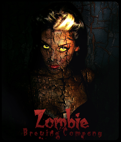
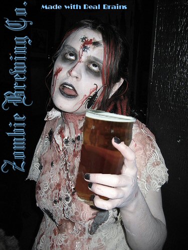
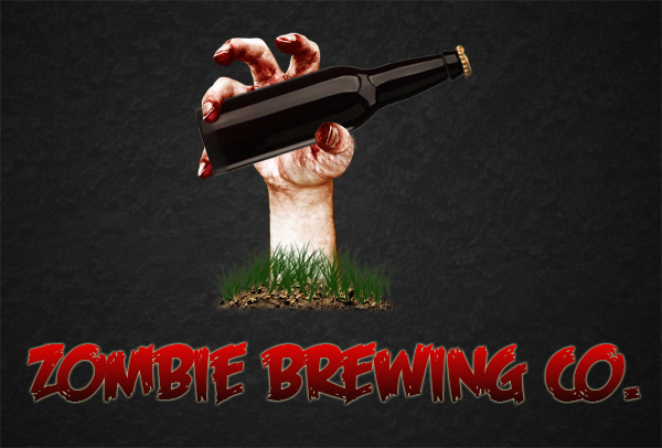
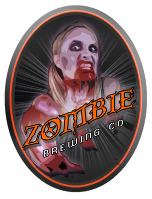
1.

2.

3.
4.
5.
6.
7.
8.

2.
3.
4.
5.
6.
7.
8.

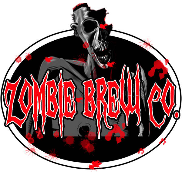
 . 5 and 6 were the best of them though.
I don't really like any of them, maybe its just because I don't get peoples emphatuation with zombies though


Kunstler's comments are spot on and show that you can give constructive criticism of something even if you don't like the subject matter. Six is the best and most professional looking but I am partial to number 3 as well just because hot zombies are a dichotomy. Do I bring her home to Mom? Can I feed her enough to keep me safe? Is room temperature going to feel good enough?
See, then it suddenly went weird.
:fro:
 Oops.
Oops.


![Craft A Brew - Safale BE-256 Yeast - Fermentis - Belgian Ale Dry Yeast - For Belgian & Strong Ales - Ingredients for Home Brewing - Beer Making Supplies - [3 Pack]](https://m.media-amazon.com/images/I/51bcKEwQmWL._SL500_.jpg)


