You are using an out of date browser. It may not display this or other websites correctly.
You should upgrade or use an alternative browser.
You should upgrade or use an alternative browser.
New label for my second brew. A Steam(c)(tm)(r) beer
- Thread starter betacrash
- Start date

Help Support Homebrew Talk:
This site may earn a commission from merchant affiliate
links, including eBay, Amazon, and others.
kcmadhatter
Active Member
the St. Leon Indiana is a bit hard to read, but I can read it. Looks awsome, you surely got the look you where aiming for!
Maveric777
Well-Known Member
Now that is "Sweet!"
Great job!
Great job!
I hadn't ever thought of that look. If you could include the word "tonic" in there it might really pull it together 
Bluelinebrewer
Well-Known Member
Looks good!

$479.00
$559.00
EdgeStar KC1000SS Craft Brew Kegerator for 1/6 Barrel and Cornelius Kegs
Amazon.com
$53.24
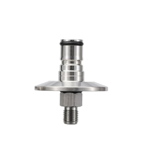
1pc Hose Barb/MFL 1.5" Tri Clamp to Ball Lock Post Liquid Gas Homebrew Kegging Fermentation Parts Brewer Hardware SUS304(Gas MFL)
Guangshui Weilu You Trading Co., Ltd

$28.98
Five Star - 6022b_ - Star San - 32 Ounce - High Foaming Sanitizer
Great Fermentations of Indiana

$58.16
HUIZHUGS Brewing Equipment Keg Ball Lock Faucet 30cm Reinforced Silicone Hose Secondary Fermentation Homebrew Kegging Brewing Equipment
xiangshuizhenzhanglingfengshop

$53.24
1pc Hose Barb/MFL 1.5" Tri Clamp to Ball Lock Post Liquid Gas Homebrew Kegging Fermentation Parts Brewer Hardware SUS304(Gas MFL)
yunchengshiyanhuqucuichendianzishangwuyouxiangongsi

$7.79 ($7.79 / Count)
Craft A Brew - LalBrew Voss™ - Kveik Ale Yeast - For Craft Lagers - Ingredients for Home Brewing - Beer Making Supplies - (1 Pack)
Craft a Brew
![Craft A Brew - Safale S-04 Dry Yeast - Fermentis - English Ale Dry Yeast - For English and American Ales and Hard Apple Ciders - Ingredients for Home Brewing - Beer Making Supplies - [1 Pack]](https://m.media-amazon.com/images/I/41fVGNh6JfL._SL500_.jpg)
$6.95 ($17.38 / Ounce)
$7.47 ($18.68 / Ounce)
Craft A Brew - Safale S-04 Dry Yeast - Fermentis - English Ale Dry Yeast - For English and American Ales and Hard Apple Ciders - Ingredients for Home Brewing - Beer Making Supplies - [1 Pack]
Hobby Homebrew

$20.94
$29.99
The Brew Your Own Big Book of Clone Recipes: Featuring 300 Homebrew Recipes from Your Favorite Breweries
Amazon.com

$10.99 ($31.16 / Ounce)
Hornindal Kveik Yeast for Homebrewing - Mead, Cider, Wine, Beer - 10g Packet - Saccharomyces Cerevisiae - Sold by Shadowhive.com
Shadowhive
$22.00 ($623.23 / Ounce)
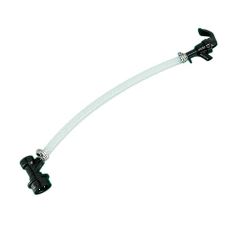
AMZLMPKNTW Ball Lock Sample Faucet 30cm Reinforced Silicone Hose Secondary Fermentation Homebrew Kegging joyful
无为中南商贸有限公司

$33.99 ($17.00 / Count)
$41.99 ($21.00 / Count)
2 Pack 1 Gallon Large Fermentation Jars with 3 Airlocks and 2 SCREW Lids(100% Airtight Heavy Duty Lid w Silicone) - Wide Mouth Glass Jars w Scale Mark - Pickle Jars for Sauerkraut, Sourdough Starter
Qianfenie Direct

$176.97
1pc Commercial Keg Manifold 2" Tri Clamp,Ball Lock Tapping Head,Pressure Gauge/Adjustable PRV for Kegging,Fermentation Control
hanhanbaihuoxiaoshoudian
I need to stop looking at these threads. I'll never be able to do something like that.
eschatz
Well-Known Member
Pretty sweet. I like that look. It doesn't have the Cali Ale thing going. I like the new angle. 

pericles
Well-Known Member
Really great job. I like that you're keeping a theme across labels. Ordinarily I'd say three fonts for such a small image is too much, but I think it works. If you could get the image's background to match the label's gold background, that might be good?
holden
Well-Known Member
- Joined
- Dec 16, 2008
- Messages
- 90
- Reaction score
- 2
If you could get the image's background to match the label's gold background, that might be good?
I agree with pericles. You should be able to just set the image layer to some setting that blends the white with the layer below it (at least you can do that in Photoshop).
r2eng
Well-Known Member
Yep! Anderj hit it... steampunk!
Ceedubya
Well-Known Member
first brew label

This label is really cool, I wish I could make stuff this good. The only other thing I could offer is maybe changing the vergage on the back label. This sounds more like a 30's era commercial. If you wanted to stick with the Tonic theme you could make it sound like one of the the old snake oil ads.
"This amazing remedy has been known to cure, as if by magic, many conditions ranging from shyness, awkwardness, truthfullness, ugliness of the opposite sex, and even makes a man feel stronger than he actually is. Yes folks, this "elixer of life" is sure to cure all of your woes"
Something along those lines, I'm no writer but I'm sure someone could improve on this idea.
evandam
Well-Known Member
- Joined
- Mar 21, 2008
- Messages
- 238
- Reaction score
- 0
This label is really cool, I wish I could make stuff this good. The only other thing I could offer is maybe changing the vergage on the back label. This sounds more like a 30's era commercial. If you wanted to stick with the Tonic theme you could make it sound like one of the the old snake oil ads.
"This amazing remedy has been known to cure, as if by magic, many conditions ranging from shyness, awkwardness, truthfullness, ugliness of the opposite sex, and even makes a man feel stronger than he actually is. Yes folks, this "elixer of life" is sure to cure all of your woes"
Something along those lines, I'm no writer but I'm sure someone could improve on this idea.
I think that is a different label all together. Could be wrong, but if it is a Winter Warmer Steam Beer I wanna taste it.
Freezeblade
Well-Known Member
The vignetting along the edges is a good concept, although I'd love to see it more just at the corners, leaving out the sides in the middle, sorta mimicing how vignetting works with old-school camera lenses. Perhaps bring up the "white" just a bit for a little more contrast, just a touch though. good lable.
betacrash
Active Member
- Joined
- Dec 9, 2008
- Messages
- 25
- Reaction score
- 0
im not much of a graphic designer so it has proven difficult for me to make the background of the image the same color as the label. i will have to figure that one out since i really dont like the way it looks either. i will see if i can do it in corel photo paint. also i will try to get those corners a little darker. i never knew that was called vignetting. like i said, not much of a graphic designer. thanks for all of the ideas and compliments. ill probably post a revision today if i get the time.
Bob
Well-Known Member
holden
Well-Known Member
- Joined
- Dec 16, 2008
- Messages
- 90
- Reaction score
- 2
That looks great! I'm glad you figured it out.ok, here it goes again. i found out how to make the background transparent.
Wheat King
Well-Known Member
awesome! im glad you were able to elimiante the white 'glow' from around the image. that robot is freakin sweet!
Similar threads
- Replies
- 7
- Views
- 1K
Latest posts
-
-
-
-
Barleywine natural conditioning failed, switched to force carb, but now what? 😆
- Latest: JimBob’s Brewskis
-
-
-
-


