Nice choice of font and CRISP images. Good contrast.
If you have kerning options in your image editing program
I would put some space in between the letters so they
don't touch. Especially the "SP" in Espresso.
If you're a stickler - the "A" in Barley is a bit lost in the image.
Nice full bold images for a espresso stout. That's going to
look nice!
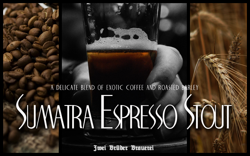

 . Where did you get the photos - are they your own, or did you Google for them?