My label for the BACK of the bottle

Homebrew Talk - Beer, Wine, Mead, & Cider Brewing Discussion Forum

Help Support Homebrew Talk - Beer, Wine, Mead, & Cider Brewing Discussion Forum:

This site may earn a commission from merchant affiliate links, including eBay, Amazon, and others.

TcJ

Member
Joined
Oct 18, 2014
Messages
12
Reaction score
1
I have always wished that beer bottles displayed pertinent information to the drinker: What's the ABV? What's the bitterness? OG/FG? It annoys me that commercial bottlers don't do that routinely.

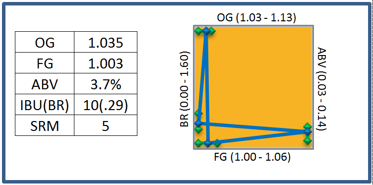
So I started thinking about ways to show "back of the bottle" information. I like visual data. So I put together an Excel spreadsheet, and here's what I came up with. It's still a work in progress.

In addition to the name, style, and bottling date, it shows five taste parameters: OG, FG, bitterness ratio (BU/OG), ABV, and color, from typical "low" to typical "high." (For example, for OG, the range of OG across the top is 1.028 to 1.130) As an added bonus, it shows the expected range (the green bars) for the style. The color gradient comes off of an SRM chart, with 1 on the bottom (pale yellow) and 40 on the top (black).

I like that it shows the beer compared with both its intended style and in comparison to other beers in general.

Here's my label for a robust porter I just bottled: OG and FG are nominal for a robust porter, ABV on the low end, and bitterness below the band for a robust porter (just the way I like it ;)) It's designed to fit and Avery 5440 1.5" x 3" label.

LarboarderLabel.png
 
Last edited:
I like the chart, it's a very cool idea.

Seems like it would be more useful it it had actual numbers on the axes (or at least values for the top/bottom of each green range). Otherwise, it doesn't really tell you much in itself, unless you are already very familiar with BJCP guidelines. Most would have to look up the style in the BJCP guide to get any sense of scale for the green bars and where the blue points lie. I can see that the beer has fairly low bitterness for the style, but it still doesn't really tell me how bitter it is in any numerical sense. Same with ABV, OG, and FG. At least the color is fairly self-evident.

Also, what does "dark brown" taste like? :p
 
Cool.

I agree it is a good idea to put the numbers on the bottle instead of how it ranks "to style". just my personal preference.

edit: maybe you already put the numbers on the front?
then i can see why you did that here on the back.
 
You're right, the numbers would be useful. And in fact the name and style aren't important here, as they would be on the front too. Here's another version, with numbers and another tweak - the color behind the graph is the SRM color from an SRM color chart.

BackLabel2.PNG
 
BR is probably Bitterness Ratio which would be IBU to OG. My crazy OCD brain is screaming at me that 4 blue lines should not cross and that they could express the same info in a pretty diamond-type shape. In other words go from FG to BR to OG to ABV and then back to FG. This is a very interesting interesting idea!

Though, on my keg labels, I like to be reminded of the malts, hops, and yeast that were used to craft the brew. I don't care too much about the numbers except for the ABV. Taste will give you all of the other reference points you need.
 
I like this idea as well. However, like gnome mentioned, I find the graph portion cluttered. Maybe a thick line over a bar for each category, where the line shows the actual figure for the beer and the bar covers the range of the style.
 
My crazy OCD brain is screaming at me that 4 blue lines should not cross and that they could express the same info in a pretty diamond-type shape.

+1

I really like the idea, but I am thinking put the OG on the left, the FG on the bottom, then the steeper the line is connecting them would represent a higher ABV and or drier beer. you could then put the abv on the right side and the Bitterness ratio on the top.

or instead of putting the ABV, as this is probably already listed elsewhere on the bottle, you could do an SRM scale on the right? or if you make a nice diamond with the blue lines you could print the ABV in the middle of the diamond.

just throwing some ideas out there.
 
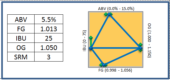
Hey, that just gave me an idea.... In this version, OG is on the right, and IBU is on the left. The scales have been adjusted so that when the line from OG to IBU is horizontal, OG:IBU is 0.5, to suggest a "balanced" beer. (But it can't be a diamond to show it this way ;))

BackLabel3.PNG
 
Oh, wait, sure it can use a diamond:

BackLabel6.PNG
 
Last edited:
IDK... The graph on the left and the scales on the right showing where in the range the measurement falls make some sense to me but the blue lines mean nothing to me?????
 
The shape of blue lines are intended to give a quick visual sense of a recipe: if things squish up into the top right corner, it's a "big" beer, and if the horizontal blue line is higher on the left, the balance tends towards bitter, while flat is balanced.

The green lines are the range of values for the selected style. If the style has a narrow range, it'll look narrow on the chart.
 
Back
Top