Awesome! That's sure to cause some questions in the cube farm.
You are using an out of date browser. It may not display this or other websites correctly.
You should upgrade or use an alternative browser.
You should upgrade or use an alternative browser.
L'Bells!
- Thread starter greencoat
- Start date

Help Support Homebrew Talk:
This site may earn a commission from merchant affiliate
links, including eBay, Amazon, and others.
Wow, thank you! I took a couple design classes in high school, and a few in college before I decided to become a rock star.
Needless to say, I'm going back to school in the winter.
Rock Star huh... that's a good un, familiar but good!
")
Hope you're not going back to school for graphic design! I advise against it if you ever want to be able to take care of a family! Seriously I can't imagine the job market is much different anywhere as related to 'graphic design' positions. I was an art director for 8 years, tons of experience, fairly talented, professional, dedicated, good references, stable job history, etc. Yet finding a graphics job that pays over $10 an hour is damn near impossible right now. Sure a lot of it is the economy, but it's simply a depressed marketplace. The fact is in my area the employers are hiring all these people with 'technical institute' certificates/degrees or junior college graduates at $8-$12 an hour. They'll gladly go through 4 or 5 before finding one with enough talent to hack it in order to keep cost down. It's a lot easier than paying me what I'm worth, or other similarly qualified people. I would have made a very fine living if not for the over-saturation of the job market by lesser skilled people. Glad to have gotten out when I did! Moral of the story, do yourself a favor, become an engineer, IT guru, or go Medical! Sorry to hijack the thread, I simply enjoy offering unsolicited advice!


Schlante,
Phillip
OP
OP
greencoat
Well-Known Member
Rock Star huh... that's a good un, familiar but good!
Hope you're not going back to school for graphic design! I advise against it if you ever want to be able to take care of a family! Seriously I can't imagine the job market is much different anywhere as related to 'graphic design' positions. I was an art director for 8 years, tons of experience, fairly talented, professional, dedicated, good references, stable job history, etc. Yet finding a graphics job that pays over $10 an hour is damn near impossible right now. Sure a lot of it is the economy, but it's simply a depressed marketplace. The fact is in my area the employers are hiring all these people with 'technical institute' certificates/degrees or junior college graduates at $8-$12 an hour. They'll gladly go through 4 or 5 before finding one with enough talent to hack it in order to keep cost down. It's a lot easier than paying me what I'm worth, or other similarly qualified people. I would have made a very fine living if not for the over-saturation of the job market by lesser skilled people. Glad to have gotten out when I did! Moral of the story, do yourself a favor, become an engineer, IT guru, or go Medical! Sorry to hijack the thread, I simply enjoy offering unsolicited advice!
Schlante,
Phillip
Hah, I'm done with graphic design besides for my own personal reasons. I'm going back for business management. Boring stuff.
I do have a new label, though. Its for a beer that doesn't exist yet, but I just wanted to make a photo manipulation of a hop plant and turn it into a creature. My first though was a hop monster, but this guy seemed to come together a lot more naturally. Keep in mind, this was thrown together fairly quickly, so there's some cleaning up to do yet. I present to you - Karate Hop!

Click for a larger size. Critiques welcome, of course
OP
OP
greencoat
Well-Known Member
This is a label I just whipped up for BierMuncher's Black Pearl Porter. The sample I took while bottling was delicious, I can't wait to try the final product!

OP
OP
greencoat
Well-Known Member
Sometimes I get way too enthusiastic and design labels before I have any beer to coincide with them. This is the case for Dayton Water Imperial Stout. Whenever I do get around to making it, I'm gonna go for 9.37% ABV (our area code here is 937.)
Yes, the texture is a dirty sock after a hard day's work.

(As if it's not painfully evident in my labels, the only thing I like more than ****ies is a 'rising sun' design.)
Yes, the texture is a dirty sock after a hard day's work.
(As if it's not painfully evident in my labels, the only thing I like more than ****ies is a 'rising sun' design.)
BrownDogBrews
Member
nice labels boys. one trick that i picked up was to prink them in high resolution on regualr paper. then its as simple as putting stick glue on the paper and putting them on the bottles. hold on very nicely. when time to get the label off just put in water and the labels float off and no scrubbing required. Ive been getting lazy lately and just kegging all my brews. i need to start bottleing some!!


$22.00 ($623.23 / Ounce)
AMZLMPKNTW Ball Lock Sample Faucet 30cm Reinforced Silicone Hose Secondary Fermentation Homebrew Kegging joyful
无为中南商贸有限公司


$10.99 ($31.16 / Ounce)
Hornindal Kveik Yeast for Homebrewing - Mead, Cider, Wine, Beer - 10g Packet - Saccharomyces Cerevisiae - Sold by Shadowhive.com
Shadowhive


$7.79 ($7.79 / Count)
Craft A Brew - LalBrew Voss™ - Kveik Ale Yeast - For Craft Lagers - Ingredients for Home Brewing - Beer Making Supplies - (1 Pack)
Craft a Brew

$176.97
1pc Commercial Keg Manifold 2" Tri Clamp,Ball Lock Tapping Head,Pressure Gauge/Adjustable PRV for Kegging,Fermentation Control
hanhanbaihuoxiaoshoudian


$33.99 ($17.00 / Count)
$41.99 ($21.00 / Count)
2 Pack 1 Gallon Large Fermentation Jars with 3 Airlocks and 2 SCREW Lids(100% Airtight Heavy Duty Lid w Silicone) - Wide Mouth Glass Jars w Scale Mark - Pickle Jars for Sauerkraut, Sourdough Starter
Qianfenie Direct

$20.94
$29.99
The Brew Your Own Big Book of Clone Recipes: Featuring 300 Homebrew Recipes from Your Favorite Breweries
Amazon.com


![Craft A Brew - Safale BE-256 Yeast - Fermentis - Belgian Ale Dry Yeast - For Belgian & Strong Ales - Ingredients for Home Brewing - Beer Making Supplies - [3 Pack]](https://m.media-amazon.com/images/I/51bcKEwQmWL._SL500_.jpg)


$58.16
HUIZHUGS Brewing Equipment Keg Ball Lock Faucet 30cm Reinforced Silicone Hose Secondary Fermentation Homebrew Kegging Brewing Equipment
xiangshuizhenzhanglingfengshop


$28.98
Five Star - 6022b_ - Star San - 32 Ounce - High Foaming Sanitizer
Great Fermentations of Indiana


$53.24
1pc Hose Barb/MFL 1.5" Tri Clamp to Ball Lock Post Liquid Gas Homebrew Kegging Fermentation Parts Brewer Hardware SUS304(Liquid MFL)
yunchengshiyanhuqucuichendianzishangwuyouxiangongsi


$53.24
1pc Hose Barb/MFL 1.5" Tri Clamp to Ball Lock Post Liquid Gas Homebrew Kegging Fermentation Parts Brewer Hardware SUS304(Liquid Hose Barb)
Guangshui Weilu You Trading Co., Ltd


This is a label I just whipped up for BierMuncher's Black Pearl Porter. The sample I took while bottling was delicious, I can't wait to try the final product!
n00b question for ya: What filter/effect did you use on the background of this label (the kinda wrinkly paper look). I've been looking for a decent filter like this and I haven't been able to come up with it.
OP
OP
greencoat
Well-Known Member
n00b question for ya: What filter/effect did you use on the background of this label (the kinda wrinkly paper look). I've been looking for a decent filter like this and I haven't been able to come up with it.
I scanned a piece of printer paper I crumbled up a bit, then changed the color to fit my needs in Photoshop. I try to use pre-made filters as little as possible and just go for the gold!
I scanned a piece of printer paper I crumbled up a bit, then changed the color to fit my needs in Photoshop. I try to use pre-made filters as little as possible and just go for the gold!
I'm enjoying the new labels. The Black Pearl has a nice cartoonish feel.
When using pshop filters it's best to apply them to a scanned/original texture of some kind or to combine them for effect. When I designed wallcovering it was always fun to stick my head in the boss' office and say, 'I'm headed to the hardware store I need a new texture'. I've sponged, spackled, scraped, scratched, and painted as many textures as pshop has.
Schlante,
Phillip
OP
OP
greencoat
Well-Known Member
And another! I'm brewing up my Delicious Awesome in a couple days and figured a label was in order. It's been a while since I've done anything in black and white, so I figured I'd go that route - and it's a ton cheaper to print, too!
My favorite part of making rock posters back in the day was the stark contrast between the blacks and whites - I love the strain it puts on your eyes. It's almost like a distorted guitar for your vision. I decided to exploit that feeling to an extreme with this label.

As I said, it isn't being brewed until Thursday, so unless everything goes perfectly as planned, I'll have to change the ABV% upon completion.
My favorite part of making rock posters back in the day was the stark contrast between the blacks and whites - I love the strain it puts on your eyes. It's almost like a distorted guitar for your vision. I decided to exploit that feeling to an extreme with this label.
As I said, it isn't being brewed until Thursday, so unless everything goes perfectly as planned, I'll have to change the ABV% upon completion.
YourBeardedPal
Well-Known Member
- Joined
- Apr 20, 2009
- Messages
- 47
- Reaction score
- 0
And another! I'm brewing up my Delicious Awesome in a couple days and figured a label was in order. It's been a while since I've done anything in black and white, so I figured I'd go that route - and it's a ton cheaper to print, too!
My favorite part of making rock posters back in the day was the stark contrast between the blacks and whites - I love the strain it puts on your eyes. It's almost like a distorted guitar for your vision. I decided to exploit that feeling to an extreme with this label.
As I said, it isn't being brewed until Thursday, so unless everything goes perfectly as planned, I'll have to change the ABV% upon completion.
Delicious Awesome, Ugly Little Bitch Weirdo Stout... you win at naming beers.
Love this label, Dayton and Black Pearl's as well.
OP
OP
greencoat
Well-Known Member
Delicious Awesome, Ugly Little Bitch Weirdo Stout... you win at naming beers.
Love this label, Dayton and Black Pearl's as well.
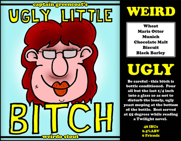
Hah, thanks. Here's the label for the yet-to-be-brewed Ugly Little Bitch:

I'm still a little on the fence about two things - the darkness of her 'lip crust,' and the drop shadow on the hand-drawn text. I feel the depth of color on the crust might be a bit much, but on the other hand - she's got to be an ugly little bitch.
YourBeardedPal
Well-Known Member
- Joined
- Apr 20, 2009
- Messages
- 47
- Reaction score
- 0
I laughed.Best served at 55 degrees while reading a Twilight novel.
I think it's fine. What don't you like about the drop shadow? You just don't like it in general or it's opacity?
OP
OP
greencoat
Well-Known Member
What don't you like about the drop shadow? You just don't like it in general or it's opacity?
I guess I'm just questioning its necessity. When it isn't there, it puts the title on the same plane as the drawing. When it is there, its sitting above it. Both work out well enough I suppose.
Without drop shadow:
With drop shadow:
Both work, but I'm still not sure what I like more.
YourBeardedPal
Well-Known Member
- Joined
- Apr 20, 2009
- Messages
- 47
- Reaction score
- 0
Personally I like it with the drop shadow as it stands out a bit more. Either way, the text stands out. But, I know what you mean. I'm stuck on something similar myself for this blonde I plan on brewing for family/friends in a couple weeks. I'll probably just flip a coin.
OP
OP
greencoat
Well-Known Member
Alright, I'm really showing my nerdiness with this one. It's for a cider I'll be making for my vacation to the Outer Banks this Summer.
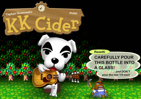
Alright, I'm really showing my nerdiness with this one. It's for a cider I'll be making for my vacation to the Outer Banks this Summer.
Pure gold. Love it!
pepperford
Member
Nice hop label. For version one, make some of the black "splats" a series of lighter colors. That should give it depth and complexity. I do really like the small restrained font. Do another version where you thing you have gone too far, and then go a little further with it. It might get super funky in a good way.
OP
OP
greencoat
Well-Known Member

I figured I'd just scan the receipt instead of typing out the ingredients for this one. The dude in the middle is my buddy who co-brewed/learned how to brew on this batch.
Boerderij_Kabouter
Well-Known Member
Absolutely awesome idea. That receipt thing is golden.
OP
OP
greencoat
Well-Known Member
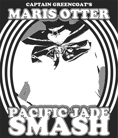
In keeping with the black and white theme, here's the label for my SMaSH that's going into bottles in a couple weeks. The central image is me in Sailor Moon cosplay at a gaming convention last year.
OP
OP
greencoat
Well-Known Member
Here's a variation on the MO/PJ SMASH. Since I'm making a marketing plan for a brewpub in school, I figured a bottle example would be useful for my presentation. My pub would be "Wright Brothers Brewing Company" out of Dayton, OH.
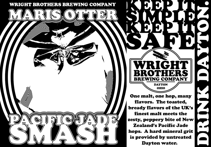
I hope I don't get points deducted for being in drag - hah!
I hope I don't get points deducted for being in drag - hah!
HokieBrewer
Well-Known Member
You got skillz, but those Wright Brothers are ours dammit!
OP
OP
greencoat
Well-Known Member
You got skillz, but those Wright Brothers are ours dammit!
They just used you guys for your costal winds. Once they chewed you up and spit you out they came back home to Huffman Prairie here in Dayton.
Zee Brothers are mine!
OP
OP
greencoat
Well-Known Member
Two labels I'm putting into competition at Dayton's Oktoberfest (judging beer and labels.) One is a re-hash of Delicious Awesome, while the other is for my mild that turned into a brown porter.


OP
OP
greencoat
Well-Known Member
My buddy - who's last name is Short - gave me a bunch of hops from his garden from this year's harvest. He's a Guided By Voices nerd, just like me, so I took an image from one of their album covers and threw in some beer imagery.
The album cover:

The label:
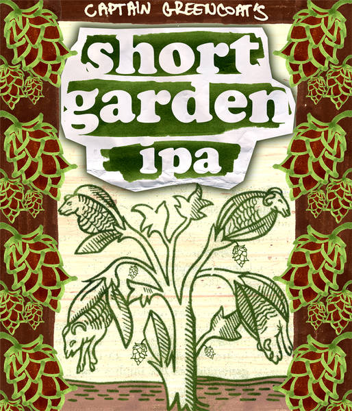
Comments and critiques are awesome
The album cover:
The label:
Comments and critiques are awesome
BargainMugs
Well-Known Member
- Joined
- May 17, 2010
- Messages
- 361
- Reaction score
- 12
You definitely have a talent for typography.
I wouldn't change a thing. Great label design!
I wouldn't change a thing. Great label design!
ptra1004
Well-Known Member
Love the Short Garden IPA label! Keep up the good work man!
Similar threads
- Replies
- 5
- Views
- 462
