Latest Lazy Turtle Brewery

Homebrew Talk - Beer, Wine, Mead, & Cider Brewing Discussion Forum

Help Support Homebrew Talk - Beer, Wine, Mead, & Cider Brewing Discussion Forum:

This site may earn a commission from merchant affiliate links, including eBay, Amazon, and others.

Pilotpistolpete

Active Member
Joined
Jan 29, 2010
Messages
27
Reaction score
0
Location
Ottawa
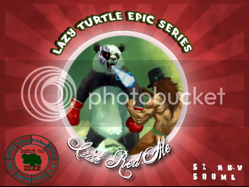
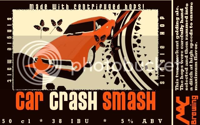
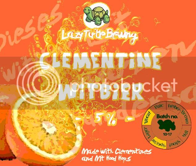
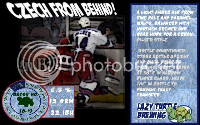
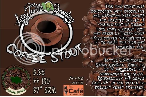
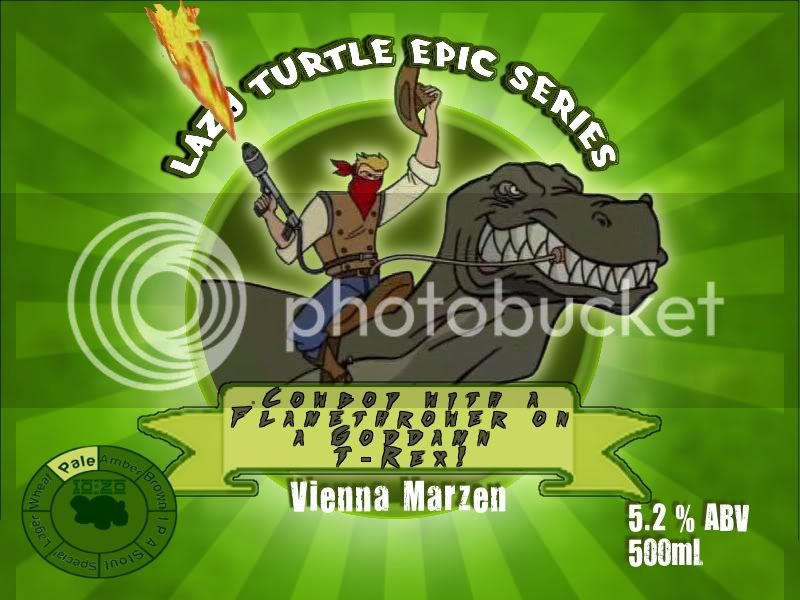
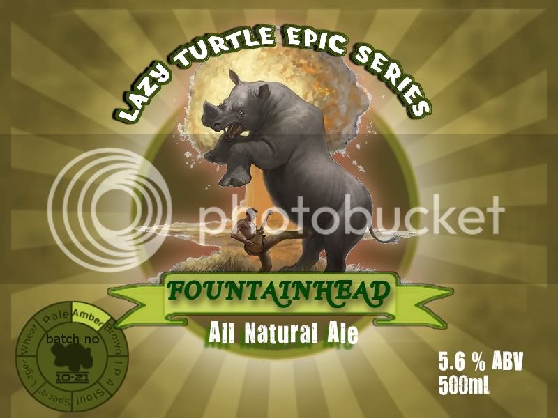
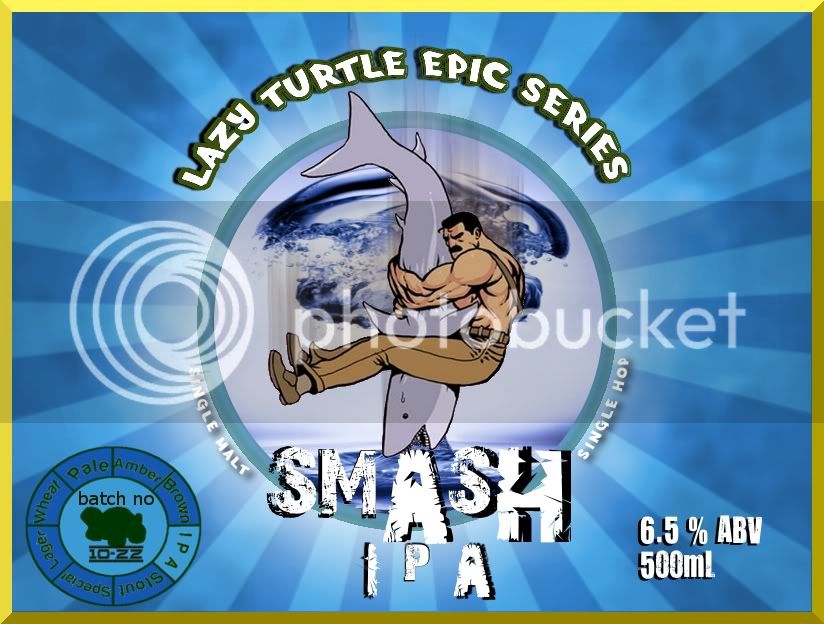
New Lazy Brewing Turtle Logos!

nutbrown.jpg


clementinewitbier.jpg


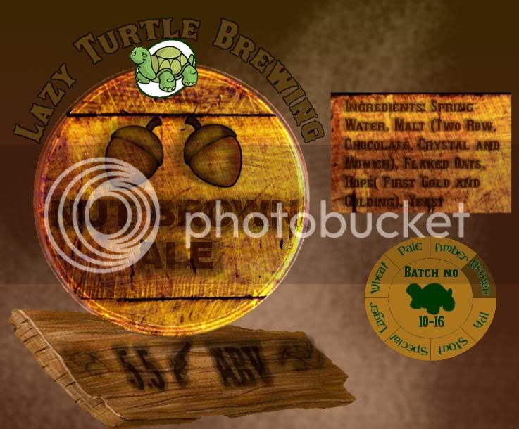
Starting to get a hing of GIMP now.

Let me know what you think!
 
Wow great labels! Really like the Witbier one, the clementines with the splash is good work. Great colors as well that just beg me to want to open up a bottle and try it.
 
I like the overall look of both of them!

the first one, though, is a bit hard to read. The text color and the background are like-colors, which has them bleed together when trying to read; especially the ingredients.

What I'd do is use a little darker text, and possibly have another common color from the rest of the label separate the text from the background.

nutbrown2.jpg


I couldn't find a similar text for the ingredients, or else I'd show you those as well.

I also really like the brew-wheel on the right hand side - awesome addition :mug:
 
Cool thanks for the input!

My original idea was to get the text to look burnt on. Yeah, I does make it harder to read though. I'd have to try maybe a different wood since it might be too dark.
 
Just make a new layer and multiply the blending of the text so you still get texture with a darker color.
 
I like the circle-dealie indicating style and batch no. Were it me, I would include a thin ring outside to indicate date bottled.

I like the rich colors.

However, I agree that the supporting text (not the beer name) is difficult to read; that made my head hurt. N_G
 
Thanks, but I cannot claim the beer dial as my own. It actually comes from an Alberta-based brewery named Big Rock. I just saw it on one of their cans and blatantly stole it. I suppose it would become a problem if I ever go commercial :mug:

Which label is making your head hurt?
 
Because you asked for my opinion: the specific sections that I am averse to reading are the 'boxes o'text" on the right hand side of 3 of the labels. The lettering needs more color contrast from the background or it needs to be a cleaner font. Particularly egregious are the white-outlined coffee beans behind white text.

I like the witbier squirt graphic more each time I see it.
 
Thanks for the input. I definitely should of spent more time of the coffee beans to remove the white between them. That definitely would of helped the text pop.

I was also thinking of having two smaller text sections on each side rather than a long one, so say each paragraph would be on the right or left side.

The funny thing, the witbeer logo was actually made in a few minutes. I just slapped on some random orange spots and applied a filter. It really came out looking like a orange juice gushing.
 
Ok, So I might have way too much time on my hands.

Anyways, here's my latest. I'm trying a bit of a different style here.

Cheers

mana1.jpg
 
Thanks guys!

I'll eventually have to settle on a general theme, but it's always fun to just be creative on GIMP.

Now I would need to top this for my next epic series label. But how do you top a flamethrower wielding cowboy on a t-rex?
 
I like the expression on the Rhino; he is looking down with a 'hey, WTF are you doing with your boot!' look. Very cool.
 
Well, it's been a while since my last brew (damn summer and other hobbies!)

Still going strong on the epic series. I'll have to eventually stop when I can't find anymore "epic" pictures.

Enjoy


epic3.jpg
 
Thanks. I enjoyed viewing your labels as well. Although we might become bitter enemies, both having turtle mascots :)
 
Thanks and I think we will be all good. There is always more than one turtle in a pond. Ours can always go play with the Terrapin Turtle as well.
 
HAHAHA that epic one is hilarious. I like that the A is bigger in smash, but I'm not sure why the H is. but other than that it looks awesome!

EDIT: and I like the style wheel, thats pretty cool. and the atomic bubble in the background haha. good job
 
HAHAHA that epic one is hilarious. I like that the A is bigger in smash, but I'm not sure why the H is. but other than that it looks awesome!


Blame the font for that one!

As I posted earlier in the thread, I blatantly stole the dial from Big Rock Brewery (they use a rooster).

It has dawned on me now that I could actually do something original and use a diagram of a turtle and use the shell sections in the same way. I'll have to sit down and try experimenting with that on GIMP
 
New Epic Series

epic4.jpg


Also, crazy story

A fellow brewer and i went to a local grower to get fresh hops. It was raining and on the way back and we ended up skidding on the pavement (later investigation showed there was some kind of paste/plaster on the road). We took the ditch and must of done at least two complete barrel rolls. We both ended up walking away from the totally wrecked car with only a few stitches and whiplash.

And behold, while almost everything else was thrown clear out of the car, our bag of fresh hops stayed safely tucked away at my feet near the firewall.

So this is our next label using those "miracle" hops!

carcrashsmash-1.jpg
 
The 2 nuts cracks me up! IMO the coffee stout label is just too brown. Maybe instead of the plain brown background go with a coffee plantation.
 
Also the words on the car crash smash label should read bottom to top, left to right, and top to bottom.
 
I love the Car Crash SMaSH!
Just bottled it last night, I'll apply the labels tonight, maybe upload a pic of the final product...
(whoo-hoo, first post)
 
Back
Top