
mullenite
Well-Known Member
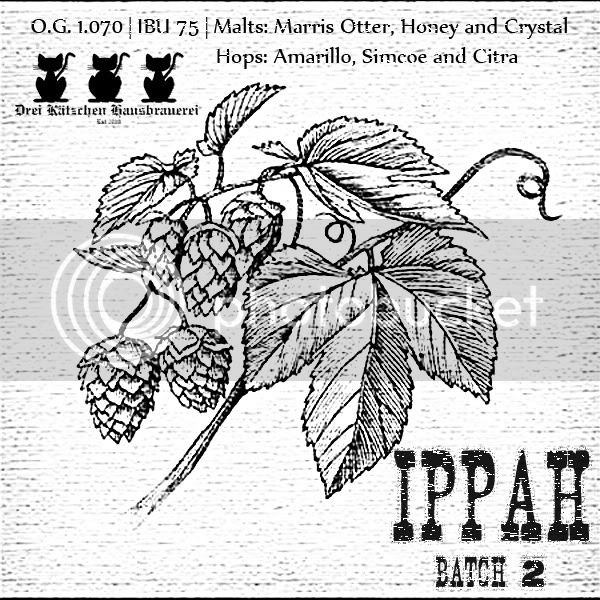
What do you guys think?
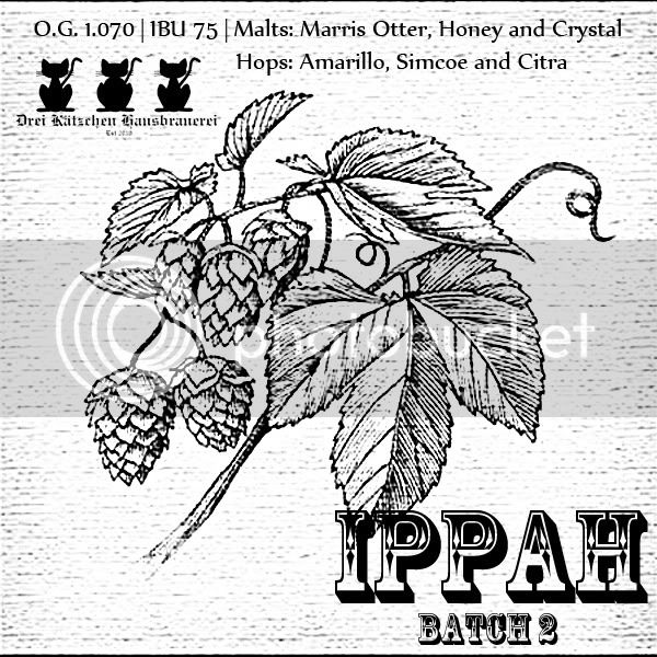
I think the etched/old look is how I'm going to go for all my labels from now on.
I think the etched/old look is how I'm going to go for all my labels from now on.


![Craft A Brew - Safale S-04 Dry Yeast - Fermentis - English Ale Dry Yeast - For English and American Ales and Hard Apple Ciders - Ingredients for Home Brewing - Beer Making Supplies - [1 Pack]](https://m.media-amazon.com/images/I/41fVGNh6JfL._SL500_.jpg)


