first time label feedback...

Homebrew Talk - Beer, Wine, Mead, & Cider Brewing Discussion Forum

Help Support Homebrew Talk - Beer, Wine, Mead, & Cider Brewing Discussion Forum:

This site may earn a commission from merchant affiliate links, including eBay, Amazon, and others.

kc.rkitek

Well-Known Member
Joined
Jun 11, 2008
Messages
106
Reaction score
29
Location
Kansas City
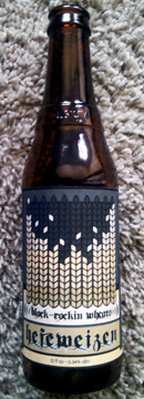
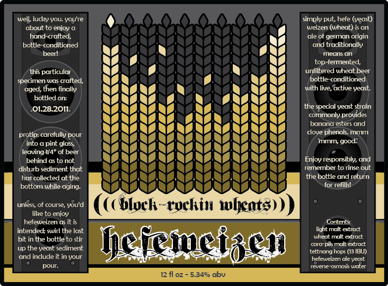
Hey all...I just tried my hand at making a label for my first homebrew. It is "Hank's Hefeweizen" kit from Midwest.

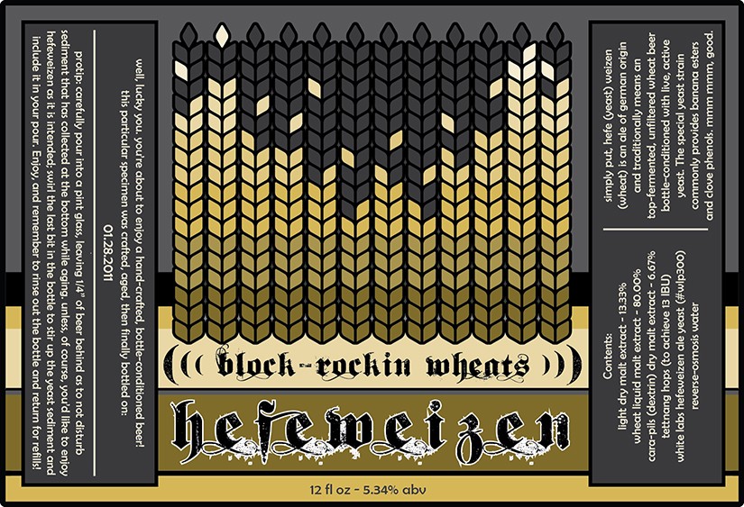
I don't have a brewery name or logo yet, but I guess you gotta start somewhere, right? So, I threw this together with Illustrator...any criticism is welcomed!

6WF6n.jpg


next up is a slightly modified Deception Cream Stout due to be bottled in a couple weeks...guess I'd better start thinking about that one pretty soon. cheers! :mug:
 
The wheat pattern is very cool.

I'd worry that all the sideways text would encourage people to tip the bottle to read it and slosh up the yeast.
 
I'd worry that all the sideways text would encourage people to tip the bottle to read it and slosh up the yeast.

Well, it wasn't the intended outcome, but wouldn't that be ok for a hefe? :) I'll keep that very constructive criticism in mind for the stout label...thanks cms!
 
That pretty much rules. I agree on the 311 comment from earlier.

You may want to find ways to simplify the piece. That's an awful lot of copy for such a small space. If you do stick with the side bars you may consider turning them into huge speaker towers. A nice, subtle touch that would add to the musical/rock motif. Just a thought.

I'm trying to figure out which 311 cover you're thinking of...I just did a Google images search and all I could identify that would be close are Soundsystem and Uplifter...one of these?

My actual inspiration images were:
Wheat vector graphic
and
Equalizer graphic

I agree with the "lot of copy/small space" comment...it is tight. But it's not as noticeable when wrapped around a bottle...the perspective cuts off the side bars when viewed straight on:
qj9i9.jpg


The speaker idea could be fun too...
 
I tried to implement some of the suggestions I've read. I drew up some speakers for side-bars, and flipped the side bar text right-side-up and made it a point larger. It seems to me like there's just too much going on now...maybe it's just that the speakers don't quite go with my wheat-quilizer.

lJ1mO.png


I think I need to exercise a little restraint and go with a more reductive approach.
 
Back
Top